


Storytelling with Data (SWD) community challenge: optimize for audience
- sam33frodon
- Aug 26, 2021
- 4 min read
The challenge is suggested by Storytelling with Data (SWD) community. https://community.storytellingwithdata.com/exercises/optimize-for-audience?page=2
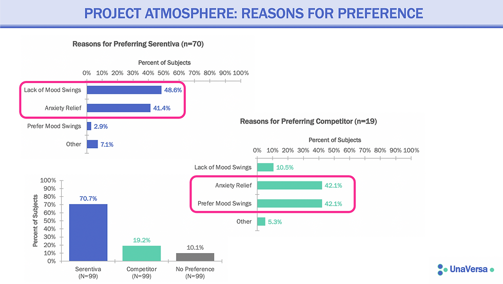
The scenario: The pharmaceutical company UnaVersa concluded a marketing study comparing their recently FDA-approved anti-anxiety drug, Serentiva, to their primary competitor's. The study was referred to internally as "Project Atmosphere," and it included patient participants who had taken both Serentiva and the competitor product for a set amount of time. The results showed a marked preference for UnaVersa's new drug.
The study results were then shared with two primary audiences as part of overall marketing efforts:
Psychiatrists who regularly speak on behalf of the company to other physicians at UnaVersa-sponsored industry events (typically, via a short slide presentation over lunch or dinner); and
UnaVersa's sales representatives who call on doctors to increase awareness of their products (typically, via a brief conversation and printed detail piece).
The visual below shows the single-slide summary that was initially used to communicate study findings to both of these audiences.
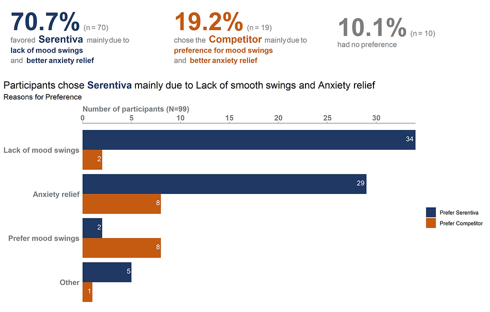
In this post, I will use ggplot2 to modify these above graphs to better target audience.
In fact, I will create the materials I would use to communicate to UnaVersa's sales representatives
Solution 1
Solution 2

Coding
Transforming data
library(ggplot2)
library(tidyverse)
library(ggtext)
library(ggpubr)
library(cowplot)
library(gridExtra)
library(grid)
Reading csv file
df <- read_csv("swd_july.csv")The data looks like:
## # A tibble: 8 x 3
##   brand      reason              number
##   <chr>      <chr>                <dbl>
## 1 Serentiva  Lack of mood swings     34
## 2 Serentiva  Anxiety relief          29
## 3 Serentiva  Prefer mood swings       2
## 4 Serentiva  Other                    5
## 5 Competitor Lack of mood swings      2
## 6 Competitor Anxiety relief           8
## 7 Competitor Prefer mood swings       8
## 8 Competitor Other                    1
The two columns brand and reason need to be transformed into factor (instead of character)
df$brand <-  factor(df$brand, levels = c("Competitor","Serentiva"))
df$reason <- factor(df$reason, levels = c( "Other","Prefer mood swings", "Anxiety relief","Lack of mood swings"))
Code for solution 1:
df_box1 <- tibble(
  label = c("<span style='font-size:40pt;color:#203864'>**70.7%**</span>
  <span style='font-size:12pt;color:#7F7F7F'>(n = 70)</span><br/>
  <span style='font-size:12pt;color:#7F7F7F'>favored</span>
  <span style='font-size:16pt;color:#203864'>**Serentiva**</span>
  <span style='font-size:12pt;color:#7F7F7F'>mainly due to <br>
  <span style='font-size:12pt;color:#203864'>**lack of mood swings**</span><br>
  <span style='font-size:12pt;color:#7F7F7F'>and</span>
  <span style='font-size:12pt;color:#203864'>**better anxiety relief**</span>"),
  x = 0.01, y = 0.5,color = c("white"),fill = c("white"))

df_box2 <- tibble(
  label = c("<span style='font-size:40pt;color:#C55A11'>**19.2%**</span>
  <span style='font-size:12pt;color:#7F7F7F'>(n = 19)</span><br/>
  <span style='font-size:12pt;color:#7F7F7F'>chose the</span>
  <span style='font-size:16pt;color:#C55A11'>**Competitor**</span>
  <span style='font-size:12pt;color:#7F7F7F'>mainly due to <br>
  <span style='font-size:12pt;color:#C55A11'>**preference for mood swings**</span>
  <span style='font-size:12pt;color:#7F7F7F'>and</span>
  <span style='font-size:12pt;color:#C55A11'>**better anxiety relief**</span> "),
  x = 0.01, y = 0.5,color = c("white"),fill = c("white"))

df_box3 <- tibble(
  label = c("<span style='font-size:40pt;color:#7F7F7F'>**10.1%**</span>
  <span style='font-size:12pt;color:#7F7F7F'>(n = 10) </span><br/>
  <span style='font-size:12pt;color:#7F7F7F'>had no preference</span><br/>
  "),
  x = 0.01, y = 0.5,color = c("white"),fill = c("white"))

theme_box <- theme(axis.ticks.x = element_blank(),
                     axis.ticks.y = element_blank(),
                     axis.title = element_blank(),
                     axis.line = element_blank(),
                     axis.text.y = element_blank(),
                     axis.text.x = element_blank(),
                     axis.title.x = element_blank(),
                     axis.title.y = element_blank(),
                     panel.grid.major = element_blank(),
                     panel.grid.minor = element_blank(),
                     panel.background = element_blank(),
                     plot.margin = unit(c(0,0,0,0),"cm"))

p1 <- ggplot()+
  geom_textbox(data = df_box1,
               aes(x , y, label = label),
               box.color = "white",
               fill = "white", lineheight = 1.5,
               width = unit(500, "pt"),
               hjust = 0,
               box.padding = unit(c(0, 0, 0, 0), "pt")) + # control the width
  xlim(0, 1) + ylim(0, 1) +
  theme_box

p2 <- ggplot()+
  geom_textbox(data = df_box2,
               aes(x , y, label = label),
               box.color = "white",
               fill = "white", lineheight = 1.5,
               width = unit(500, "pt"),
               hjust = 0,
               box.padding = unit(c(0, 0, 0, 0), "pt")) + # control the width
  xlim(0, 1) + ylim(0, 1) +
  theme_box

p3 <- ggplot()+
  geom_textbox(data = df_box3,
               aes(x , y, label = label),
               box.color = "white",
               fill = "white", lineheight = 1.5,
               width = unit(400, "pt"),
               hjust = 0,
               box.padding = unit(c(0, 0, 0, 0), "pt")) + # control the width
  xlim(0, 1) + ylim(0, 1) +
  theme_box

p4 <- ggplot(data = df, aes (x = reason, y = number,fill = brand)) +
  geom_bar(stat = "identity", position = 'dodge', )+

  geom_text(aes(label= number),
            position=position_dodge(width=0.9),
            color= "white",
            vjust=0.25, hjust =1.25)+

  scale_fill_manual(values = c("#203864","#C55A11"),
                    breaks = c("Serentiva", "Competitor"),
                         labels=c("Prefer Serentiva", "Prefer Competitor")) +

  labs(title = "Participants chose <span style='font-size:16pt;color:#203864'>**Serentiva**</span> mainly due to
       Lack of smooth swings and Anxiety relief",
  subtitle= "Reasons for Preference") +

  scale_y_continuous(expand = c(0, 0),name = "Number of participants (N=99)",
                     breaks = seq(0, 40, by= 5),
                     position = 'right') +
  coord_flip() +

  theme(plot.title = element_markdown(size=16),
        plot.title.position = "plot",
        plot.subtitle = element_markdown(size=12),
        axis.title.y = element_blank(),
        axis.ticks.y = element_blank(),
        axis.text.y = element_text(color ="#777B7E", face="bold", size = 12),
        axis.title.x = element_markdown(hjust = 0,size = 12, color ="#777B7E",face="bold"),
        axis.text.x = element_text(color ="#777B7E", face="bold", size = 12),
        axis.line.x = element_line(color="grey", size = 1),
        axis.ticks.x = element_line(color="#a9a9a9"),
        legend.title = element_blank(),
        panel.grid.major = element_blank(),
        panel.grid.minor = element_blank(),
        panel.background = element_blank())
plot_grid(plot_grid(p1,p2,p3, ncol = 3, nrow = 1, align = "h" ), p4, nrow = 2, rel_heights = c(0.7, 2.1))Code for solution 2:
g1 <- ggplot(data = df %>%
         filter(brand == "Competitor") %>%
           mutate(pct = prop.table(number)),
       aes(x = reason, y = number)) +
  geom_bar(stat = "identity", fill = "#C55A11" , width = 0.65)+

  geom_text(aes(label= paste("n = ",number ,"\n",round(pct*100,digits= 1),"%", sep="")),
            position=position_dodge(width=0.9),
            color= "#C55A11", size= 4.5,
            vjust=0.5, hjust =-0.15)+

  scale_y_continuous(expand = c(0, 0),
                     limits = c(0, 40),
                     name = "Number of participants",
                     breaks = seq(0, 40, by= 10)) + # ,position = 'right'

  theme_graph2 + coord_flip()

g2 <- ggplot(data = df %>%
           filter(brand == "Serentiva") %>%
           mutate(pct = prop.table(number)),
       aes(x = reason, y = number)) +
  geom_bar(stat = "identity", fill =  "#203864", width = 0.65)+

  geom_text(aes(label= paste("n = ",number,"\n",round(pct*100,digits= 1),"%", sep="")),
            position=position_dodge(width=0.9),
            color= "#203864", size= 4.5,
            vjust=0.5, hjust =1.25)+

  scale_y_continuous(expand = c(0, 0),
                     name = "Number of participants",
                     limits = c(40, 0),
                     breaks = seq(0, 40, by= 10),
                     # position = 'right',
                     trans = 'reverse') +
  scale_x_discrete(position = 'top') +
  theme_graph2 + coord_flip()

mid <- ggplot(df,aes(x=1,y=reason))+
  geom_text(aes(label=reason),size = 5, color ="#777B7E" ,fontface="bold")+
  labs(title= "Reason for preference")+
  scale_x_continuous(expand=c(0,0),
                     limits=c(1,1))+
  theme(plot.title = element_text(hjust=0.5),
        axis.title.y = element_blank(),
        axis.text= element_blank(),
        axis.ticks = element_blank(),
        axis.title.x = element_blank(),
        #axis.text.y = element_text(color ="#777B7E", face="bold", size = 12),
        # axis.ticks.x = element_blank(),
        # axis.line.x = element_line(color="grey", size = 1),
        panel.background=element_blank(),
        panel.grid=element_blank())
plot_grid(
plot_grid(p1,g2, ncol = 1, nrow = 2,rel_heights = c(0.7, 2.)),
plot_grid(p3, mid, ncol = 1, nrow = 2,rel_heights = c(0.7, 2)),
plot_grid(p2,g1, ncol = 1, nrow = 2,rel_heights = c(0.7, 2.)),
ncol =3, rel_widths = c(1, 0.6,1))


Comments