


Explanatory visuals, part 1: Choosing an effective visual
- sam33frodon
- Aug 25, 2021
- 10 min read
Updated: Aug 31, 2021
All of the following graphs were created using ggplot2 and are inspired from the book Storytelling With Data: Let’s Practice!
(Ref: Knaflic, Cole. Storytelling With Data: Let’s Practice! Wiley, © 2019.)
The author created all the figures using Excel and PowerPoint.
In this post, I will use mainly two ubiquitous packages, namely ggplot2 (for data visualization) and tidyverse (for data transforming).
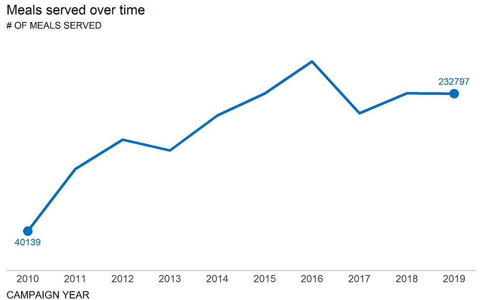
Case study 1: the number of meals served each year as part of a corporate giving program
1.1. Bar plot

1.2. Line graph
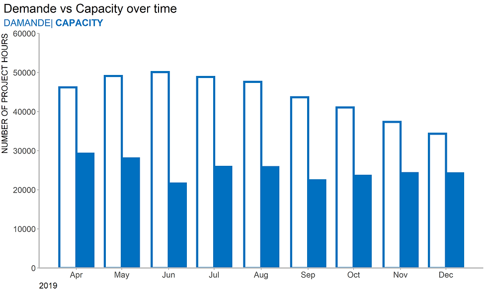
Case study 2: Capacity and demand measured in number of project hours over time
Now we are ready to tidy our data and convert the table to long format.
To do this we will use the gather function from the tidyr package.
2.1. Side-by-side bar chart
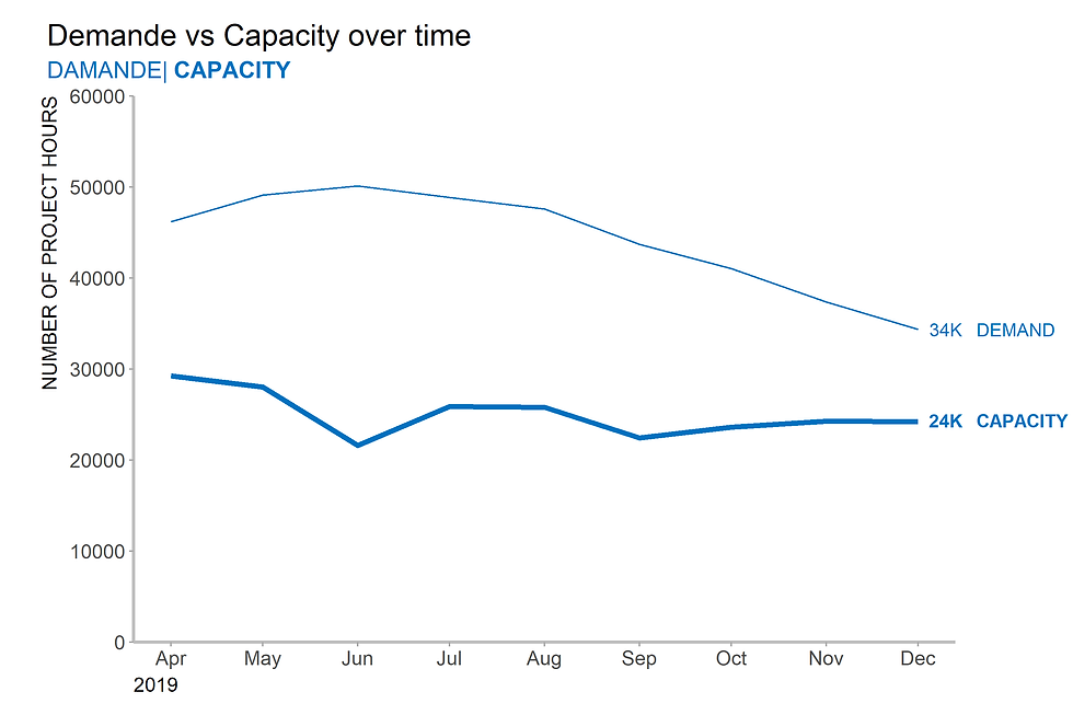
2.2. Line graph
2.3 Overlapping bars
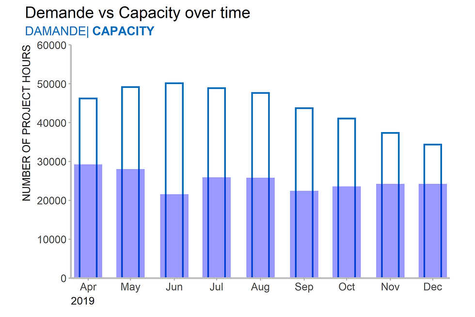
2.3 Stacked bar graph

2.4 Dot plot

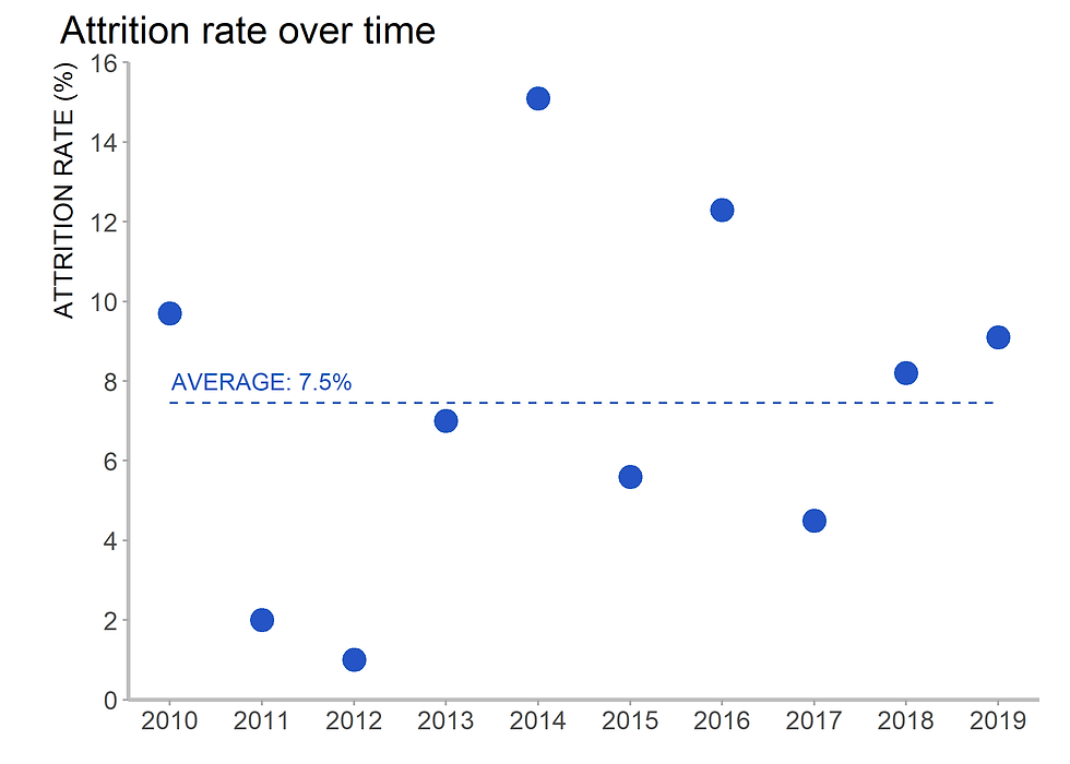
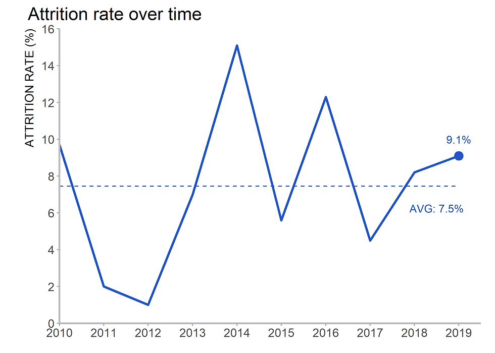
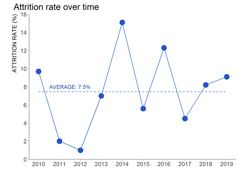
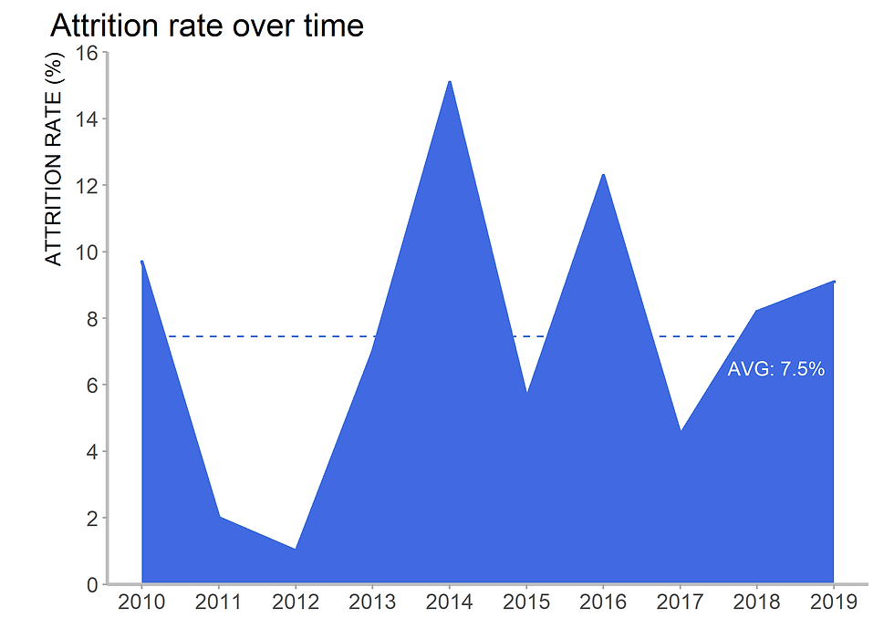
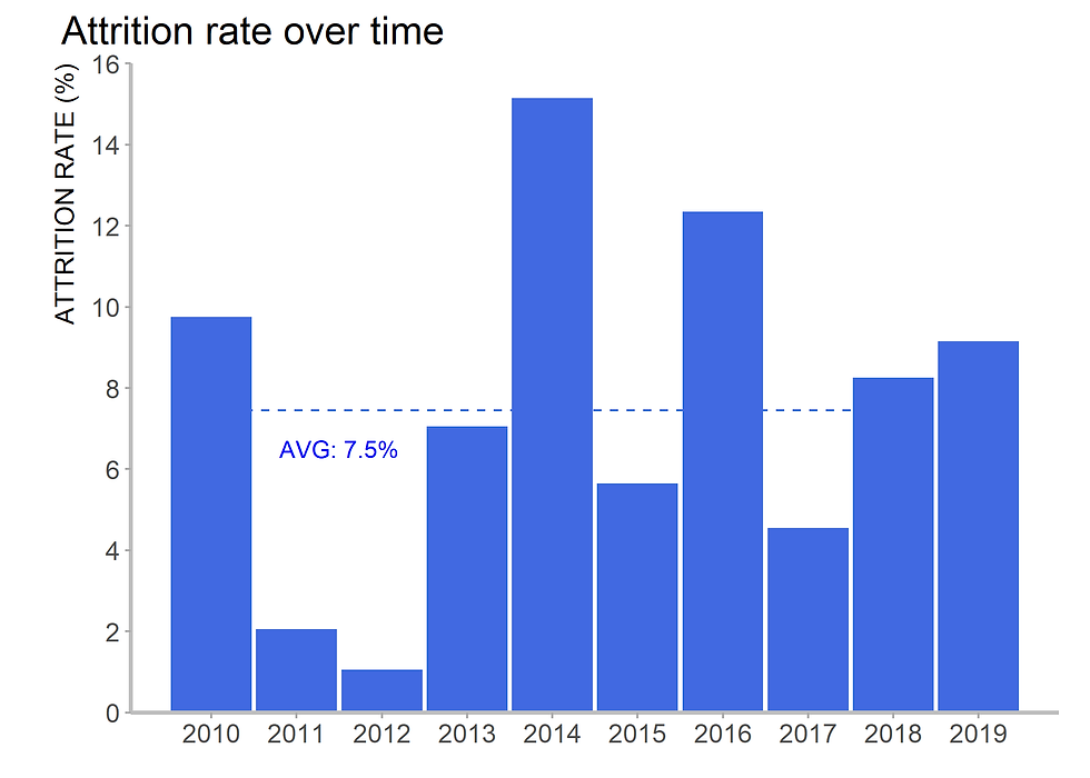
Case study 3: Attrition over time
3.1 Dot plot
3.2. Line graph
3.3. Line and dot graphs
3.4. Line graph

3.5. Area graph
3.6. Bar chart
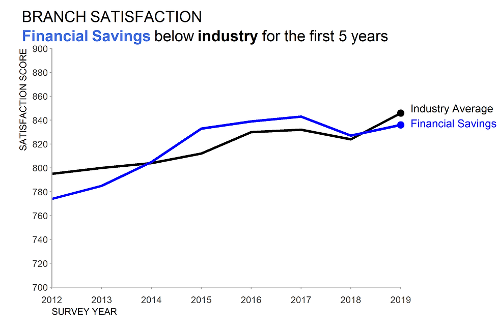
Case study 4: The bank index over time for a number of national banks
Coding
Code for figure 1
meals <- c(40139,127020,168193,153115,202102,232897,277912,205350,233389,232797)
year <- c(2010:2019)
df <- data.frame(year, meals)
ggplot(data=df,
aes(x=year,
y=meals)) +
geom_bar(stat="identity", fill="#0070c0", width = 0.75) +
scale_x_continuous(breaks=seq(2010, 2019,1)) +
scale_y_continuous(breaks=seq(0, 300000, 50000),
labels = function(x) format(x, scientific = FALSE)) +
labs(title ="Meals served over time",
x = "CAMPAIGN YEAR",
y = "# OF MEALS SERVED") +
theme(plot.title = element_text(size=16),
plot.title.position = "plot",
axis.title.x = element_text(size = 12, hjust = 0, vjust = -1.5, color ="black"),
# axis.title.y = element_blank(),
axis.text = element_text(size=12),
# axis.text.y = element_blank(),
axis.line.x = element_line(color = "grey"),
axis.ticks = element_blank(),
panel.grid.major = element_blank(),
panel.grid.minor = element_blank(),
panel.background = element_blank())Code for figure 2
ggplot(data=df, aes(x=year,
                    y=meals)) +
  geom_line(color="#0070c0", size = 1.5) +
  geom_point(data = filter(df, year == 2010 | year == 2019),
             aes(x = year,y = meals),
             color = "#0070c0",
             size = 5) +
  labs(title ="Meals served over time",
       subtitle = "# OF MEALS SERVED",
       x = "CAMPAIGN YEAR") +
  annotate("text", x = 2010, y = 25000, label = "40139", color = "#0070c0") +
  annotate("text", x = 2019, y = 250000, label = "232797", color = "#0070c0") +
  scale_x_continuous(breaks=seq(2010, 2019,1)) +
  scale_y_continuous(limits = c(0,300000)) +

  theme(plot.title = element_text(size=16),
        axis.title.x = element_text(size = 12, hjust = 0, vjust = -1.5, color ="black"),
        axis.title.y = element_blank(),
        axis.text.x = element_text(size=12),
        axis.text.y = element_blank(),
        axis.line.x = element_line(color = "grey"),
        axis.ticks = element_blank(),
        panel.grid.major = element_blank(),
        panel.grid.minor = element_blank(),
        panel.background = element_blank())
Code for figure 3
project <- read_csv("project.csv")
library(lubridate)
project$DATE2 <-ym(project$DATE)

df2 <- gather(project, category, project, DEMAND:CAPACITY)
df2$category = factor(df2$category, levels = c("DEMAND", "CAPACITY"), ordered = TRUE)
df2

        ## # A tibble: 18 x 4
##    DATE   DATE2      category project
##    <chr>  <date>     <ord>      <dbl>
##  1 19-Apr 2019-04-01 DEMAND     46193
##  2 19-May 2019-05-01 DEMAND     49131
##  3 19-Jun 2019-06-01 DEMAND     50124
##  4 19-Jul 2019-07-01 DEMAND     48850
##  5 19-Aug 2019-08-01 DEMAND     47602
##  6 19-Sep 2019-09-01 DEMAND     43697
##  7 19-Oct 2019-10-01 DEMAND     41058
##  8 19-Nov 2019-11-01 DEMAND     37364
##  9 19-Dec 2019-12-01 DEMAND     34364
## 10 19-Apr 2019-04-01 CAPACITY   29263
## 11 19-May 2019-05-01 CAPACITY   28037
## 12 19-Jun 2019-06-01 CAPACITY   21596
## 13 19-Jul 2019-07-01 CAPACITY   25895
## 14 19-Aug 2019-08-01 CAPACITY   25813
## 15 19-Sep 2019-09-01 CAPACITY   22427
## 16 19-Oct 2019-10-01 CAPACITY   23605
## 17 19-Nov 2019-11-01 CAPACITY   24263
## 18 19-Dec 2019-12-01 CAPACITY   24243

# Plotting

ggplot(df2, aes(x = DATE2,
               y = project,
               fill = category)) +
  geom_bar(stat = "identity",
           position = 'dodge',
           color="#0070c0",
           size = 1.5,
           width = 22.5) +

  scale_fill_manual(values = c("white", "#0070c0")) +
  scale_x_date(breaks = seq(as.Date("2019-04-01"),
                            as.Date("2019-12-01"),
                            by = "1 month"),
              date_labels = "%b") +
  scale_y_continuous(expand = c(0, 0),
                     limits = c(0,60000),
                     breaks = seq(0, 60000, 10000),) +
  labs(title = "Demande vs Capacity over time",
       subtitle = bquote("DAMANDE|"~ bold("CAPACITY")),
       x =  "2019",
       y = "NUMBER OF PROJECT HOURS") +

  theme(plot.title = element_text(size = 18),
        plot.title.position = "plot",
        plot.subtitle = element_text(color = "#0070c0", size = 14),
        axis.title.x = element_text(size = 12, hjust = 0, vjust = 0, color = "black"),
        axis.title.y = element_text(size = 12, hjust = 1, vjust = 2.5 , color = "black"),
        axis.text = element_text(size=12),
        axis.ticks = element_line(color="#a9a9a9"),
        # axis.ticks = element_blank(),# axis.title.x=element_blank(),
        axis.line = element_line(color = "grey", size = 1),
        legend.position = "none",
        panel.grid.major = element_blank(),
        panel.grid.minor = element_blank(),
        panel.background = element_blank())
Code for figure 4
ggplot(df2, aes(x = DATE2,
               y = project)) +
  geom_line(data = filter(df2, category == "DEMAND"), size = 0.5, color =  "#0070c0") +  # bright navy blue
  geom_line(data = filter(df2, category == "CAPACITY"), size = 1.5, color =  "#0070c0") +

  annotate("text", x = as.Date("2019-12-10"), y = 34360, label = "34K", color = "#0070c0") + # as.Date is required
  annotate("text", x = as.Date("2019-12-20"), y = 34360, label = "DEMAND", color = "#0070c0",hjust = 0) + # as.Date is required
  annotate("text", x = as.Date("2019-12-10"), y = 24360, label = "24K", color = "#0070c0", fontface = "bold") +
  annotate("text", x = as.Date("2019-12-20"), y = 24360, label = "CAPACITY", color = "#0070c0", fontface = "bold",hjust = 0) +

  scale_x_date(breaks = seq(as.Date("2019-04-01"),
                            as.Date("2019-12-01"),
                            by = "1 month"),
              date_labels = "%b") +

  coord_cartesian(xlim = c(as.Date("2019-04-01"),
                            as.Date("2019-12-01")),
                  clip = 'off') +

  scale_y_continuous(expand = c(0, 0),
                     limits = c(0,60000),
                     breaks = seq(0, 60000, 10000),) +

  labs(title = "Demande vs Capacity over time",
       subtitle = bquote("DAMANDE|"~ bold("CAPACITY")),
       x =  "2019",
       y = "NUMBER OF PROJECT HOURS") +
  theme(plot.title = element_text(size = 18),
                      plot.title.position = "plot",
                      plot.subtitle = element_text(color = "#0070c0", size = 14),
                      axis.title.x = element_text(size = 12, hjust = 0, vjust = 0, color = "black"),
                      axis.title.y = element_text(size = 12, hjust = 1, vjust = 2.5 , color = "black"),
                      axis.text = element_text(size=12),
                      axis.ticks = element_line(color="#a9a9a9"),
                      axis.line = element_line(color = "grey", size = 1),
                      legend.position = "none",
                      panel.grid.major = element_blank(),
                      panel.grid.minor = element_blank(),
                      panel.background = element_blank(),
                      plot.margin=unit(c(0.5,2.5,0.5,1),"cm"))
Code for figure 5
ggplot(df2, aes(x = DATE2, y = project)) +
  geom_bar(data = filter(df2, category == "DEMAND"),
           stat = "identity", width = 12, color =  "#0070c0",
           fill = "white", size= 1) +
  geom_bar(data = filter(df2, category == "CAPACITY"),
           stat = "identity", width = 20,
           fill = "blue", alpha = 0.4) +
  scale_x_date(breaks = seq(as.Date("2019-04-01"),
                            as.Date("2019-12-01"),
                            by = "1 month"),date_labels = "%b") +
  coord_cartesian(xlim = c(as.Date("2019-04-01"),as.Date("2019-12-01")),
                  clip = 'off') +
  scale_y_continuous(expand = c(0, 0),limits = c(0,60000),
                     breaks = seq(0, 60000, 10000),) +

  labs(title = "Demande vs Capacity over time",
       subtitle = bquote("DAMANDE|"~ bold("CAPACITY")),
       x =  "2019",y = "NUMBER OF PROJECT HOURS") +
  theme(plot.title = element_text(size = 18),
                      plot.title.position = "plot",
                      plot.subtitle = element_text(color = "#0070c0", size = 14),
                      axis.title.x = element_text(size = 12, hjust = 0, vjust = 0, color = "black"),
                      axis.title.y = element_text(size = 12, hjust = 1, vjust = 2.5 , color = "black"),
                      axis.text = element_text(size=12),
                      axis.ticks = element_line(color="#a9a9a9"),
                      axis.line = element_line(color = "grey", size = 1),
                      legend.position = "none",
                      panel.grid.major = element_blank(),
                      panel.grid.minor = element_blank(),
                      panel.background = element_blank(),
                      plot.margin=unit(c(0.25,1,0.5,1),"cm"))
Code for Figure 6.
ggplot(df2, aes(x = DATE2,y = project)) +
  geom_bar(data = filter(df2, category == "DEMAND"),
           stat = "identity", width = 20,
           color =  "#0070c0", fill = "#0070c0", size = 1) +
  geom_bar(data = filter(df2, category == "CAPACITY"),
           stat = "identity", width = 20,
           color =  "#0070c0", fill = "lightgrey", size = 1) +
  scale_x_date(breaks = seq(as.Date("2019-04-01"),
                            as.Date("2019-12-01"),
                            by = "1 month"),
              date_labels = "%b") +
  coord_cartesian(xlim = c(as.Date("2019-04-01"),as.Date("2019-12-01")),
                  clip = 'off') +
  scale_y_continuous(expand = c(0, 0),limits = c(0,60000),
                     breaks = seq(0, 60000, 10000),) +
  labs(title = "Demande vs Capacity over time",
       subtitle = bquote("DAMANDE|"~ bold("CAPACITY")),
       x =  "2019",
       y = "NUMBER OF PROJECT HOURS") +
   theme(plot.title = element_text(size = 18),
                      plot.title.position = "plot",
                      plot.subtitle = element_text(color = "#0070c0", size = 14),
                      axis.title.x = element_text(size = 12, hjust = 0, vjust = 0, color = "black"),
                      axis.title.y = element_text(size = 12, hjust = 1, vjust = 2.5 , color = "black"),
                      axis.text = element_text(size=12),
                      axis.ticks = element_line(color="#a9a9a9"),
                      axis.line = element_line(color = "grey", size = 1),
                      legend.position = "none",
                      panel.grid.major = element_blank(),
                      panel.grid.minor = element_blank(),
                      panel.background = element_blank(),
                      plot.margin=unit(c(0.25,1,0.5,1),"cm"))
Code for figure 7
ggplot(df2, aes(x = DATE2,
               y = project)) +

  geom_bar(data = filter(df2, category == "DEMAND"), stat = "identity",
           width = 17.8, color =  "white", fill = "#0070c0",alpha = 0.4)+
  geom_bar(data = filter(df2, category == "CAPACITY"), stat = "identity",
           width = 17, color =  "white", fill = "white") +

  geom_point(aes(color = factor(category),fill = factor(category)),
             shape = 21, size = 14, stroke = 2.2) +
  scale_fill_manual(values=c("white", "#0070c0")) +
  scale_colour_manual(values=c("steelblue", "#0070c0"))   +
  geom_text(data = filter(df2, category == "DEMAND"),
            aes(x = DATE2,y = project,label = round(project/1000,0), size = 10),
            color = "blue",
            show.legend =F) +
  geom_text(data = filter(df2, category == "CAPACITY"),
            aes(x = DATE2,y = project,label = round(project/1000,0), size = 10),
            color = "white",
            show.legend =F) +

  annotate("text", x = as.Date("2019-12-30"), y = 34360, label = "DEMAND", color = "steelblue") + # as.Date is required
  annotate("text", x = as.Date("2019-12-30"), y = 24360, label = "CAPACITY", color = "#0070c0", fontface = "bold") +
  expand_limits(x = as.Date(c("2019-04-01", "2020-01-15"))) +

  scale_x_date(breaks = seq(as.Date("2019-04-01"),
                            as.Date("2019-12-01"),
                            by = "1 month"),
              date_labels = "%b") +

  coord_cartesian(xlim = c(as.Date("2019-04-01"),
                            as.Date("2019-12-01")),
                  clip = 'off') +

  scale_y_continuous(expand = c(0, 0),
                     limits = c(0,60000),
                     breaks = seq(0, 60000, 10000),) +


  labs(title = "Demande vs Capacity over time",
       subtitle = bquote("DAMANDE|"~ bold("CAPACITY")),
       x =  "2019",
       y = "NUMBER OF PROJECT HOURS") +
  theme_ex2_69
Code for figure 8
year <- c(2010:2019)
rate <- c(9.7, 2.0, 1.0, 7.0, 15.1, 5.6, 12.3, 4.5, 8.2, 9.1)
attrition <- data.frame(year, rate)
attrition
##    year rate
## 1  2010  9.7
## 2  2011  2.0
## 3  2012  1.0
## 4  2013  7.0
## 5  2014 15.1
## 6  2015  5.6
## 7  2016 12.3
## 8  2017  4.5
## 9  2018  8.2
## 10 2019  9.1

ggplot(data = attrition,
       aes(x = year, y = rate))+
  geom_point(color = "#2554C7", size = 5) +
  annotate("segment", x = 2010, xend = 2019,
           y = mean(rate), yend = mean(rate),
           color = "#2554C7", linetype = "dashed")  +
  annotate("text", x = 2011,  y = 8.0, label = "AVERAGE: 7.5%", color = "#2554C7") +
  scale_x_continuous(n.breaks = 9) +
  scale_y_continuous(expand = c(0, 0),limits = c(0, 16), n.breaks = 9) +

  labs(title = "Attrition rate over time",
       y = "ATTRITION RATE (%)") +
  theme(plot.title = element_text(size = 18),
        plot.title.position = "plot",
        axis.title.x = element_blank(),
        axis.title.y = element_text(size = 12, hjust = 1, vjust = 2.5 , color = "black"),
        axis.text = element_text(size=12),
        axis.ticks = element_line(color="#a9a9a9"),
        axis.line = element_line(color = "grey", size = 1),
        legend.position = "none",
        panel.grid.major = element_blank(),
        panel.grid.minor = element_blank(),
        panel.background = element_blank(),
        plot.margin=unit(c(0.25,0.5,0.5,1),"cm"))
Code for figure 9
ggplot(data=attrition , aes(x=year, y=rate)) +
  geom_line(color="#2554C7", size = 1.2) +
  geom_point(data = filter(attrition, year == 2019),
             aes(x = year,y = rate),
             color = "#2554C7",size=4) +
  annotate("segment",
           x = 2010, xend = 2019,
           y = mean(rate), yend = mean(rate),
           color = "#2554C7", linetype="dashed") +
  annotate("text", x =2018.5,  y = 6.25, label = "AVG: 7.5%", color = "#2554C7") +
  annotate("text", x = 2019,  y = 10, label = "9.1%", color = "#2554C7") +

  scale_x_continuous(expand = c(0, 0),limits = c(2010, 2019.5), n.breaks = 9) +
  scale_y_continuous(expand = c(0, 0),limits = c(0, 16), n.breaks = 9) +

  labs(title = "Attrition rate over time",
       y = "ATTRITION RATE (%)") +

  theme_ex
Code for figure 10
ggplot(data = attrition,
       aes(x = year, y = rate))+

  geom_line(color="royalblue", size = 0.5) +
  geom_point(color = "#2554C7", size = 5) +

  annotate("segment",
           x = 2010, xend = 2019,
           y = mean(rate), yend = mean(rate),
           color = "royalblue",linetype="dashed")  +
  annotate("text",
           x = 2011.5,  y = 8.0,
           label = "AVERAGE: 7.5%", color = "#2554C7") +

  scale_x_continuous( n.breaks = 9) +
  scale_y_continuous(expand = c(0, 0),limits = c(0, 16), n.breaks = 9) +
  labs(title = "Attrition rate over time",
       y = "ATTRITION RATE (%)") +
  theme_ex3
Code for figure 11
ggplot(data=attrition , aes(x=year, y=rate)) +
  geom_line(color="#2554C7", size = 1.75) +
  geom_rect(aes(xmin=2010, xmax=2019,
                ymin=0, ymax= 7.5),
            alpha= 0.05, fill = "#2554C7") +
  geom_point(data = filter(attrition, year == 2019),
             aes(x = year,y = rate),
             color = "#2554C7",size=4) +

  annotate("segment", x = 2010, xend = 2019, y = mean(rate), yend = mean(rate),
           color = "#2554C7",linetype="dashed") +

  annotate("text", x =2018.25,  y = 6.5, label = "AVG: 7.5%", color = "#2554C7") +
  annotate("text", x = 2018.75,  y = 10.5, label = "9.1%", color = "#2554C7") +

  scale_x_continuous(expand = c(0, 0), limits = c(2010, 2019.2), n.breaks = 9) +
  scale_y_continuous(expand = c(0, 0),limits = c(0, 16), n.breaks = 9) +

  labs(title = "Attrition rate over time",
       y = "ATTRITION RATE (%)") +

  theme_ex3
Code for figure 12
ggplot(attrition, aes(x = year, y = rate)) +
  geom_area(fill='royalblue', colour = "royalblue", size = 1) +
  # scale_fill_brewer(palette = "Blues") ne marche pas +

  annotate("segment", x = 2010, xend = 2019, y = mean(rate), yend = mean(rate), color = "royalblue",linetype="dashed") +

  annotate("text", x =2018.25,  y = 6.5, label = "AVG: 7.5%", color = "white") +

  scale_x_continuous(n.breaks = 9) +
  scale_y_continuous(expand = c(0, 0),limits = c(0, 16), n.breaks = 9) +

  labs(title = "Attrition rate over time",
       y = "ATTRITION RATE (%)") +

  theme_ex3
Code for figure 13.
ggplot(attrition, aes(x = year, y = rate)) +
  geom_bar(stat = "identity", fill='royalblue', colour = "royalblue", size = 1) +

  annotate("segment",
           x = 2010, xend = 2019,
           y = mean(rate), yend = mean(rate),
           color = "royalblue", linetype="dashed") +
  annotate("text", x = 2011.5,  y = 6.5, label = "AVG: 7.5%", color = "blue") +

  scale_x_continuous(n.breaks = 9) +
  scale_y_continuous(expand = c(0, 0),limits = c(0, 16), n.breaks = 9) +

  labs(title = "Attrition rate over time",
       y = "ATTRITION RATE (%)") +

  theme_ex3
Code for figure 14
year <- c(rep(2012:2019,2))
score <- c(795, 800,    804,    812,    830,    832,    824,    846, 774,   785,    805,    833,    839,    843,    827,    836)
category <- c(rep("Industry Average", 8), rep("Financial Saving",8))
data <- data.frame(year, category, score)
data
## year category score
## 1 2012 Industry Average 795
## 2 2013 Industry Average 800
## 3 2014 Industry Average 804
## 4 2015 Industry Average 812
## 5 2016 Industry Average 830
## 6 2017 Industry Average 832
## 7 2018 Industry Average 824
## 8 2019 Industry Average 846
## 9 2012 Financial Saving 774
## 10 2013 Financial Saving 785
## 11 2014 Financial Saving 805
## 12 2015 Financial Saving 833
## 13 2016 Financial Saving 839
## 14 2017 Financial Saving 843
## 15 2018 Financial Saving 827
## 16 2019 Financial Saving 836
  ggplot(data = data, aes(x= year, y = score))+
  geom_line(data = filter(data, category == "Industry Average"), size = 1.5, color =  "black") +  # bright navy blue
  geom_line(data = filter(data, category == "Financial Saving"), size = 1.5, color =  "blue") +

  geom_point(data = filter(data, category == "Industry Average", year == 2019), size = 4, color =  "black") +
  geom_point(data = filter(data, category == "Financial Saving", year == 2019), size = 4, color =  "blue") +

  annotate("text", x = 2019.2, y = 850, label = "Industry Average", color = "black", size = 5, hjust = 0) +
  annotate("text", x = 2019.2, y = 837.5, label = "Financial Savings", color ="blue", size = 5, hjust = 0) +

  scale_x_continuous(expand = c(0, 0),n.breaks = 10) +
  coord_cartesian(xlim = c(2012, 2019), clip = 'off') +
  # this is a good and simple way to generate breaks for scale_x_continuous
  scale_y_continuous(expand = c(0, 0),limits = c(700, 900), n.breaks = 10) +
  labs(title = "BRANCH SATISFACTION<br><span style = 'color:#4169e1;'>**Financial Savings**</span> below <span style ='color:#000000;'>**industry**</span> for the first 5 years") +

  ylab("SATISFACTION SCORE") +
  xlab("SURVEY YEAR") +
  theme(plot.title = element_markdown(size = 20, lineheight = 1.25),
        # plot.subtitle = element_markdown(size = 20, vjust = 1, hjust = 0.5),
        plot.title.position = "plot", # applied for subtitle# plot.subtitle = element_markdown(size=16, hjust = 1), # when using ggtext package# Adjust Space Between ggplot2 Axis Labels and Plot Area
        axis.text.x = element_text(size=12, vjust = -2) ,
        axis.text.y = element_text(size=12, hjust = -3), # ca marche pas cet commande

        axis.title.x= element_text(size = 12, hjust = 0, vjust = -2.5, color ="black"), # change the position of label on y axis
        axis.title.y = element_text(size = 12, hjust = 1, vjust = 2.5 , color ="black"),# change the position of label on x axis# axis.title.x=element_blank(),
        axis.line.x= element_line(color="grey"),
        axis.line.y= element_line(color="grey", size = 1),

        axis.ticks = element_line(color="#a9a9a9"),
        # axis.text.y = element_blank(),
        legend.position = "none",
        panel.grid.major = element_blank(),
        panel.grid.minor = element_blank(),
        panel.background = element_blank(),

plot.margin=unit(c(0.5,4.5,1,1),"cm")) 

Comments