


How to create line charts using ggplot2
- sam33frodon
- Sep 9, 2021
- 8 min read
In this post, we will work towards creating the line graph below.
The post will take you from a basic line plot and explain all the customization we add to the code step-by-step.
In this chapter, we will learn to:
** build simple line chart
** modify line properties, including type, color, and size
** create grouped line chart
Loading libraries
library(tidyverse)
library(ggplot2)
library(ggtext)
Loading data
data <- read_csv("gta_realestate.csv")##
## -- Column specification --------------------------------------------------------
## cols(
## city = col_character(),
## year = col_double(),
## type = col_character(),
## price = col_double()
## )head(data,10)## # A tibble: 10 x 4
## city year type price
## <chr> <dbl> <chr> <dbl>
## 1 Toronto 2011 detached home 701846
## 2 Toronto 2012 detached home 722393
## 3 Toronto 2013 detached home 864351
## 4 Toronto 2014 detached home 934039
## 5 Toronto 2015 detached home 1039638
## 6 Toronto 2016 detached home 1286605
## 7 Toronto 2017 detached home 1250235
## 8 Toronto 2018 detached home 1145892
## 9 Toronto 2019 detached home 1363357
## 10 Toronto 2020 detached home 1475758Data transformation
df <- data %>%
  filter(type == "detached home" & city == "Toronto") %>%
  mutate(year = as.factor(year))

df
## # A tibble: 10 x 4
##    city    year  type            price
##    <chr>   <fct> <chr>           <dbl>
##  1 Toronto 2011  detached home  701846
##  2 Toronto 2012  detached home  722393
##  3 Toronto 2013  detached home  864351
##  4 Toronto 2014  detached home  934039
##  5 Toronto 2015  detached home 1039638
##  6 Toronto 2016  detached home 1286605
##  7 Toronto 2017  detached home 1250235
##  8 Toronto 2018  detached home 1145892
##  9 Toronto 2019  detached home 1363357
## 10 Toronto 2020  detached home 1475758
1. Creating a basic line plot
The main function here is geom_line()
ggplot(data= df,
       aes(x = year, y = price, group = 1)) +
  geom_line() +
  theme_minimal()
Figure 1 .Basic line graph using geom_line()
At this stage, I would like to show you how to modify graph using ggplot2. There will be other posts will focus on improve the aesthetic of the image.
Alternatively, we can also use geom_path()
ggplot(data= df,
       aes(x = year, y = price, group = 1)) +
  geom_path() +
  theme_minimal()
Figure 2. Basic line graph using geom_path()
2. Modify line properties
2.1 Size
ggplot(data= df,
       aes(x = year, y = price, group = 1)) +
  geom_line(size = 1) +
  theme_minimal()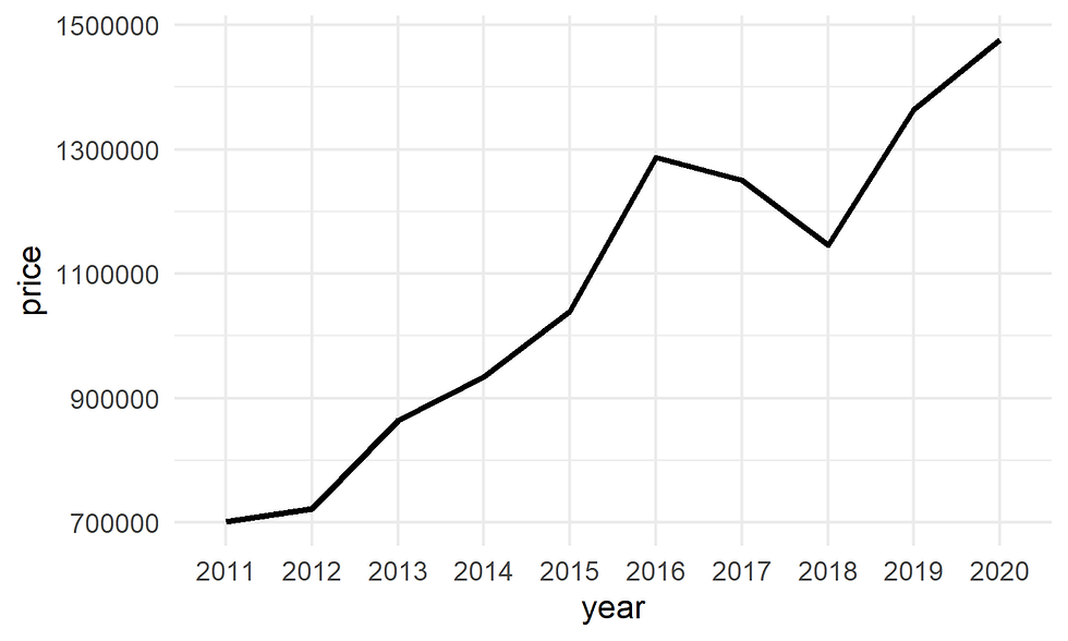
Figure 3. Customize line size.
2.2. Type
The line type can be modified using the linetype argument. It can take 7 different values.
We can specify the line type either using numbers or words as shown below:
0 : blank
1 : solid
2 : dashed
3 : dotted
4 : dotdash
5 : longdash
6 : twodash
2.2.1. using words
ggplot(data= df,
       aes(x = year, y = price, group = 1)) +
  geom_line(linetype = "dashed", size = 1) +
  theme_minimal()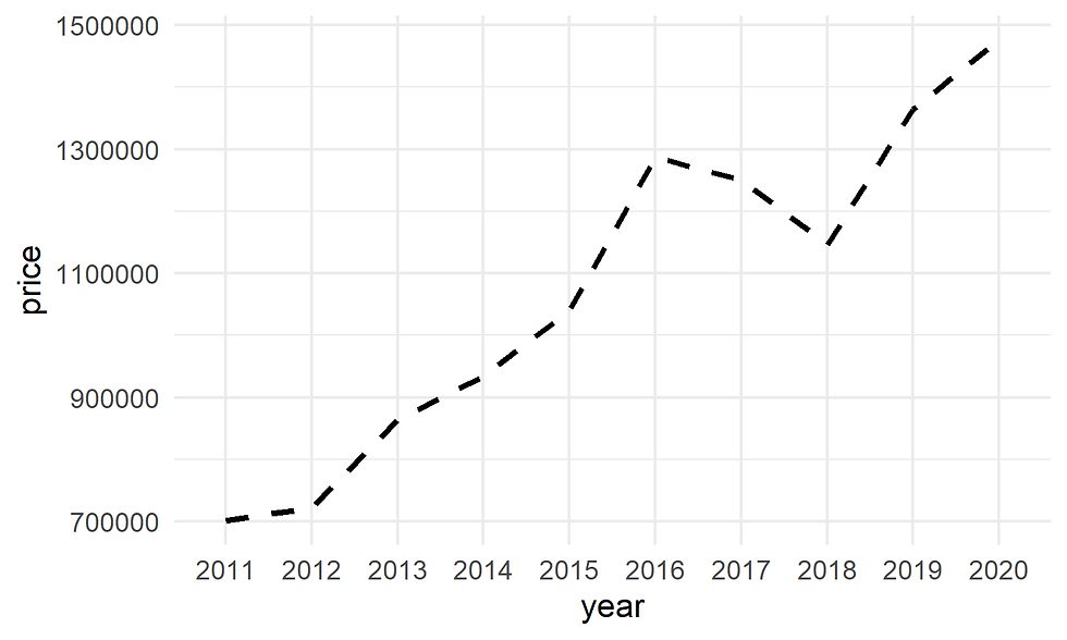
Figure 4. Customize line type using words
2.2.2. Using number
Here the number 4 corresponds to “dotdash”.
ggplot(data= df,
       aes(x = year, y = price, group = 1)) +
  geom_line(linetype = 4, size = 1) +
  theme_minimal()
Figure 5. Customize line type using number
2.3 Changing colors
ggplot(data= df,
       aes(x = year, y = price, group = 1)) +
  geom_line(color = "blue", size =1, linetype ="longdash") +
  theme_minimal()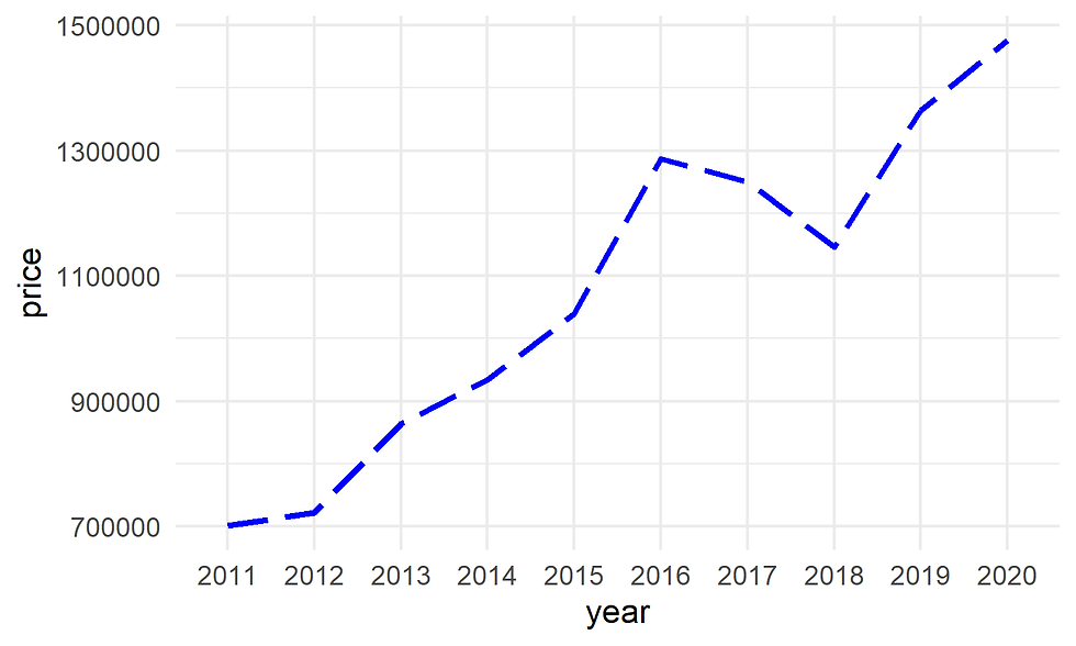
Figure 6. Customize color
2.4 Adding points to the line
ggplot(data= df,
       aes(x = year, y = price, group = 1)) +
  geom_line() +
  geom_point() + # changing size and color of the point
  theme_minimal()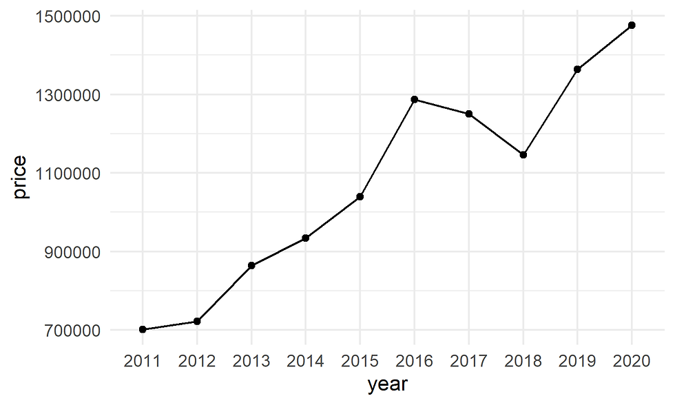
Figure 7. Adding points
2.4.1. Changing size and color of the point
ggplot(data= df,
       aes(x = year, y = price, group = 1)) +
  geom_line() +
  geom_point(size = 5, color = "purple") +
  theme_minimal()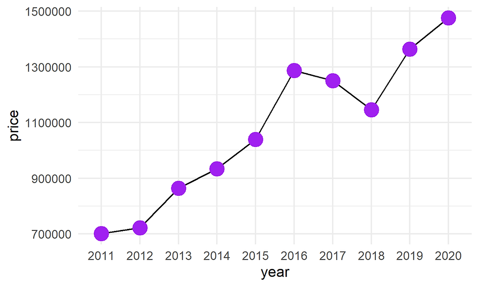
Figure 8. Customize color of points
2.4.2. Changing the shape
ggplot(data= df,
       aes(x = year, y = price, group= 1)) +
  geom_line() +
  geom_point(size = 3, color = "blue", shape=23) +
  theme_minimal()
Figure 9. Customize shape of points
2.4.3. Changing filling color
ggplot(data= df,
       aes(x = year, y = price, group = 1)) +
  geom_line() +
  geom_point(size = 3, color = "blue", shape=23, fill= "purple") +
  theme_minimal()
Figure 10. Customize color of points
2.4.4. Adding labels
ggplot(data= df,
       aes(x = year, y = price, group = 1)) +
  geom_line() +
  geom_point(size = 2, color = "blue",fill= "blue", shape=21) +
  geom_text(data= df, aes(x = year, y = price, group = 1,
                          label= paste("$",round(price/1000000,2),"M")),
            color = "blue",
            vjust = 2.5)+
  scale_y_continuous(expand =  c(0,0),
                     limits = c(500000,1500000),
                     n.breaks = 5) +
  theme_minimal() +
  theme(axis.title = element_text(size =12),
        axis.text = element_text(size =12))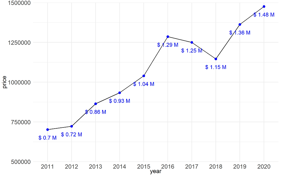
Figure 11A. Adding label
Note: We can customize labels. For example, we want to compares only the data of 2011 and 2020.
ggplot(data= df,
       aes(x = year, y = price, group = 1)) +
  geom_line() +
  geom_point(size = 3, color = "blue",fill= "blue", shape=21) +
  geom_text(data= df %>%
              filter(year == 2011 | year == 2020),
            aes(x = year, y = price,
                group = 1,
                label= paste("$",round(price/1000000,2),"M")),
            color = "blue",
            vjust =2.5)+
  scale_y_continuous(expand =  c(0,0),
                     limits = c(500000,1500000),
                     n.breaks = 5) +
  theme_minimal() +
  theme(axis.title = element_text(size =12),
        axis.text = element_text(size =12))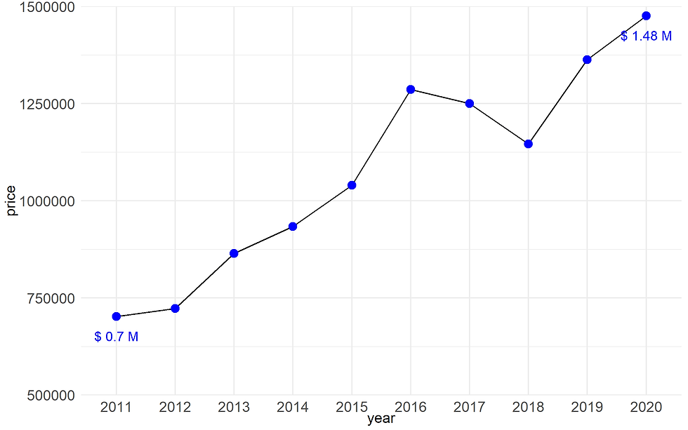
Figure 11B. Adding labels
3. Multiple lines
Example: We would like to see the change of detached homes in three cities: Toronto, Brampton, and Scarborough.
Data preparation
df <- data %>%
  filter(type == "detached home") %>%
  mutate(year = as.factor(year),
         city = as.factor(city))
To display multiple lines, you can use the group attribute in the data aesthetics layer.
3.1. Basic line chart
ggplot() +
  geom_line(data = df,
            aes(x= year, y = price,
                group = city), # to draw multiple lines, we need to use group here
size = 1.5) 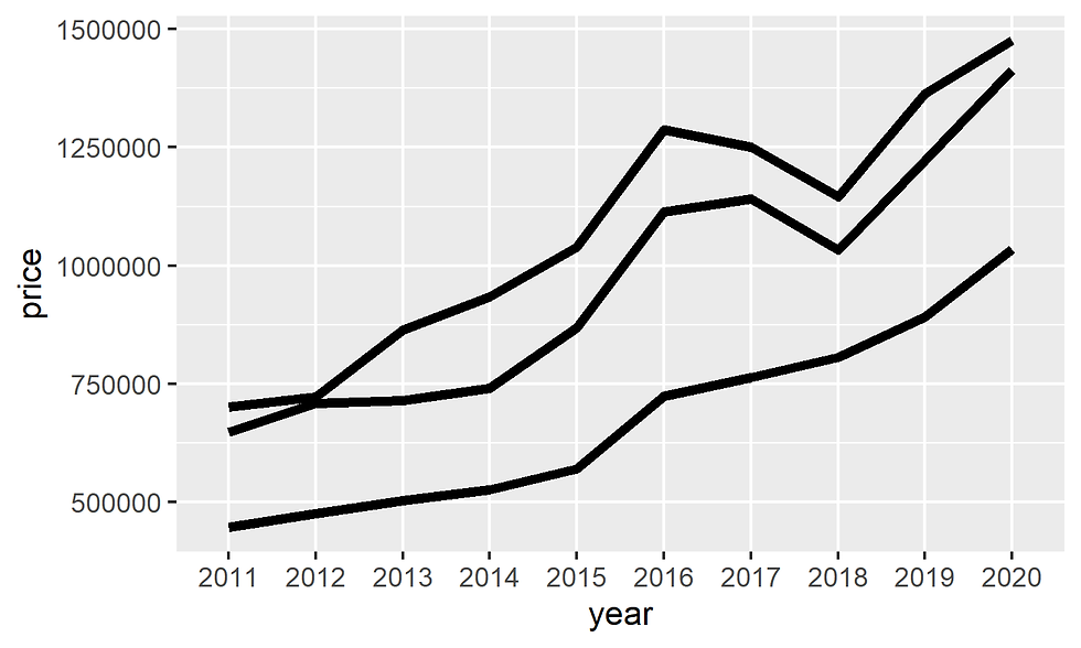
Figure 12. Create multiple line
In order to distinguish these three lines, we have to map them with color.
ggplot() +
  geom_line(data = df,
            aes(x= year, y = price,
                group = city, #
                color = city), # three line by three default color
            size = 1.5) +
  theme(axis.title = element_text(size =12),
        axis.text = element_text(size =12))#  increase the size of the line
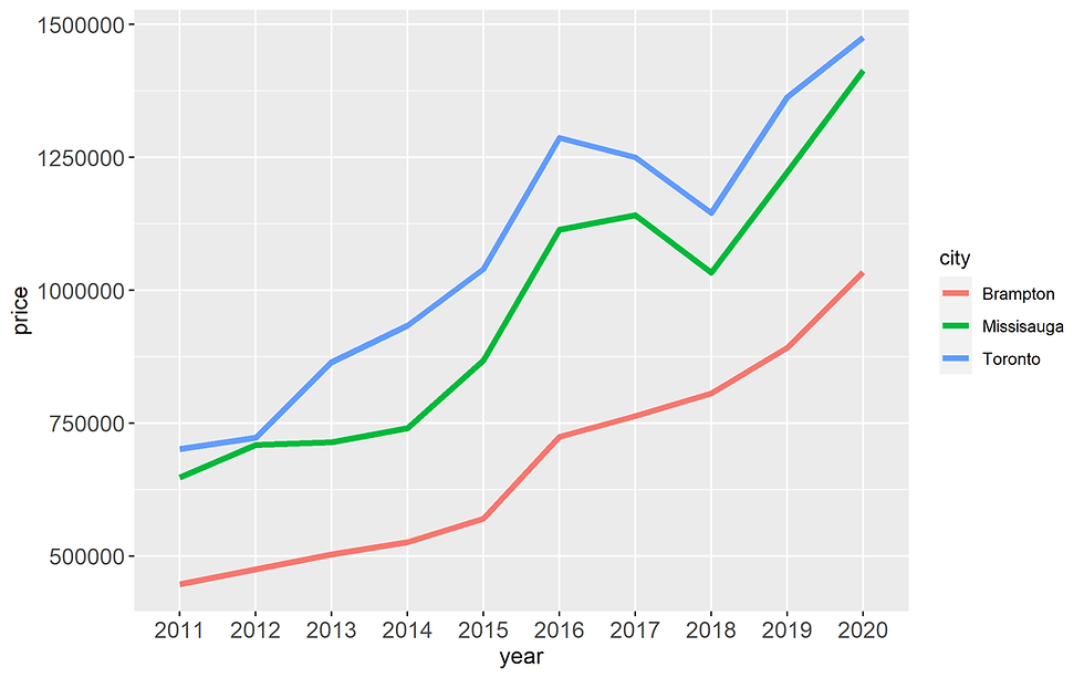
Figure 13. Adding color to line
The three colors here are default colors.
When applying color for three line, the legend will automatically created
3.2. Customize color of the line
We can change manually line colors using the functions :
scale_color_manual() : to use custom colors
scale_color_brewer() : to use color palettes from RColorBrewer package
scale_color_grey() : to use grey color palettes
3.2.1. scale_color_manual()
Using color codes
ggplot() +
  geom_line(data = df,
            aes(x= year, y = price,
                group = city, #
                color = city), # three line by three default color
            size = 1.5) + #  increase the size of the line +
 scale_colour_manual(values=c("#6495ED", "#808000", "#000080"))  +
  theme_minimal() +
  theme(axis.title = element_text(size =12),
        axis.text = element_text(size =12))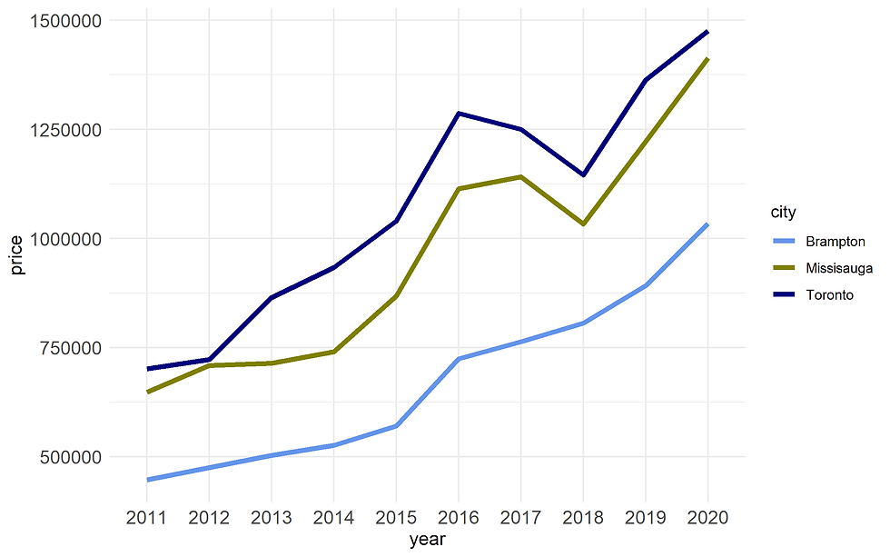
Figure 14A. Customize colors using scale_colour_manual()
Using words
ggplot() +
  geom_line(data = df,
            aes(x= year, y = price, group = city, color = city),
            size = 1.5) +
 scale_colour_manual(values=c("red", "darkgreen", "orange"))  +
  theme_minimal() +
  theme(axis.title = element_text(size =12),
        axis.text = element_text(size =12))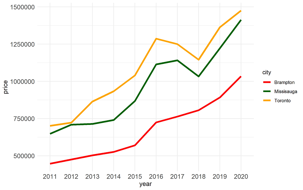
Figure 14B. Customize colors using scale_colour_manual()
3.2.2. scale_color_brewer()
ggplot() +
  geom_line(data = df,
            aes(x= year, y = price, group = city, color = city),
            size = 1.5) +
 scale_color_brewer(palette = "Set1") +
  theme_minimal() +
  theme(axis.title = element_text(size =12),
        axis.text = element_text(size =12))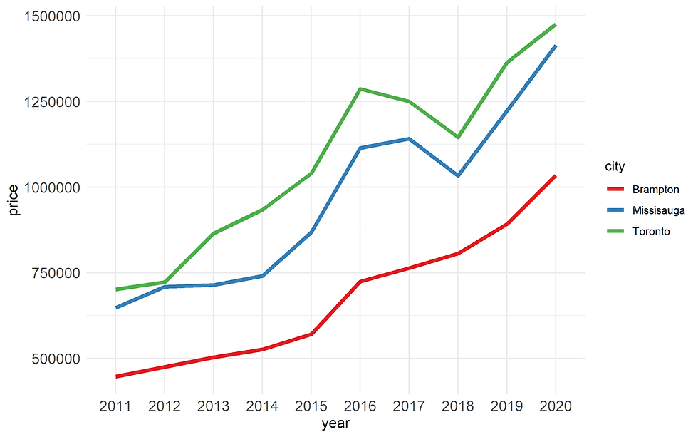
Figure 15. Customize colors using scale_color_brewer()
See https://ggplot2.tidyverse.org/reference/scale_brewer.html for more information about scale_color_brewer
3.2.3. scale_color_grey()
ggplot() +
geom_line(data = df, aes(x= year, y = price, group = city,
                color = city), size = 1.5) +
 scale_color_grey() +
  theme_minimal() +
  theme(axis.title = element_text(size =12),
        axis.text = element_text(size =12))
Figure 16. Customize colors using scale_color_grey()
3.3. Set line types manually
You must map a column in your data to the linetype aesthetic and then assign linetype to the values of that column.
ggplot() +
  geom_line(data = df,
            aes(x= year, y = price,group = city,
                color = city,linetype = city),
            size = 1.5) +
  scale_colour_manual(values=c("#6495ED", "#808000", "#000080")) +
  scale_linetype_manual(values=c("dotted","dotted","solid")) +
  theme_minimal() +
  theme(axis.title = element_text(size =12),
        axis.text = element_text(size =12))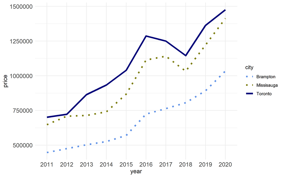
Figure 17.Customize line types using scale_linetype_manual()
See https://ggplot2.tidyverse.org/reference/scale_linetype.html for more information
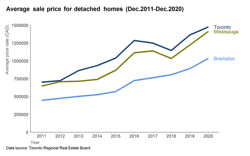
4. The final graph
Applying all the steps above, we can obtain the following graph.
ggplot() +
  geom_line(data = df,
            aes(x= year, y = price, group = city, color = city),
            size = 1.5) +
  scale_y_continuous(expand =  c(0,0), limits = c(0,1500000), n.breaks = 6) +
  scale_colour_manual(values=c("#6495ED", "#808000", "#1F497D"))  +
  geom_text(data = df %>% filter(year == 2020),
            aes(x = year,y = price, color = city, label = city),
            nudge_x = 0.3,hjust =0,size = 4) +
  labs(title = "Average sale price for detached homes (Dec.2011-Dec.2020)",
         caption = "Data source: Toronto Regional Real Estate Board ",
         x = "Year",
         y = "Average price sale (CAD)") +
  coord_cartesian(clip = 'off') +
  theme(plot.title = element_markdown(size=14, margin=margin(0,0,30,0),face="bold"),
        plot.subtitle = element_markdown(size=12, margin=margin(0,0,15,0)),
        plot.title.position = "plot",
        plot.caption = element_text(hjust = 0),
        plot.caption.position =  "plot",
        axis.title.x= element_text(size = 11, hjust = 0, vjust = 0, color = "#6d6d6d"),
        axis.text.x = element_text(size = 11),
        axis.line.x = element_line(color = "#7F7F7F"),
        axis.title.y = element_text(size = 11, hjust = 1 ,vjust = 2, color = "#6d6d6d"),
        axis.text.y = element_text(size = 11),
        axis.line.y = element_line(color = "#7F7F7F"),
        axis.ticks = element_line(color="#a9a9a9") ,
        legend.position = "none",
        panel.grid.major = element_blank(),
        panel.grid.minor = element_blank(),
        panel.background = element_blank(),
        plot.margin = unit(c(0.5,2.5,0.5,0.5),"cm"))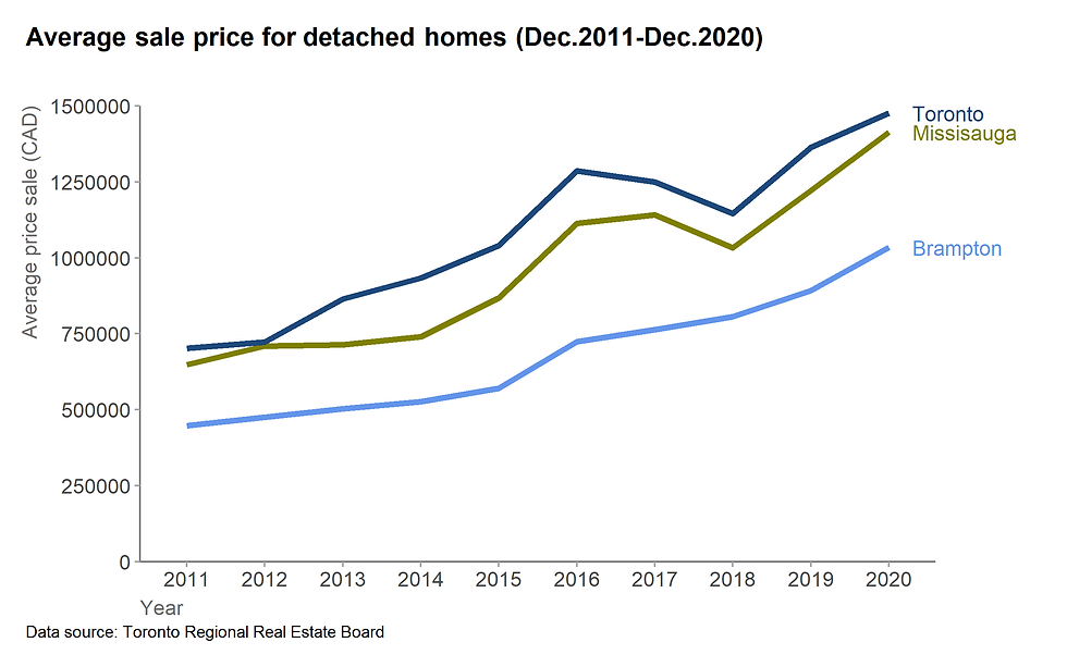
Figure 18. The final graph
5. Other examples using line graphs
5.1. Life expectation for North Americas Countries
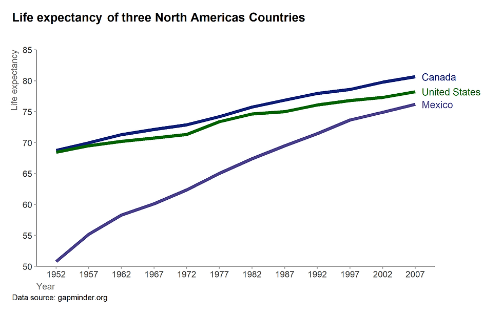
Figure 19. Life expectancy of three North Americas countries (See R code here)
5.2. Indexed chart
The line chart can also be used for indexed chart.
We want to see how the price of detached homes increased for three cities.
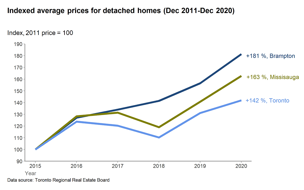
Figure 20. Indexed average prices for detached homes (See the R code here)
5.3. Scaling effect
Ref. Just Plain Data Analysis, Garry M. Klass, 2008, Rowman & Littlefield Inc.
It seems that company DEF grows faster than ABC.
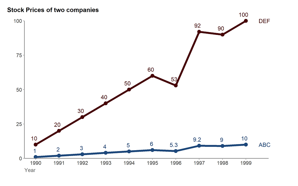
Figure 21. Linear scale (See R code here).
But the rate of increase is identical.
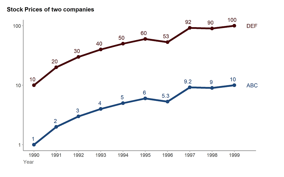
Figure 22. Log scale (See R code here).
R codes
Code Figure 19
library(gapminder)
df_gapminder <- gapminder
df_gapminder%>%
  filter(country %in%  c("Canada","Mexico","United States")) %>%
  ggplot() +
  geom_line(aes(x = factor(year),y = lifeExp,
                color = country, group =  country), size = 1.75)+
  geom_text(data = df_gapminder %>% filter(country %in%  c("Canada","Mexico","United States"), year == 2007),
            aes(x = factor(year),y = lifeExp, color = country, label = country),
            nudge_x = 0.2,
            hjust = 0,
            size = 4) +
  scale_y_continuous(expand =  c(0,0),limits = c(50,85),n.breaks = 8) +
  scale_colour_manual(values=c("Mexico" ="#483D8B", "United States" = "#006400","Canada" ="#0b1d78"))+
  labs(title = "Life expectancy of three North Americas Countries",
       caption = "Data source: gapminder.org",
       x = "Year",y = "Life expectancy") +
  coord_cartesian(clip = 'off') +
  theme(plot.title = element_markdown(size=14, margin=margin(0,0,30,0),face="bold"),
        plot.subtitle = element_markdown(size=12, margin=margin(0,0,15,0)),
        plot.title.position = "plot",
        plot.caption = element_text(hjust = 0),
        plot.caption.position =  "plot",
        axis.title.x= element_text(size = 10, hjust = 0, vjust = 0, color = "#6d6d6d"),
        axis.text.x = element_text(size = 10),
        axis.line.x = element_line(color = "#7F7F7F"),
        axis.title.y = element_text(size = 10, hjust = 1 ,vjust = 2, color = "#6d6d6d"),
        axis.text.y = element_text(size = 10),
        axis.line.y = element_line(color = "#7F7F7F"),
        axis.ticks = element_line(color="#a9a9a9") ,
        legend.position = "none",
        panel.grid.major = element_blank(),
        panel.grid.minor = element_blank(),
        panel.background = element_blank(),
        plot.margin = unit(c(0.5,2.75,0.5,0.5),"cm"))
Code for figure 20
data <- read_csv("gta_realestate.csv")
df_modified <- data%>%
  filter(year >= 2015) %>%
  group_by(city, type) %>%
  mutate(ind = 100*price/ first(price))

ggplot() +
  geom_line(data =df_modified %>% filter(type == "detached home") ,
            aes(x = year,
                y = ind,
                color = city, group =  city), size = 1.75) +

  scale_x_continuous(breaks=seq(2011, 2020,1)) +
  scale_y_continuous(expand =  c(0,0),limits = c(90,190),n.breaks =8) +
  annotate("text", x = 2020, y = 142, label = "+142 %, Toronto", color = "#6495ED", hjust =-0.1) +
  annotate("text", x = 2020, y = 180, label = "+181 %, Brampton", color = "#1F497D", hjust =-0.1) +
  annotate("text", x = 2020, y = 162, label = "+163 %, Missisauga", color = "#808000", hjust =-0.1 ) +
  scale_colour_manual(values=c("Toronto" ="#6495ED", "Brampton" = "#1F497D","Missisauga" ="#808000")) +

  labs(title = "Indexed average prices for detached homes (Dec 2011-Dec 2020)",
       caption = "Data source: Toronto Regional Real Estate Board",
       subtitle = "Index, 2011 price = 100",
       x = "Year", y= "") +
  coord_cartesian(clip = 'off') +
  theme(plot.title = element_markdown(size=14, margin=margin(0,0,30,0),face="bold"),
        plot.subtitle = element_markdown(size=12, margin=margin(0,0,15,0)),
        plot.title.position = "plot",
        plot.caption = element_text(hjust = 0),
        plot.caption.position =  "plot",
        axis.title.x= element_text(size = 10, hjust = 0, vjust = 0, color = "#6d6d6d"),
        axis.text.x = element_text(size = 10),
        axis.line.x = element_line(color = "#7F7F7F"),
        axis.title.y = element_text(size = 10, hjust = 1 ,vjust = 2, color = "#6d6d6d"),
        axis.text.y = element_text(size = 10),
        axis.line.y = element_line(color = "#7F7F7F"),
        axis.ticks = element_line(color="#a9a9a9") ,
        legend.position = "none",
        panel.grid.major = element_blank(),
        panel.grid.minor = element_blank(),
        panel.background = element_blank(),
        plot.margin = unit(c(0.5,3.5,0.5,0.5),"cm"))
Code for figure 21
year <- c(1990:1999)
ABC <- c(1,2,3,4,5,6,5.3,9.2,9,10)
DEF <- c(10,20,30,40,50,60,53,92,90,100)
df_wide <- tibble(year, ABC, DEF)
df_long <- df_wide %>%
  pivot_longer(cols = c("ABC","DEF"),
               names_to = "type",
               values_to = "value")
ggplot() +
  geom_line(data =df_long,aes(x = year,y = value,color = type, group = type), size = 1.75) +
  geom_point(data =df_long,aes(x = year,y = value, color = type), size =3)+
  scale_x_continuous(breaks=seq(1990, 1999,1)) +
  scale_y_continuous(expand =  c(0,0),limits = c(0,100),n.breaks =5) +
  scale_colour_manual(values=c("ABC"="#1F497D", "DEF" = "#490206")) +
  annotate("text", x = 1999.5, y = 10, label = "ABC", color = "#1F497D", hjust =-0.1) +
  annotate("text", x = 1999.5, y = 100, label = "DEF", color = "#490206", hjust =-0.1) +
  geom_text(data= df_long, aes(x = year, y = value, group =type,label= value,color = type),vjust = -1, hjust =0.75)+
  labs(title = "Stock Prices of two companies",
       caption = "",
       x = "Year", y= "") +
  coord_cartesian(clip = 'off')+
  theme_ind
Code for figure 22
ggplot() +
  geom_line(data =df_long,aes(x = year,y = value,color = type, group = type), size = 1.75) +
  geom_point(data =df_long,aes(x = year,y = value, color = type), size =3)+
  scale_x_continuous(breaks=seq(1990, 1999,1)) +
  scale_y_log10() +
  scale_colour_manual(values=c("ABC"="#1F497D", "DEF" = "#490206")) +
  annotate("text", x = 1999.5, y = 10, label = "ABC", color = "#1F497D", hjust =-0.1) +
  annotate("text", x = 1999.5, y = 100, label = "DEF", color = "#490206", hjust =-0.1) +

  geom_text(data= df_long, aes(x = year, y = value, group =type,label= value,color = type),vjust = -1, hjust =0.75)+

  labs(title = "Stock Prices of two companies",
       caption = "",
       x = "Year", y= "") +
  coord_cartesian(clip = 'off')+
  theme_ind


Comments