


Classification of income using US census data (1994)
- sam33frodon
- Dec 27, 2020
- 25 min read
Updated: Jan 25, 2021
Goal of project: Classification the income per year using the 1994 US Census Data
Classification techniques: decision tree, random forest, KNN, and Naïve Bayes.
Data Set Information
Data extraction was done by Barry Becker from the 1994 Census database. The dataset can be downloaded from: “https://www.kaggle.com/uciml/incomecensus-census-income”
Response variable
A. income: Categorical variable that contains yearly income of the respondent (“<=$50K” or “>50K”).
Independent variables
B. age: Numerical variable that contains the age of the respondent.
C. workclass : Categorical variable that contains the type of employer of the respondent
D. fnlwgt: Numerical variable that contains the number of respondents that each row of the data set represents.
E. education: Categorical variable that represents the level of education of the respondent (Doctorate, Prof-school, Masters, Bachelors, Assoc-acdm, Assoc-voc, Some-college, HS-grad, 12th, 11th, 10th, 9th, 7th-8th, 5th-6th, 1st-4th, Preschool)
F. education.num: Numerical variable that represents the education variable.
G. marital.status: The marital status of the respondent
H. occupation: Categorical variable that represents the type of employment of the respondent (?, Adm-clerical, Armed-Forces, Craft-repair, Exec-managerial, Farming-fishing, Handlers-cleaners, Machine-op-inspct, Other-service, Priv-house-serv, Prof-specialty, Protective-serv, Sales, Tech-support, Transport-moving).
I. relationship: Categorical variable that represents the position in the family of the respondent (Husband, Not-in-family, Other-relative, Own-child, Unmarried, Wife).
J. race: Categorical variable that represents the race of the respondent (Amer-Indian-Eskimo, Asian-Pac-Islander, Black,Other, White).
K. sex: Categorical variable that represent the sex of the respondent (Female, Male).
L. capital.gain: Numerical variable that represents the income gained by the respondent from sources other than salary/wages.
M. capital.loss: Numerical variable that represents the income lost by the respondent from sources other than salary/wages.
N. hours.per.week: Numerical variable that represents the hours worked per week by the respondent.
O. native.country: Categorical variable that represents the native country of the respondent.
1. Importing data
We will read in our data using the read_csv() function, from the tidyverse package readr, instead of read.csv().
library(readr)
library(tidyverse)
library(ggplot2)
library(dplyr)
library(DataExplorer)
incomecensus <- read_csv("adultincome.csv")## Parsed with column specification:
## cols(
## age = col_double(),
## workclass = col_character(),
## fnlwgt = col_double(),
## education = col_character(),
## education.num = col_double(),
## marital.status = col_character(),
## occupation = col_character(),
## relationship = col_character(),
## race = col_character(),
## sex = col_character(),
## capital.gain = col_double(),
## capital.loss = col_double(),
## hours.per.week = col_double(),
## native.country = col_character(),
## income = col_character()
## )2. Inspecting the data
First look at the data
str(incomecensus)## Classes 'spec_tbl_df', 'tbl_df', 'tbl' and 'data.frame': 32561 obs. of 15 variables:
## $ age : num 90 82 66 54 41 34 38 74 68 41 ...
## $ workclass : chr "?" "Private" "?" "Private" ...
## $ fnlwgt : num 77053 132870 186061 140359 264663 ...
## $ education : chr "HS-grad" "HS-grad" "Some-college" "7th-8th" ...
## $ education.num : num 9 9 10 4 10 9 6 16 9 10 ...
## $ marital.status: chr "Widowed" "Widowed" "Widowed" "Divorced" ...
## $ occupation : chr "?" "Exec-managerial" "?" "Machine-op-inspct" ...
## $ relationship : chr "Not-in-family" "Not-in-family" "Unmarried" "Unmarried" ...
## $ race : chr "White" "White" "Black" "White" ...
## $ sex : chr "Female" "Female" "Female" "Female" ...
## $ capital.gain : num 0 0 0 0 0 0 0 0 0 0 ...
## $ capital.loss : num 4356 4356 4356 3900 3900 ...
## $ hours.per.week: num 40 18 40 40 40 45 40 20 40 60 ...
## $ native.country: chr "United-States" "United-States" "United-States" "United-States" ...
## $ income : chr "<=50K" "<=50K" "<=50K" "<=50K" ...
## - attr(*, "spec")=
## .. cols(
## .. age = col_double(),
## .. workclass = col_character(),
## .. fnlwgt = col_double(),
## .. education = col_character(),
## .. education.num = col_double(),
## .. marital.status = col_character(),
## .. occupation = col_character(),
## .. relationship = col_character(),
## .. race = col_character(),
## .. sex = col_character(),
## .. capital.gain = col_double(),
## .. capital.loss = col_double(),
## .. hours.per.week = col_double(),
## .. native.country = col_character(),
## .. income = col_character()
## .. )We will not need the column fnlwgt
incomecensus <- incomecensus %>%
select(-c(fnlwgt))head(incomecensus)## # A tibble: 6 x 15
## age workclass fnlwgt education education.num marital.status occupation
## <dbl> <chr> <dbl> <chr> <dbl> <chr> <chr>
## 1 90 ? 77053 HS-grad 9 Widowed ?
## 2 82 Private 132870 HS-grad 9 Widowed Exec-mana~
## 3 66 ? 186061 Some-col~ 10 Widowed ?
## 4 54 Private 140359 7th-8th 4 Divorced Machine-o~
## 5 41 Private 264663 Some-col~ 10 Separated Prof-spec~
## 6 34 Private 216864 HS-grad 9 Divorced Other-ser~
## # ... with 8 more variables: relationship <chr>, race <chr>, sex <chr>,
## # capital.gain <dbl>, capital.loss <dbl>, hours.per.week <dbl>,
## # native.country <chr>, income <chr>We can see that there are some rows containing question marks (“?”).
The next step is to ensure the consistency of data before building any classification technique.
Assigning correct R data types to each column
To convert character to factor
incomecensus <- incomecensus %>%
  mutate_if(is.character,as.factor)

str(incomecensus)
## Classes 'spec_tbl_df', 'tbl_df', 'tbl' and 'data.frame': 32561 obs. of 15 variables:
## $ age : num 90 82 66 54 41 34 38 74 68 41 ...
## $ workclass : Factor w/ 9 levels "?","Federal-gov",..: 1 5 1 5 5 5 5 8 2 5 ...
## $ fnlwgt : num 77053 132870 186061 140359 264663 ...
## $ education : Factor w/ 16 levels "10th","11th",..: 12 12 16 6 16 12 1 11 12 16 ...
## $ education.num : num 9 9 10 4 10 9 6 16 9 10 ...
## $ marital.status: Factor w/ 7 levels "Divorced","Married-AF-spouse",..: 7 7 7 1 6 1 6 5 1 5 ...
## $ occupation : Factor w/ 15 levels "?","Adm-clerical",..: 1 5 1 8 11 9 2 11 11 4 ...
## $ relationship : Factor w/ 6 levels "Husband","Not-in-family",..: 2 2 5 5 4 5 5 3 2 5 ...
## $ race : Factor w/ 5 levels "Amer-Indian-Eskimo",..: 5 5 3 5 5 5 5 5 5 5 ...
## $ sex : Factor w/ 2 levels "Female","Male": 1 1 1 1 1 1 2 1 1 2 ...
## $ capital.gain : num 0 0 0 0 0 0 0 0 0 0 ...
## $ capital.loss : num 4356 4356 4356 3900 3900 ...
## $ hours.per.week: num 40 18 40 40 40 45 40 20 40 60 ...
## $ native.country: Factor w/ 42 levels "?","Cambodia",..: 40 40 40 40 40 40 40 40 40 1 ...
## $ income : Factor w/ 2 levels "<=50K",">50K": 1 1 1 1 1 1 1 2 1 2 ...3. Preparing the consistent the data
3.1. Removing unnecessary column
incomecensus <- incomecensus %>%
  select(-c(fnlwgt))
3.2. Detecting missing values
There are many ways to detect missing values. In this project, we will use the package DataExplorer to quickly see if there are any missing values in the data.
library(DataExplorer)plot_missing(incomecensus)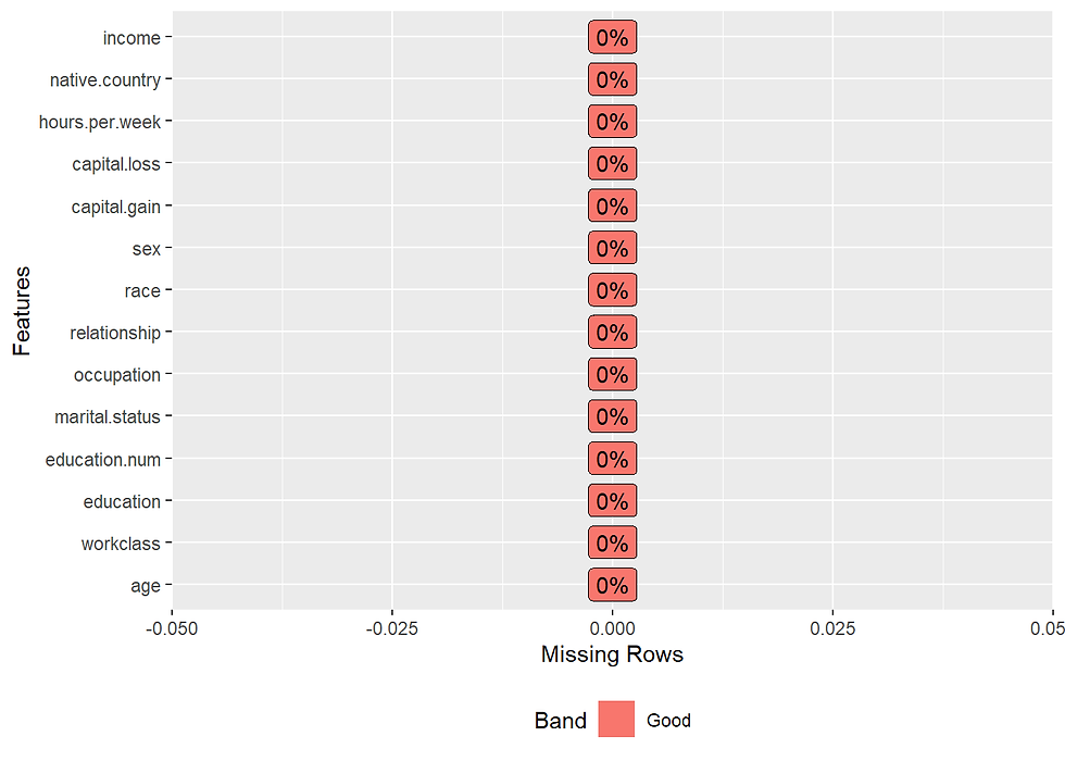
There is no missing value.
3.3. Checking duplicate records
 # to check for duplicate records
incomecensus %>%
  summarize(record_count = n(),
            distinct_records = n_distinct(.))
## # A tibble: 1 x 2
## record_count distinct_records
## <int> <int>
## 1 32561 29096The function distinct() [dplyr package] can be used to keep only unique/distinct rows from a data frame.
If there are duplicate rows, only the first row is preserved. It’s an efficient version of the R base function unique().
incomecensus <- incomecensus %>%
  distinct()
The resulting data frame contain 26904 records.
3.4. Dealing with unusual data points
3.4.1. First we will find unusual data points that appear in many columns. Dealing with rows containing “?” (Note that these rows are not empty) Example: How many row with “?” in the column work class
incomecensus %>%
  group_by(workclass) %>%
  summarise(count = n())
## # A tibble: 9 x 2
## workclass count
## <fct> <int>
## 1 ? 1632
## 2 Federal-gov 946
## 3 Local-gov 2040
## 4 Never-worked 7
## 5 Private 19621
## 6 Self-emp-inc 1091
## 7 Self-emp-not-inc 2473
## 8 State-gov 1272
## 9 Without-pay 14We will check if there are any other columns containing question marks.
First, we will check for the records with any “?”.
question_marks_count <- purrr::map_df(incomecensus,
                                      ~ stringr::str_detect(., pattern = "\\?")) %>%
  rowSums() %>%
  tbl_df() %>%
  filter(value > 0) %>%
  summarize(question_marks_count= n())

question_marks_count
## # A tibble: 1 x 1
## question_marks_count
## <int>
## 1 2192In total, there are 2192 rows containing question marks (“?”).
Now we will count the number of question marks for each column.
count.NA.per.col <- plyr::ldply(incomecensus, function(c) sum(c == "?"))
count.NA.per.col
## .id V1
## 1 age 0
## 2 workclass 1632
## 3 education 0
## 4 education.num 0
## 5 marital.status 0
## 6 occupation 1639
## 7 relationship 0
## 8 race 0
## 9 sex 0
## 10 capital.gain 0
## 11 capital.loss 0
## 12 hours.per.week 0
## 13 native.country 580
## 14 income 0There are three columns that contain “?”, including workclass, occupation, and native.country.
We will remove all of these records.
3.4.2 Checking the consistency of each column
We will use package ggplot2 to detect any unusual points.
3.4.2A. age and education
incomecensus %>%
  ggplot(aes(age, education)) +
  geom_point(alpha = 0.3, col = "#00AFBB") +
  geom_point(aes(col = (age<= 20 & education == 'Masters')),
             alpha = 1,
             size = 3) +
  scale_colour_manual(values = setNames(c('blue','grey'),
                                        c(T, F))) +
  theme(legend.position="bottom") +
  scale_x_continuous(breaks = seq(0,100,10))+
  xlab("Age") +
  ylab("Education Level") +
  ggtitle("Age vs Education Level")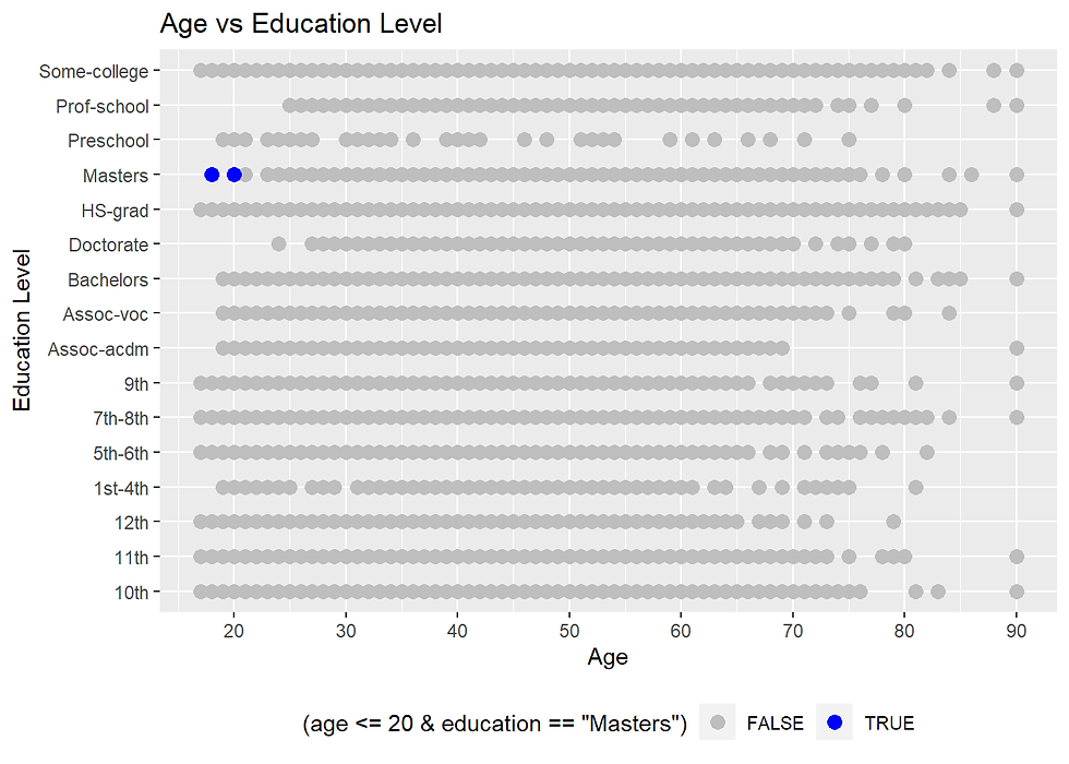
There are a few data points (in blue) that are outlier datapoints. It is doubtful that people with ages of 20 years and less can complete a Masters degree. In reality, it might be possible. These data points can be removed.
incomecensus <- incomecensus %>%
  filter(!(age <= 20 & education == 'Masters'))
3.4.2B. sex and relationship status
table(incomecensus$sex, incomecensus$relationship)##
## Husband Not-in-family Other-relative Own-child Unmarried Wife
## Female 1 3262 384 1576 2354 1365
## Male 10808 3853 489 2077 732 1There are two records where the husbands are female. There is also one record where the wife is female. In 1994, this situation was not possible in the US. Where are these records?
incomecensus %>%
  select(sex, relationship, marital.status) %>%
  filter((sex == 'Male' & relationship == 'Wife')  | (sex == 'Female' & relationship == 'Husband'))
## # A tibble: 2 x 3
## sex relationship marital.status
## <fct> <fct> <fct>
## 1 Male Wife Married-civ-spouse
## 2 Female Husband Married-civ-spouseThese points can be removed using the code below.
incomecensus <- incomecensus %>%
  filter(!((sex == 'Male' & relationship == 'Wife') | (sex == 'Female' & relationship == 'Husband')))
3.4.2C. Relationship and marital status
The marital status classification identifies five major categories: never married, married, widowed, and divorced.
table(incomecensus$relationship, incomecensus$marital.status) ##
## Divorced Married-AF-spouse Married-civ-spouse
## Husband 0 9 10799
## Not-in-family 2153 0 14
## Other-relative 102 1 118
## Own-child 305 1 83
## Unmarried 1449 0 0
## Wife 0 10 1355
##
## Married-spouse-absent Never-married Separated Widowed
## Husband 0 0 0 0
## Not-in-family 181 3959 382 426
## Other-relative 26 533 53 40
## Own-child 43 3120 89 12
## Unmarried 120 774 404 339
## Wife 0 0 0 0The group “other married, spouse absent” includes married people living apart because either the husband or wife was employed and living at a considerable distance from home, was serving away from home in the Armed Forces, had moved to another area, or had a different place of residence for any other reason except separation as defined above. (https://www.unmarried.org/government-terminology/)
incomecensus %>%
  filter(marital.status == 'Married-spouse-absent' & relationship == 'Unmarried') %>%
  summarise(count = n())
## # A tibble: 1 x 1
## count
## <int>
## 1 120There are 130 rows where people are ‘Married-spouse-absent’ and ‘Unmarried’ at the same time. These records will be removed.
incomecensus <- incomecensus %>%
  filter(!(marital.status == 'Married-spouse-absent' & relationship == 'Unmarried'))
3.4.2D. age and weekly working hour
incomecensus %>%
  ggplot(aes(age, hours.per.week)) +
  geom_point(size = 2, shape = 23, color = "blue") +
  theme(legend.position="bottom") +
  scale_x_continuous(breaks = seq(0,100,10))+
  scale_y_continuous(breaks = seq(0,100,10))+
  xlab("Age") +
  ylab("Weekly working hours") +
  ggtitle("Age vs Weekly working hours ")
Some people aged older than 70 and work more than 80 hours a week. Even for people with 90 years of age, there are records of 100 hours per week.
To highlight these data point
incomecensus %>%
  ggplot(aes(age, hours.per.week)) +
  geom_point(alpha = 0.3, col = "#00AFBB") +
  geom_point(aes(col = (age >= 70 & hours.per.week >= 40)),
             alpha = 1,
             size = 3) +
  scale_colour_manual(values = setNames(c('red','grey'),
                                        c(T, F))) +
  theme(legend.position="bottom") +
  scale_x_continuous(breaks = seq(0,100,10))+
  scale_y_continuous(breaks = seq(0,100,10))+
  xlab("Age") +
  ylab("Weekly working hours") +
  ggtitle("Age vs Weekly working hours ")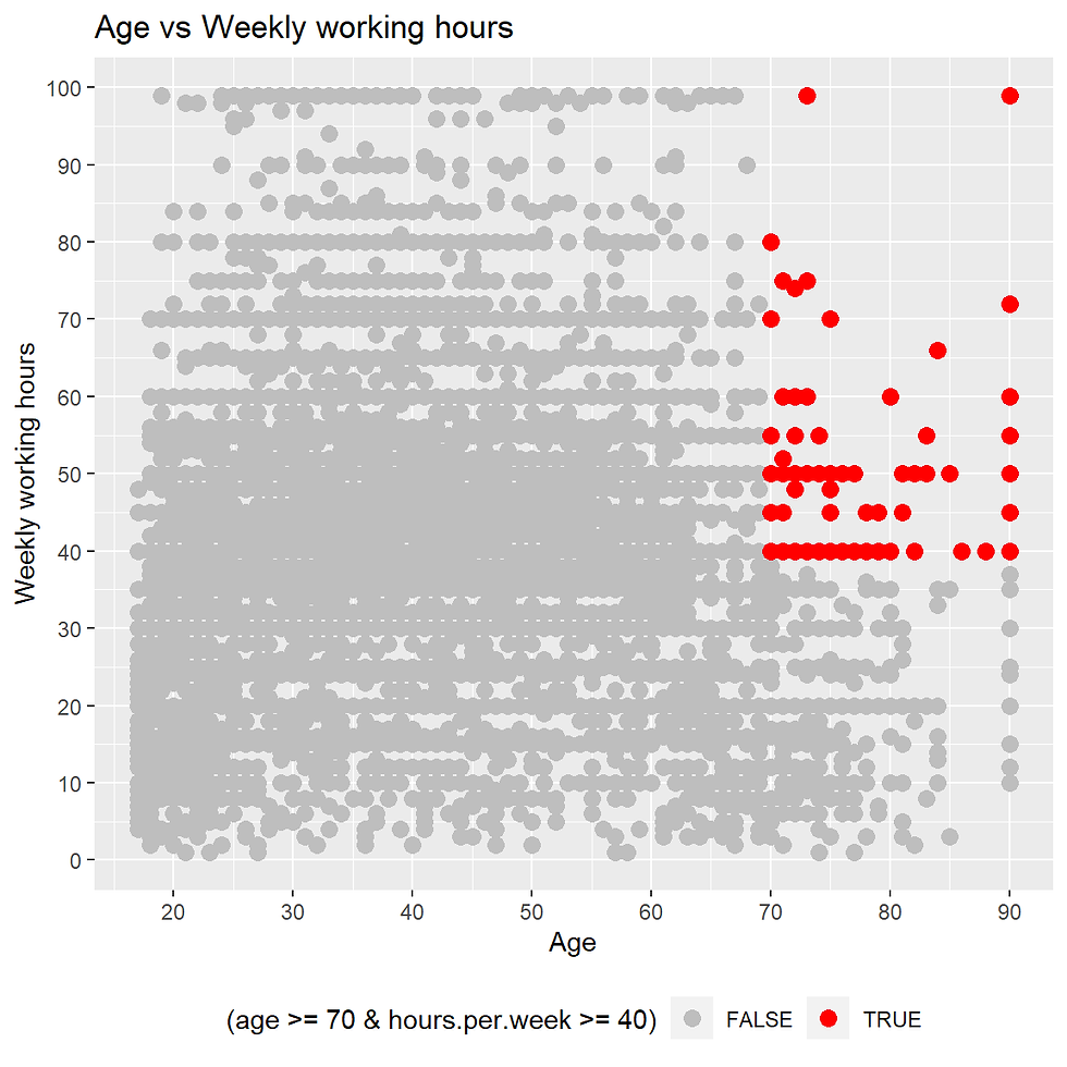
incomecensus %>%
  filter(age >= 70 & hours.per.week > 50) %>%
  summarise(counts =n())
## # A tibble: 1 x 1
## counts
## <int>
## 1 25Data points with age more than and equal to 70 years and working hours greater than 50 hours can be removed.
incomecensus <- incomecensus %>%
   filter(!(age >= 70 & hours.per.week > 50))
3.4.2E. capital loss and capital gain
Taking a look at the capital gain.
incomecensus %>% ggplot(aes(capital.gain)) +
  geom_histogram(fill= "lightblue",
                 color = 'blue',
                 binwidth = 5000) +
  labs(title= "Capital gain Distribution") +
  theme(plot.title = element_text(hjust = 0.5))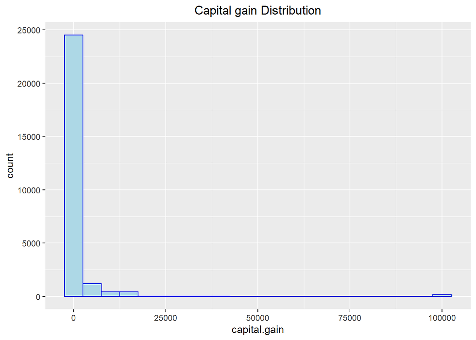
There are many points with 99999 as Capital gain, which seems suspicious and should be eliminated from the analysis. We can remove all the records where the capital gain is equal to 99999.
incomecensus %>%
  group_by(capital.gain) %>%
  summarise(counts =n()) %>%
  arrange(desc(capital.gain)) %>%
  head(10)
## # A tibble: 10 x 2
## capital.gain counts
## <dbl> <int>
## 1 99999 147
## 2 41310 2
## 3 34095 3
## 4 27828 32
## 5 25236 10
## 6 25124 1
## 7 22040 1
## 8 20051 31
## 9 18481 2
## 10 15831 6incomecensus <- incomecensus %>%
filter(!(capital.gain == 99999))incomecensus %>% ggplot(aes(capital.loss)) +
geom_histogram(fill= "lightblue",
color = 'blue',
binwidth = 100) +
labs(title= "Capital loss Distribution") +
theme(plot.title = element_text(hjust = 0.5))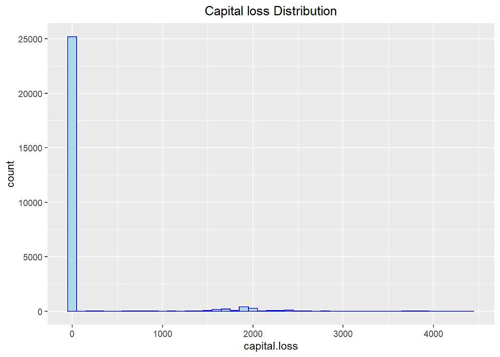
incomecensus %>%
  group_by(capital.loss) %>%
  summarise(counts =n()) %>%
  arrange(desc(capital.loss)) %>%
  head(10)
## # A tibble: 10 x 2
## capital.loss counts
## <dbl> <int>
## 1 4356 1
## 2 3900 2
## 3 3770 2
## 4 3683 2
## 5 3004 1
## 6 2824 8
## 7 2754 2
## 8 2603 4
## 9 2559 12
## 10 2547 4It seems that there is no unusual data point.
3.4.2F Work class and occupation
table(incomecensus$occupation, incomecensus$workclass)##
## ? Federal-gov Local-gov Never-worked Private
## ? 0 0 0 0 0
## Adm-clerical 0 308 269 0 2360
## Armed-Forces 0 9 0 0 0
## Craft-repair 0 62 138 0 2377
## Exec-managerial 0 175 209 0 2296
## Farming-fishing 0 8 27 0 427
## Handlers-cleaners 0 21 44 0 1056
## Machine-op-inspct 0 14 11 0 1571
## Other-service 0 33 187 0 2349
## Priv-house-serv 0 0 0 0 137
## Prof-specialty 0 164 664 0 2001
## Protective-serv 0 27 291 0 183
## Sales 0 14 7 0 2508
## Tech-support 0 66 38 0 667
## Transport-moving 0 24 112 0 1093
##
## Self-emp-inc Self-emp-not-inc State-gov Without-pay
## Adm-clerical 28 46 245 3
## Armed-Forces 0 0 0 0
## Craft-repair 96 485 52 1
## Exec-managerial 360 369 181 0
## Farming-fishing 51 415 15 5
## Handlers-cleaners 2 15 9 1
## Machine-op-inspct 10 35 13 1
## Other-service 27 171 119 0
## Priv-house-serv 0 0 0 0
## Prof-specialty 138 346 392 0
## Protective-serv 5 6 112 0
## Sales 266 362 10 0
## Tech-support 3 26 55 0
## Transport-moving 26 118 40 14. Exploratory data analysis (EDA)
4A. income
Categorical variable that contains yearly income of the respondent (“<=$50K” or “>50K”).
incomecensus %>%
  group_by(income) %>%
  summarise(count = n())
## # A tibble: 2 x 2
## income count
## <fct> <int>
## 1 <=50K 19888
## 2 >50K 6720income_prop <- incomecensus %>%
group_by(income) %>%
summarise(count = n()) %>%
ungroup()%>%
arrange(desc(income)) %>%
mutate(percentage = round(count/sum(count),4)*100,
lab.pos = cumsum(percentage)-0.5*percentage)
ggplot(data = income_prop,
aes(x = "",
y = percentage,
fill = income))+
geom_bar(stat = "identity")+
coord_polar("y") +
geom_text(aes(y = lab.pos, label = paste(percentage,"%", sep = "")),
col = "blue",
size = 5) +
scale_fill_manual(values=c("#E3CD81FF", "#B1B3B3FF")) +
theme_void() +
theme(legend.title = element_text(color = "black", size = 14),
legend.text = element_text(color = "black", size = 14))
The summary of the data shows that 75 % of the observations have an income less than or equal to 50k dollars. Specifically, 22654 persons have an income <=50k dollars, while 7508 people earn more than 50k.
4B. Age
incomecensus %>% ggplot(aes(age)) +
  geom_histogram(fill= "lightblue",
                 color = 'blue',
                 binwidth = 5) +
  labs(title= "Age Distribution") +
  theme(plot.title = element_text(hjust = 0.5))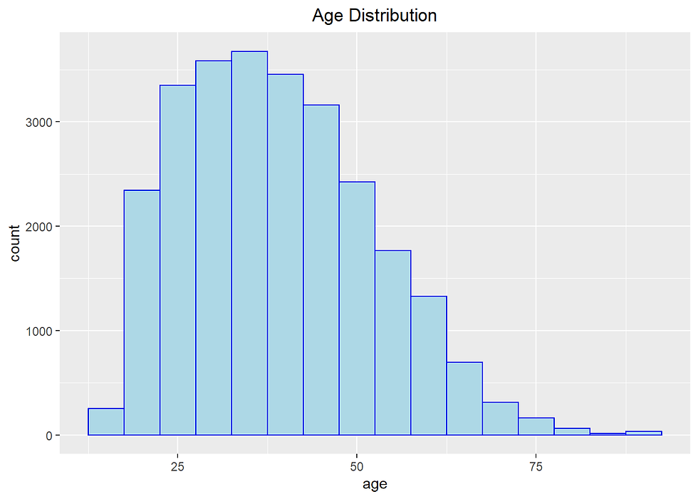
summary(incomecensus$age)## Min. 1st Qu. Median Mean 3rd Qu. Max.
## 17.00 28.00 38.00 38.97 48.00 90.00incomecensus %>% ggplot(aes(age)) +
geom_histogram(aes(fill=income),
color = 'grey',
binwidth = 1) +
scale_fill_manual(values=c("#E3CD81FF", "#B1B3B3FF")) +
labs(title= "Age Distribution for Income")+
theme(plot.title = element_text(hjust = 0.5))
incomecensus %>%
  ggplot(aes(age,
             fill= income)) +
  geom_density(alpha= 0.7, color = 'blue') +
  scale_fill_manual(values=c("#E3CD81FF", "#B1B3B3FF")) +
  labs(x = "Age",
       y = "Density",
       title = "Density graph of age distribution")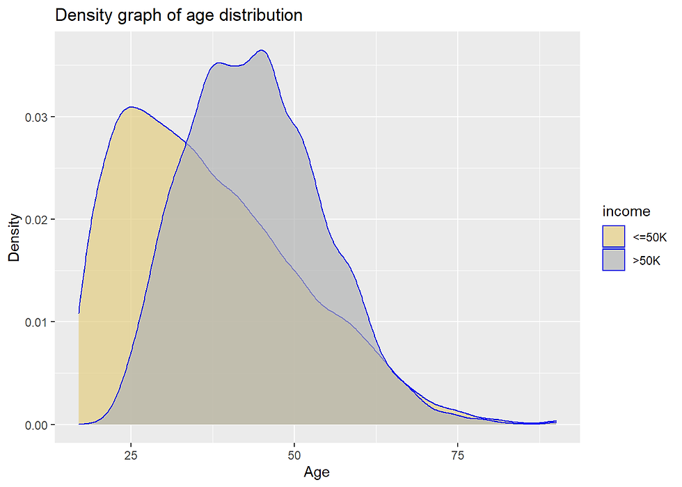
Older people tends to earn more. On the other hand, majority of the people with an age around 25 years earns less than 50k per annum.
4C. workclass
library(ggthemes)
library(hrbrthemes)
incomecensus %>%
group_by(workclass) %>%
summarise(counts = n()) %>%
mutate(Percentage = round(counts*100/sum(counts),2)) %>%
arrange(desc(counts)) %>%
ggplot(aes(x= reorder(workclass, -counts),
y = counts,
fill = Percentage)) +
geom_bar(stat = "identity",
width = 0.6) +
scale_fill_gradient(low="skyblue1", high="royalblue4")+
geom_text(aes(label = paste0(round(counts,1), "\n",Percentage,"%")),
vjust = -0.1,
color = "darkblue",
size = 4) +
scale_y_continuous(limits = c(0,25000)) +
theme_minimal() +
labs(x = "Work class",
y = "Frequency",
caption = "Income census US 1994") 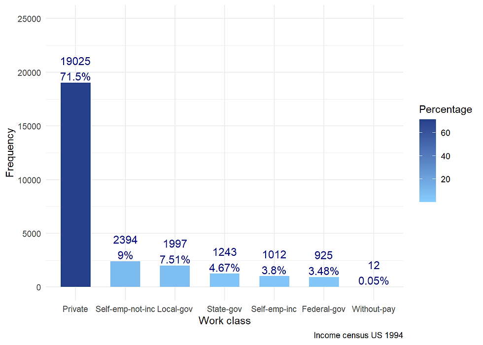
Almost three-quarters of sample work in the private sector.
In this data, there are dictinction between Local-gov, State-gov, and Federal-gov.
We might group these three category if there is no difference in income level between them.
library(ggpubr)
library(scales)
p1 <- incomecensus %>%
group_by(workclass) %>%
summarise(counts = n()) %>%
mutate(Percentage = round(counts*100/sum(counts),2)) %>%
arrange(desc(counts)) %>%
ggplot(aes(x= reorder(workclass, counts),
y = counts)) +
geom_bar(stat = "identity",
width = 0.6,
fill = "steelblue") +
geom_text(aes(label = paste0(round(counts,1),"\n",Percentage,"%")),
vjust = 0.5,
hjust = -0.5,
color = "darkblue",
size = 4) +
scale_y_continuous(limits = c(0,20000)) +
theme_minimal() +
labs(x = "Work class",y = "Frequency") +
coord_flip()
p2 <- incomecensus %>%
group_by(workclass, income) %>%
summarize(n = n()) %>%
mutate(pct = n*100/sum(n)) %>%
ggplot(aes(x = reorder(workclass, n),
y = pct/100,
fill = income)) +
geom_bar(stat = "identity", width = 0.6) +
scale_x_discrete(name = "") +
scale_y_continuous(name= "Percentage",
labels = percent) +
scale_fill_manual(values=c("#E3CD81FF", "#B1B3B3FF")) +
geom_text(aes(label = paste0(round(pct,0),"%")),
position = position_stack(vjust = 0.5),
size = 4,
color = "black") +
theme(plot.title = element_text(hjust = 0.5),
axis.text.y=element_blank()) +
coord_flip()
ggarrange(p1, p2, nrow = 1)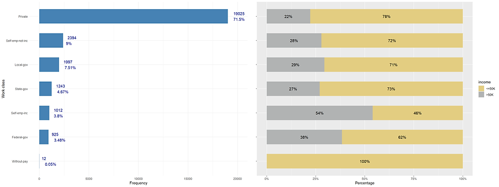
income_gov <- incomecensus %>%
  filter(workclass %in% c("Local-gov", "State-gov", "Federal-gov")) %>%
  group_by(workclass, income) %>%
  summarise(count = n()) %>%
  mutate(pct = count/sum(count)) %>%
  arrange(desc(income), pct)

income_gov <-  income_gov %>% transmute(income, percent = count*100/sum(count))
income_gov
## # A tibble: 6 x 3
## # Groups: workclass [3]
## workclass income percent
## <fct> <fct> <dbl>
## 1 State-gov >50K 27.0
## 2 Local-gov >50K 29.4
## 3 Federal-gov >50K 38.4
## 4 Federal-gov <=50K 61.6
## 5 Local-gov <=50K 70.6
## 6 State-gov <=50K 73.0incomecensus %>%
filter(workclass %in% c("Local-gov", "State-gov", "Federal-gov")) %>%
group_by(workclass, income) %>%
summarize(n = n()) %>%
mutate(pct = n*100/sum(n)) %>%
ggplot(aes(x = reorder(workclass, n),
y = pct,
fill = income)) +
geom_bar(stat = "identity", width = 0.6) +
scale_x_discrete(name = "") +
scale_fill_manual(values=c("#E3CD81FF", "#B1B3B3FF")) +
geom_text(aes(label = paste0(round(pct,0),"%")),
position = position_stack(vjust = 0.5),
size = 4,
color = "black") +
theme(axis.text.y = element_blank(),
axis.title.y = element_blank(),
axis.ticks.y = element_blank())
There is a slight difference between Local-gov and Stave-gov.
Working for the federal government can have a greater chance of getting an income higher than 50K.
incomecensus %>%
  filter(workclass %in% c("Self-emp-not-inc", "Self-emp-inc", "Without-pay")) %>%
  group_by(workclass, income) %>%
  summarize(n = n()) %>%
  mutate(pct = n*100/sum(n)) %>%
  ggplot(aes(x = reorder(workclass, n),
             y = pct,
             fill = income)) +
  geom_bar(stat = "identity", width = 0.6) +
  scale_x_discrete(name = "") +
  scale_fill_manual(values=c("#E3CD81FF", "#B1B3B3FF")) +
  geom_text(aes(label = paste0(round(pct,0),"%")),
            position = position_stack(vjust = 0.5),
            size = 4,
            color = "black") +
  theme(axis.text.y = element_blank(),
        axis.title.y = element_blank(),
        axis.ticks.y = element_blank()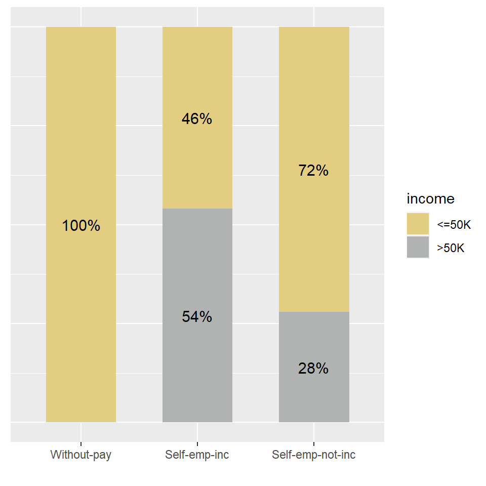
4D. education
incomecensus %>%
  group_by(education) %>%
  summarise(counts = n()) %>%
  arrange(desc(counts))
## # A tibble: 16 x 2
## education counts
## <fct> <int>
## 1 HS-grad 8201
## 2 Some-college 5853
## 3 Bachelors 4447
## 4 Masters 1534
## 5 Assoc-voc 1248
## 6 Assoc-acdm 990
## 7 11th 937
## 8 10th 763
## 9 7th-8th 534
## 10 Prof-school 486
## 11 9th 445
## 12 12th 356
## 13 Doctorate 349
## 14 5th-6th 275
## 15 1st-4th 146
## 16 Preschool 44incomecensus %>%
group_by(education.num) %>%
summarise(counts = n()) %>%
arrange(desc(counts)) ## # A tibble: 16 x 2
## education.num counts
## <dbl> <int>
## 1 9 8201
## 2 10 5853
## 3 13 4447
## 4 14 1534
## 5 11 1248
## 6 12 990
## 7 7 937
## 8 6 763
## 9 4 534
## 10 15 486
## 11 5 445
## 12 8 356
## 13 16 349
## 14 3 275
## 15 2 146
## 16 1 44We can see that these two columns are identical. The column education.num is simply converted from the column education.
If we keep the column education which is factor type, we might regroup some categories in this column. If we keep the column education.num which is numerical type,, we can keep the column as it is (numeric).
eudcation_df <- incomecensus %>%
  group_by(education.num) %>%
  summarise(counts = n()) %>%
  mutate(Percentage = round(counts*100/sum(counts),2)) %>%
  arrange(education.num)

eudcation_df
## # A tibble: 16 x 3
## education.num counts Percentage
## <dbl> <int> <dbl>
## 1 1 44 0.17
## 2 2 146 0.55
## 3 3 275 1.03
## 4 4 534 2.01
## 5 5 445 1.67
## 6 6 763 2.87
## 7 7 937 3.52
## 8 8 356 1.34
## 9 9 8201 30.8
## 10 10 5853 22
## 11 11 1248 4.69
## 12 12 990 3.72
## 13 13 4447 16.7
## 14 14 1534 5.77
## 15 15 486 1.83
## 16 16 349 1.31ggplot(data = eudcation_df ,
aes(x= education.num,
y = counts,
fill = Percentage)) +
geom_bar(stat = "identity",
width = 0.6) +
scale_x_continuous(breaks = c(0:16)) +
scale_fill_gradient(low="skyblue1", high="royalblue4")+
geom_text(aes(label = paste0(round(counts,1), "\n","(",Percentage,"%)")),
vjust = -0.1,
color = "darkblue",
size = 4) +
scale_y_continuous(limits = c(0,12000)) +
theme_minimal() +
labs(x = "Years of education",
y = "Frequency",
caption = "Income census US 1994") +
ggtitle("Distribution of years of education") +
theme(plot.title = element_text(hjust = 0.5),
axis.title = element_text(size = 12),
axis.text.x = element_text(size = 12),
axis.text.y = element_text(size = 12),
legend.position = "right",
legend.title = element_text(size = 12, face = "bold"),
legend.text = element_text(colour="black", size = 12))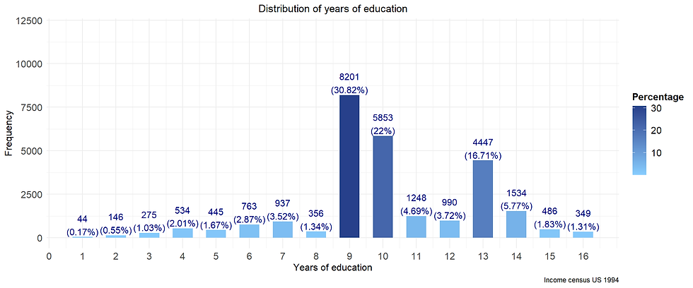
About 50% of respondents have 9-10 years of education.
About 17% of people in the sample hold bachelor degree (13 years of education).
education.pct <- incomecensus %>%
  group_by(education.num, income) %>%
  summarize(count = n()) %>%
  mutate(pct = count/sum(count)) %>%
  arrange(desc(income), pct)

ggplot(education.pct,
       aes(education.num, pct, fill = income)) +
  geom_bar(stat="identity", position = "fill") +
  geom_hline(yintercept = 0.2489, col = "blue") +
  scale_x_continuous(breaks = c(0:16)) +
  scale_y_continuous(labels=scales::percent) +
  scale_fill_manual(values=c("#E3CD81FF", "#B1B3B3FF")) +
  ggtitle("Income by years of education") +
  xlab("Education (years)") +
  ylab("Percentage") +
  theme(plot.title = element_text(hjust = 0.5),
        axis.title = element_text(size = 12),
        axis.text.x = element_text(size = 12),
        axis.text.y = element_text(size = 12),
        legend.position = "right",
        legend.title = element_text(size = 12, face = "bold"),
        legend.text = element_text(colour="black", size = 12))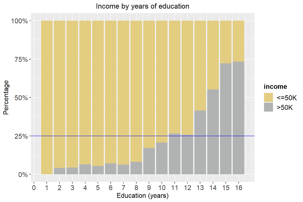
Higher years of education led to a higher chance of having >50K.
4D. marital status
incomecensus %>%
  group_by(marital.status) %>%
  summarise(counts = n()) %>%
  arrange(desc(counts))
## # A tibble: 7 x 2
## marital.status counts
## <fct> <int>
## 1 Married-civ-spouse 12236
## 2 Never-married 8369
## 3 Divorced 3996
## 4 Separated 926
## 5 Widowed 811
## 6 Married-spouse-absent 249
## 7 Married-AF-spouse 21We can put all the married people in the same group
This column have 7 labels, three of them are:
Married-AF-spouse: Married armed forces spouse
Married-civ-spouse: Married civilian spouse
Married-spouse-absent
These levels can be grouped into the group “married”.
Replace “Married-AF-spouse”, “Married-civ-spouse”, and “Married-spouse-absent” by “Married”
pat = c("Married-AF-spouse|Married-civ-spouse|Married-spouse-absent")
incomecensus <- incomecensus %>%
  mutate(marital_status = stringr::str_replace_all(marital.status, pat, "Married"))
incomecensus <- incomecensus %>%
select(-marital.status)marital_df <- incomecensus %>%
group_by(marital_status) %>%
summarise(counts = n()) %>%
mutate(Percentage = round(counts*100/sum(counts),1)) %>%
arrange(desc(counts))
marital_df ## # A tibble: 5 x 3
## marital_status counts Percentage
## <chr> <int> <dbl>
## 1 Married 12506 47
## 2 Never-married 8369 31.5
## 3 Divorced 3996 15
## 4 Separated 926 3.5
## 5 Widowed 811 3The proportion of married people that have an income higher than 50K is highest.
p3 <- incomecensus %>%
  group_by(marital_status) %>%
  summarise(counts = n()) %>%
  mutate(Percentage = round(counts*100/sum(counts),2)) %>%
  arrange(desc(counts)) %>%
  ggplot(aes(x= reorder(marital_status, counts),
             y  = counts)) +
  geom_bar(stat = "identity",
           width = 0.6,
           fill = "steelblue") +
  geom_text(aes(label = paste0(round(counts,1),"\n","(",Percentage,"%)")),
            vjust = 0.4,
            hjust = -0.5,
            color = "darkblue",
            size = 4) +
  scale_y_continuous(limits = c(0,20000)) +
  theme_minimal() +
  labs(x = "Marital status",y = "Frequency") +
  coord_flip()

p4 <- incomecensus %>%
  group_by(marital_status, income) %>%
  summarize(n = n()) %>%
  mutate(pct = n*100/sum(n)) %>%
  ggplot(aes(x = reorder(marital_status, n),
             y = pct/100,
             fill = income)) +
  geom_bar(stat = "identity", width = 0.6) +
  scale_x_discrete(name = "") +
  scale_y_continuous(name = "Percentage",
                     labels = scales::percent) +
  scale_fill_manual(values=c("#E3CD81FF", "#B1B3B3FF")) +
  geom_text(aes(label = paste0(round(pct,0),"%")),
            position = position_stack(vjust = 0.5),
            size = 4,
            color = "black") +
  theme(plot.title = element_text(hjust = 0.5),
        axis.text.y=element_blank()) +
  coord_flip()

ggarrange(p3, p4, nrow = 1)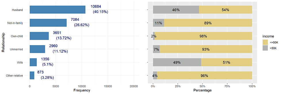
4F. occupation
Category_df <- incomecensus %>%
  group_by(occupation) %>%
  summarise(counts = n()) %>%
  mutate(Percentage = round(counts*100/sum(counts),2)) %>%
  arrange(counts)

ggplot(data = Category_df,
           aes(x= reorder(occupation, -counts),
               y  = counts,
               fill = Percentage)) +
  geom_bar(stat = "identity",
           width = 0.7) +
  geom_text(aes(label = paste0(counts,", ", Percentage,"%")),
            vjust = 0.2,
            hjust = -0.1,
            color = "darkblue",
            size = 4) +
  scale_y_continuous(limits = c(0,5000)) +
  scale_fill_distiller(palette = "Spectral") +
  theme_minimal() +
  labs(x = "Category",
       y = "Frequency",
       caption = "Income census US 1994") +
  coord_flip()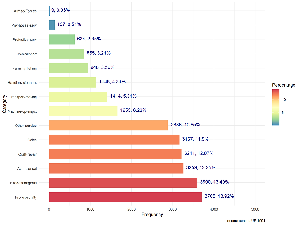
occupation.pct <- incomecensus %>%
  group_by(occupation, income) %>%
  summarize(count = n()) %>%
  mutate(pct = count/sum(count)) %>%
  arrange(desc(income), pct)

occupation.pct$occupation <- factor(occupation.pct$occupation,
                                    levels = occupation.pct$occupation[1:(nrow(occupation.pct)/2)])

ggplot(occupation.pct, aes(reorder(occupation,-pct), pct, fill = income)) +
  geom_bar(stat="identity", position = "fill") +
  geom_hline(yintercept = 0.2489, col = "blue") +
  ggtitle("Income by occupation") +
  xlab("Occupation") +
  ylab("Percentage") +
  scale_y_continuous(labels=scales::percent) +
  scale_fill_manual(values=c("#E3CD81FF", "#B1B3B3FF")) +
  theme(plot.title = element_text(hjust = 0.5),
        axis.title = element_text(size = 12),
        axis.text.x = element_text(size = 12),
        axis.text.y = element_text(size = 12),
        legend.position = "bottom",
        legend.title = element_text(size = 12, face = "bold"),
        legend.text = element_text(colour="black", size = 12)) +
  coord_flip()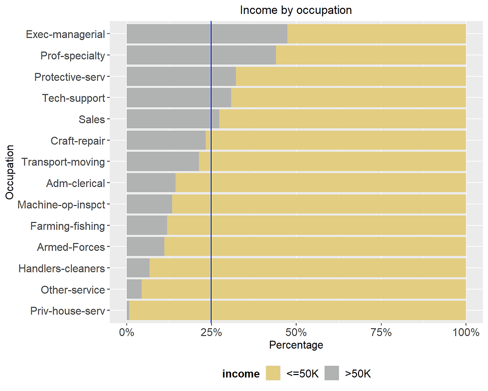
About 25% of the sample has an income of more than 50K. There are five categories of jobs that have a higher percentage: Protective service, tech-support, Sales, Exec-managerial, and Prof-speciality.
Question: Are these people work in the private sector?
incomecensus %>%
  filter(occupation %in% c("Protective-serv", "Tech-support", "Sales", "Exec-managerial", "Prof-specialty")) %>%
  group_by(workclass) %>%
  summarise(freq =  n()) %>%
  mutate(percentage = round(freq*100/sum(freq),1)) %>%
  arrange(desc(percentage))
## # A tibble: 6 x 3
## workclass freq percentage
## <fct> <int> <dbl>
## 1 Private 7655 64.1
## 2 Local-gov 1209 10.1
## 3 Self-emp-not-inc 1109 9.3
## 4 Self-emp-inc 772 6.5
## 5 State-gov 750 6.3
## 6 Federal-gov 446 3.7About two-third of respondents work in the private sector.
Governmental job accounts for 18.81 %.
occupation_distr <- incomecensus %>%
  group_by(occupation) %>%
  summarise(counts = n()) %>%
  mutate(Percentage = round(counts*100/sum(counts),2)) %>%
  arrange(desc(counts)) %>%
  ggplot(aes(x= reorder(occupation, counts),
             y  = counts)) +
  geom_bar(stat = "identity",
           width = 0.6,
           fill = "steelblue") +
  geom_text(aes(label = paste0(round(counts,1),"\n","(",Percentage,"%)")),
            vjust = 0.4, hjust = -0.5,color = "darkblue", size = 4) +
  scale_y_continuous(limits = c(0,20000)) +
  theme_minimal() +
  labs(x = "Grouped Occupation", y = "Frequency") +
  coord_flip()

occupation_pct <- incomecensus %>%
  group_by(occupation, income) %>%
  summarize(n = n()) %>%
  mutate(pct = n*100/sum(n)) %>%
  ggplot(aes(x = reorder(occupation, n),
             y = pct/100,
             fill = income)) +
  geom_bar(stat = "identity", width = 0.6) +
  scale_x_discrete(name = "") +
  scale_y_continuous(name = "Percentage",
                     labels = scales::percent) +
  scale_fill_manual(values=c("#E3CD81FF", "#B1B3B3FF")) +
  geom_text(aes(label = paste0(round(pct,0),"%")),
            position = position_stack(vjust = 0.5),
            size = 4,
            color = "black") +
  theme(plot.title = element_text(hjust = 0.5),
        axis.text.y=element_blank()) +
  coord_flip()

ggarrange(occupation_distr, occupation_pct, nrow = 1)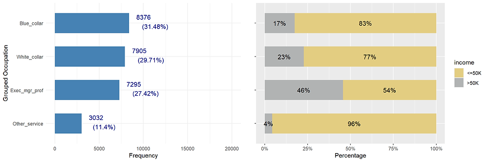
4G. relationship
incomecensus %>%
  ggplot(aes(income, color= income, fill= income)) +
  geom_bar( alpha = 0.8, width = 0.8) +
  facet_grid(~ relationship) +
  labs(x = "Incomes", y = "Count", title = "Incomes by relationship")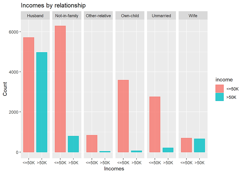
This column contains categories that might be overlap with other feature.
For example, unmarried people in the relationship attribute is the same as the unmarried level in the marital column.
relationship_distr <- incomecensus %>%
  group_by(relationship) %>%
  summarise(counts = n()) %>%
  mutate(Percentage = round(counts*100/sum(counts),2)) %>%
  arrange(desc(counts)) %>%
  ggplot(aes(x= reorder(relationship, counts),
             y  = counts)) +
  geom_bar(stat = "identity",
           width = 0.6,
           fill = "steelblue") +
  geom_text(aes(label = paste0(round(counts,1),"\n","(",Percentage,"%)")),
            vjust = 0.4, hjust = -0.5,color = "darkblue", size = 4) +
  scale_y_continuous(limits = c(0,20000)) +
  theme_minimal() +
  labs(x = "Relationship", y = "Frequency") +
  coord_flip()

relationship_pct <- incomecensus %>%
  group_by(relationship, income) %>%
  summarize(n = n()) %>%
  mutate(pct = n*100/sum(n)) %>%
  ggplot(aes(x = reorder(relationship, n),
             y = pct/100,
             fill = income)) +
  geom_bar(stat = "identity", width = 0.6) +
  scale_x_discrete(name = "") +
  scale_y_continuous(name = "Percentage",
                     labels = scales::percent) +
  scale_fill_manual(values=c("#E3CD81FF", "#B1B3B3FF")) +
  geom_text(aes(label = paste0(round(pct,0),"%")),
            position = position_stack(vjust = 0.5),
            size = 4,
            color = "black") +
  theme(plot.title = element_text(hjust = 0.5),
        axis.text.y=element_blank()) +
  coord_flip()

ggarrange(relationship_distr, relationship_pct, nrow = 1)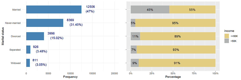
This variable may be redundant as it collapse somehow with the feature marital_status.
4H. race
incomecensus %>%
  ggplot(aes(race, fill= income)) +
  geom_bar(position = "fill") +
  labs(x = "Race",
       y = "Proportion",
       title = "Incomes by race")+
  scale_fill_manual(values=c("#E3CD81FF", "#B1B3B3FF")) +
  theme(axis.text.x = element_text(angle = 90, hjust = 1))+
  geom_hline(yintercept = 0.2489, col="blue") +
  coord_flip()
However, the percent of whites and “Asian-Pac-Islander” that earn more than 50k is over the general population average.
4H. sex
Here we can see that the vast majority of people having an income greater than 50000 dollars are males.
gender_prop <- incomecensus %>%
  group_by(sex) %>%
  summarise(count = n()) %>%
  ungroup()%>%
  arrange(desc(sex)) %>%
  mutate(percentage = round(count/sum(count),4)*100,
         lab.pos = cumsum(percentage)-0.5*percentage)

gender_distr <- ggplot(data = gender_prop,
       aes(x = "",
           y = percentage,
           fill = sex))+
  geom_bar(stat = "identity")+
  coord_polar("y") +
  geom_text(aes(y = lab.pos,
                label = paste(percentage,"%", sep = "")), col = "blue", size = 4) +
  scale_fill_manual(values=c("orange", "lightblue"),
                    name = "Gender") +
  theme_void() +
  theme(legend.title = element_text(color = "black", size = 12),
        legend.text = element_text(color = "black", size = 12))


gender_prop <- incomecensus %>%
  group_by(sex, income) %>%
  summarize(n = n()) %>%
  mutate(pct = n*100/sum(n)) %>%
  ggplot(aes(x = reorder(sex, n),
             y = pct,
             fill = income)) +
  geom_bar(stat = "identity", width = 0.6) +
  scale_x_discrete(name = "") +
  scale_fill_manual(values=c("#E3CD81FF", "#B1B3B3FF")) +
  geom_text(aes(label = paste0(round(pct,0),"%")),
            position = position_stack(vjust = 0.5),
            size = 4,
            color = "black") +
  theme(axis.text.y = element_blank(),
        axis.text.x = element_text(color = "black", size = 12),
        axis.title.y = element_blank(),
        axis.ticks.y = element_blank(),
        legend.title = element_text(color = "black", size = 12),
        legend.text = element_text(color = "black", size = 12))

ggarrange(gender_distr, gender_prop, nrow = 1)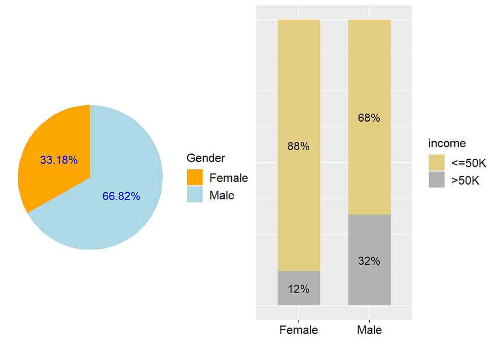
Two-third of respondents are male.
The proportion of women that earn more than 50k is much lower than that of their male counterparts.
4I. house per week
Distribution of hours per week
incomecensus %>% ggplot(aes(hours.per.week)) +
  geom_histogram(fill= "orange",
                 color = 'blue',
                 binwidth = 5) +
  theme(plot.title = element_text(hjust = 0.5))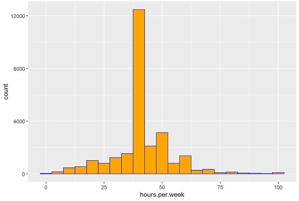
incomecensus %>%
  group_by(income) %>%
  summarise("Mean hours per week" = mean(hours.per.week),
            "Standard deviatrion" = sd(hours.per.week))
## # A tibble: 2 x 3
## income `Mean hours per week` `Standard deviatrion`
## <fct> <dbl> <dbl>
## 1 <=50K 39.5 12.3
## 2 >50K 45.8 11.0ggplot(data = incomecensus,
aes(income,
hours.per.week,
fill = income))+
scale_fill_manual(values=c("#E3CD81FF", "#B1B3B3FF")) +
geom_boxplot()+
labs(x = "Incomes",
y = "Worked hours per week",
title = "Incomes by working hours")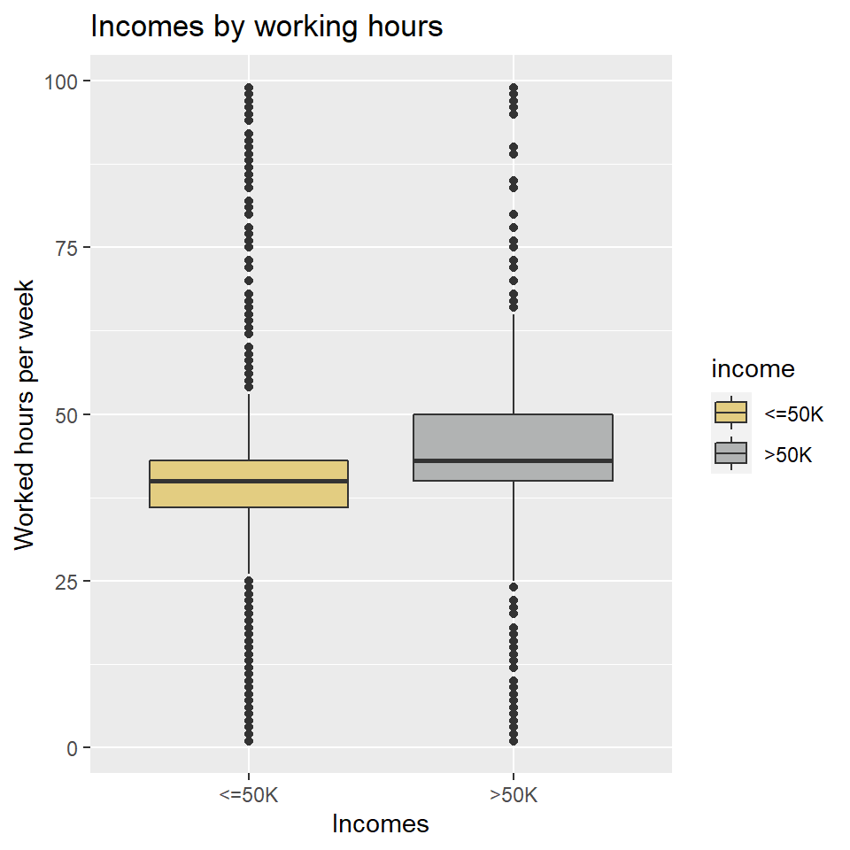
There are many outliers. Some people work for 100 hours a week (which is possible?).
4J. native.country
There are 40 different native countries and some of them have just a few cases, for instance, Honduras have just 10 cases. Therefore, the first attempt is to group the countries by continent.
incomecensus <- incomecensus %>%
  mutate(native_continent = case_when(
    native.country %in% c("France", "Greece", "Hungary", "Italy", "Portugal",
                          "Scotland", "England", "Germany", "Holand-Netherlands",
                          "Ireland", "Poland", "Yugoslavia") ~ "Europe",
    native.country %in% c("Columbia", "Dominican-Republic", "El-Salvador", "Haiti",
                          "Honduras", "Mexico", "Outlying-US(Guam-USVI-etc)",
                          "Cuba", "Ecuador", "Guatemala", "Jamaica", "Nicaragua",
                          "Peru", "Puerto-Rico", "Trinadad&Tobago") ~ "Latin America", # "Trinadad&Tobago" and "Outlying-US(Guam-USVI-etc"
    native.country %in% c("Iran", "Japan", "Philippines", "Taiwan", "Vietnam", "Cambodia",
                          "China", "Hong", "India", "Laos", "South", "Thailand") ~ "Asia",
    native.country %in% c("United-States","Canada") ~ "USA/Canada"))
incomecensus %>%
group_by(native_continent) %>%
count()## # A tibble: 4 x 2
## # Groups: native_continent [4]
## native_continent n
## <chr> <int>
## 1 Asia 693
## 2 Europe 490
## 3 Latin America 1314
## 4 USA/Canada 24111incomecensus %>%
group_by(native_continent, income) %>%
summarize(n = n()) %>%
mutate(pct = n*100/sum(n)) %>%
ggplot(aes(x = reorder(native_continent, n),
y = pct,
fill = income)) +
geom_bar(stat = "identity", width = 0.6) +
scale_x_discrete(name = "") +
scale_fill_manual(values=c("#E3CD81FF", "#B1B3B3FF")) +
geom_text(aes(label = paste0(round(pct,0),"%")),
position = position_stack(vjust = 0.5),
size = 4,
color = "blue") +
theme(axis.text.y = element_blank(),
axis.text.x = element_text(color = "black", size = 12),
axis.title.y = element_blank(),
axis.ticks.y = element_blank(),
legend.title = element_text(color = "black", size = 12),
legend.text = element_text(color = "black", size = 12))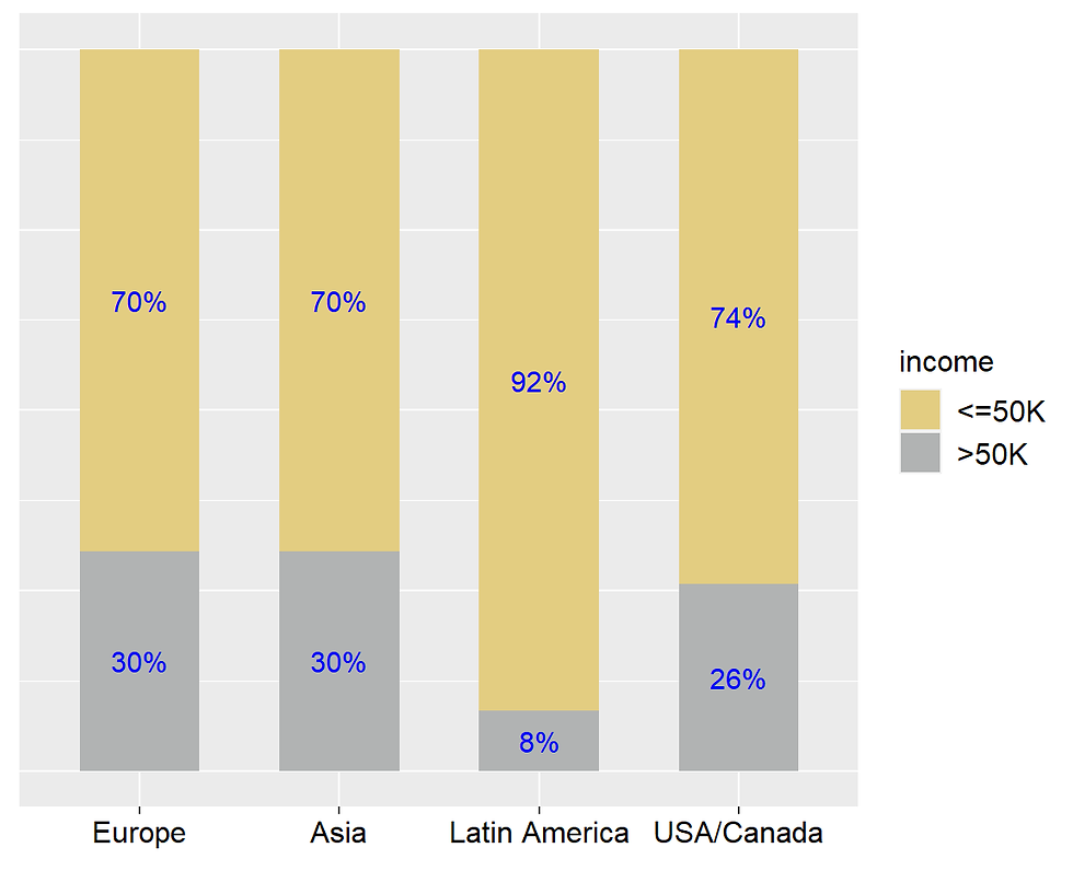
5. Preparing the final data for machine learning
We will remove some columns
incomecensus <- incomecensus %>%
  select(-c("education","capital.gain","capital.loss", "relationship", "native.country"))
The final data
str(incomecensus)## Classes 'spec_tbl_df', 'tbl_df', 'tbl' and 'data.frame': 26608 obs. of 10 variables:
## $ age : num 82 54 41 34 38 74 68 45 38 52 ...
## $ workclass : Factor w/ 9 levels "?","Federal-gov",..: 5 5 5 5 5 8 2 5 7 5 ...
## $ education.num : num 9 4 10 9 6 16 9 16 15 13 ...
## $ occupation : Factor w/ 5 levels "?","White_collar",..: 5 4 5 3 2 5 5 5 5 3 ...
## $ race : Factor w/ 5 levels "Amer-Indian-Eskimo",..: 5 5 5 5 5 5 5 3 5 5 ...
## $ sex : Factor w/ 2 levels "Female","Male": 1 1 1 1 2 1 1 1 2 1 ...
## $ hours.per.week : num 18 40 40 45 40 20 40 35 45 20 ...
## $ income : Factor w/ 2 levels "<=50K",">50K": 1 1 1 1 1 2 1 2 2 2 ...
## $ marital_status : chr "Widowed" "Divorced" "Separated" "Divorced" ...
## $ native_continent: chr "USA/Canada" "USA/Canada" "USA/Canada" "USA/Canada" ...We need to convert two columns marital_status and native_continent in factor
incomecensus$marital_status <- as.factor(incomecensus$marital_status)
incomecensus$native_continent <- as.factor(incomecensus$native_continent)
We will save this data as income.csv
write.csv(incomecensus,file = "income.csv", row.names= FALSE)6. Building models
data <- read_csv("income.csv")## Parsed with column specification:
## cols(
## age = col_double(),
## workclass = col_character(),
## education.num = col_double(),
## occupation = col_character(),
## race = col_character(),
## sex = col_character(),
## hours.per.week = col_double(),
## income = col_character(),
## marital_status = col_character(),
## native_continent = col_character()
## )data <- data %>%
mutate_if(is.character,as.factor)
str(data)## Classes 'spec_tbl_df', 'tbl_df', 'tbl' and 'data.frame': 26608 obs. of 10 variables:
## $ age : num 82 54 41 34 38 74 68 45 38 52 ...
## $ workclass : Factor w/ 7 levels "Federal-gov",..: 3 3 3 3 3 6 1 3 5 3 ...
## $ education.num : num 9 4 10 9 6 16 9 16 15 13 ...
## $ occupation : Factor w/ 4 levels "Blue_collar",..: 2 1 2 3 4 2 2 2 2 3 ...
## $ race : Factor w/ 5 levels "Amer-Indian-Eskimo",..: 5 5 5 5 5 5 5 3 5 5 ...
## $ sex : Factor w/ 2 levels "Female","Male": 1 1 1 1 2 1 1 1 2 1 ...
## $ hours.per.week : num 18 40 40 45 40 20 40 35 45 20 ...
## $ income : Factor w/ 2 levels "<=50K",">50K": 1 1 1 1 1 2 1 2 2 2 ...
## $ marital_status : Factor w/ 5 levels "Divorced","Married",..: 5 1 4 1 4 3 1 1 3 5 ...
## $ native_continent: Factor w/ 4 levels "Asia","Europe",..: 4 4 4 4 4 4 4 4 4 4 ...library(caret)Trainindex <- createDataPartition(y = data$income , p = .70, list = FALSE)
training <- data[Trainindex ,]
validation <- data[-Trainindex,]
training_new <- training[-8]
validation_new <- validation[-8]
income_training_label <- training$income
income_validation_label <- validation$income6.1. Logistic regression
set.seed(123)
default_glm_mod <- train(form = income ~ .,
                         data = training,
                         method = "glm",
                         family = "binomial",
                         tuneLength = 5)
glm_pred <- predict(default_glm_mod, newdata = validation)
confusionMatrix(glm_pred, validation$income)## Confusion Matrix and Statistics
##
## Reference
## Prediction <=50K >50K
## <=50K 5495 972
## >50K 471 1044
##
## Accuracy : 0.8192
## 95% CI : (0.8106, 0.8276)
## No Information Rate : 0.7474
## P-Value [Acc > NIR] : < 2.2e-16
##
## Kappa : 0.4783
##
## Mcnemar's Test P-Value : < 2.2e-16
##
## Sensitivity : 0.9211
## Specificity : 0.5179
## Pos Pred Value : 0.8497
## Neg Pred Value : 0.6891
## Prevalence : 0.7474
## Detection Rate : 0.6884
## Detection Prevalence : 0.8102
## Balanced Accuracy : 0.7195
##
## 'Positive' Class : <=50K
## 6.2. Tree based methods
6.2.1. rpart
library(rpart)
library(rpart.plot)
rparttree <- rpart(income ~ .,
data = training,
method = "class")rparttree ## n= 18626
##
## node), split, n, loss, yval, (yprob)
## * denotes terminal node
##
## 1) root 18626 4704 <=50K (0.74744980 0.25255020)
## 2) marital_status=Divorced,Never-married,Separated,Widowed 9806 725 <=50K (0.92606567 0.07393433) *
## 3) marital_status=Married 8820 3979 <=50K (0.54886621 0.45113379)
## 6) education.num< 12.5 6116 2072 <=50K (0.66121648 0.33878352) *
## 7) education.num>=12.5 2704 797 >50K (0.29474852 0.70525148) *# Plot the trees
rpart.plot(rparttree)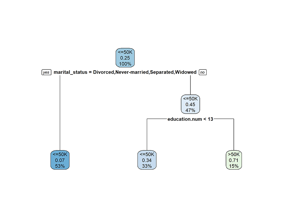
Marital status is the most important feature for this data set.
6.2.2. C5.0 with boosting
library(C50)set.seed(123)
treeC5 <- C5.0(income ~ .,
data = training,
trials = 100)
treeC5_Pred <- predict(treeC5, validation)
confusionMatrix(treeC5_Pred, validation$income)## Confusion Matrix and Statistics
##
## Reference
## Prediction <=50K >50K
## <=50K 5439 842
## >50K 527 1174
##
## Accuracy : 0.8285
## 95% CI : (0.82, 0.8367)
## No Information Rate : 0.7474
## P-Value [Acc > NIR] : < 2.2e-16
##
## Kappa : 0.521
##
## Mcnemar's Test P-Value : < 2.2e-16
##
## Sensitivity : 0.9117
## Specificity : 0.5823
## Pos Pred Value : 0.8659
## Neg Pred Value : 0.6902
## Prevalence : 0.7474
## Detection Rate : 0.6814
## Detection Prevalence : 0.7869
## Balanced Accuracy : 0.7470
##
## 'Positive' Class : <=50K
## 6.2.3. Random forest
library(randomForest)set.seed(123)
treeRf <- randomForest(income ~ .,
data = training,
ntree = 500,
mtry = 3,
importance = TRUE)treeRf_Pred <- predict(treeRf, validation)
confusionMatrix(treeRf_Pred, validation$income)## Confusion Matrix and Statistics
##
## Reference
## Prediction <=50K >50K
## <=50K 5377 865
## >50K 589 1151
##
## Accuracy : 0.8178
## 95% CI : (0.8092, 0.8263)
## No Information Rate : 0.7474
## P-Value [Acc > NIR] : < 2.2e-16
##
## Kappa : 0.4946
##
## Mcnemar's Test P-Value : 5.517e-13
##
## Sensitivity : 0.9013
## Specificity : 0.5709
## Pos Pred Value : 0.8614
## Neg Pred Value : 0.6615
## Prevalence : 0.7474
## Detection Rate : 0.6736
## Detection Prevalence : 0.7820
## Balanced Accuracy : 0.7361
##
## 'Positive' Class : <=50K
## 6.3. NAIVE BAYES
library(e1071)set.seed(123)
NB <- naiveBayes(income ~., data = training)
# that one is faster than the package caretNB_pred <- predict(NB, validation, type="class")
confusionMatrix(NB_pred,validation$income)## Confusion Matrix and Statistics
##
## Reference
## Prediction <=50K >50K
## <=50K 5224 760
## >50K 742 1256
##
## Accuracy : 0.8118
## 95% CI : (0.8031, 0.8203)
## No Information Rate : 0.7474
## P-Value [Acc > NIR] : <2e-16
##
## Kappa : 0.5001
##
## Mcnemar's Test P-Value : 0.6609
##
## Sensitivity : 0.8756
## Specificity : 0.6230
## Pos Pred Value : 0.8730
## Neg Pred Value : 0.6286
## Prevalence : 0.7474
## Detection Rate : 0.6545
## Detection Prevalence : 0.7497
## Balanced Accuracy : 0.7493
##
## 'Positive' Class : <=50K
## 6.4. KNN
set.seed(3333)
knn_fit <- train(income ~.,
                 data = training,
                 method = "knn",
preProcess = c("center", "scale"),tuneLength = 5)knn_fit## k-Nearest Neighbors
##
## 18626 samples
## 9 predictor
## 2 classes: '<=50K', '>50K'
##
## Pre-processing: centered (24), scaled (24)
## Resampling: Bootstrapped (25 reps)
## Summary of sample sizes: 18626, 18626, 18626, 18626, 18626, 18626, ...
## Resampling results across tuning parameters:
##
## k Accuracy Kappa
## 5 0.7844624 0.4197798
## 7 0.7927082 0.4377792
## 9 0.7980115 0.4499211
## 11 0.8006633 0.4561392
## 13 0.8028696 0.4613813
##
## Accuracy was used to select the optimal model using the largest value.
## The final value used for the model was k = 13.KNN_pred <- predict(knn_fit, validation, type="raw")
confusionMatrix(KNN_pred,validation$income)## Confusion Matrix and Statistics
##
## Reference
## Prediction <=50K >50K
## <=50K 5319 874
## >50K 647 1142
##
## Accuracy : 0.8094
## 95% CI : (0.8007, 0.818)
## No Information Rate : 0.7474
## P-Value [Acc > NIR] : < 2.2e-16
##
## Kappa : 0.4758
##
## Mcnemar's Test P-Value : 6.837e-09
##
## Sensitivity : 0.8916
## Specificity : 0.5665
## Pos Pred Value : 0.8589
## Neg Pred Value : 0.6383
## Prevalence : 0.7474
## Detection Rate : 0.6664
## Detection Prevalence : 0.7759
## Balanced Accuracy : 0.7290
##
## 'Positive' Class : <=50K
## 

Comments