


Revisiting the Gapminder dataset using dplyr and ggplot2
- sam33frodon
- Jan 20, 2021
- 9 min read
This post demonstrates the use of tidyverse package (https://tidyverse.tidyverse.org) to explore the data. In addition, ggplot2 will support the exploration. (Note: This post will use a very basic ggplot for exploring data.
library(tidyverse)
library(ggplot2)library(gapminder)
df <- gapminder # this package contains the data1. Smell-testing dataset
There are many functions that can be used such as: str(), summary(), head(), tail()…
str(df)

## Classes 'tbl_df', 'tbl' and 'data.frame':    1704 obs. of  6 variables:
##  $ country  : Factor w/ 142 levels "Afghanistan",..: 1 1 1 1 1 1 1 1 1 1 ...
##  $ continent: Factor w/ 5 levels "Africa","Americas",..: 3 3 3 3 3 3 3 3 3 3 ...
##  $ year     : int  1952 1957 1962 1967 1972 1977 1982 1987 1992 1997 ...
##  $ lifeExp  : num  28.8 30.3 32 34 36.1 ...
##  $ pop      : int  8425333 9240934 10267083 11537966 13079460 14880372 12881816 13867957 16317921 22227415 ...
##  $ gdpPercap: num  779 821 853 836 740 ...
There are six variables:
** country ** continent ** year
** lifeExp: life expectancy at birth
** pop: Total population
** gdpPercap: The gross domestic product (GDP) per capita
head(df)
## # A tibble: 6 x 6
##   country     continent  year lifeExp      pop gdpPercap
##   <fct>       <fct>     <int>   <dbl>    <int>     <dbl>
## 1 Afghanistan Asia       1952    28.8  8425333      779.
## 2 Afghanistan Asia       1957    30.3  9240934      821.
## 3 Afghanistan Asia       1962    32.0 10267083      853.
## 4 Afghanistan Asia       1967    34.0 11537966      836.
## 5 Afghanistan Asia       1972    36.1 13079460      740.
## 6 Afghanistan Asia       1977    38.4 14880372      786.
summary(gapminder)
## country continent year lifeExp
## Afghanistan: 12 Africa :624 Min. :1952 Min. :23.60
## Albania : 12 Americas:300 1st Qu.:1966 1st Qu.:48.20
## Algeria : 12 Asia :396 Median :1980 Median :60.71
## Angola : 12 Europe :360 Mean :1980 Mean :59.47
## Argentina : 12 Oceania : 24 3rd Qu.:1993 3rd Qu.:70.85
## Australia : 12 Max. :2007 Max. :82.60
## (Other) :1632
## pop gdpPercap
## Min. :6.001e+04 Min. : 241.2
## 1st Qu.:2.794e+06 1st Qu.: 1202.1
## Median :7.024e+06 Median : 3531.8
## Mean :2.960e+07 Mean : 7215.3
## 3rd Qu.:1.959e+07 3rd Qu.: 9325.5
## Max. :1.319e+09 Max. :113523.1
## The data (life expectancy, population, and per-capita GDP) were recorded from 1952 to 2007.
2. Counting
For categorical variables such as country, continent, year, we can count the unique values. (Note: In this example, the variable year will be treated as categorical variable).
Question 1: How many countries, continents, and reported years are there in this data ?
df %>%
  summarise(nb_country = n_distinct(country),
            nb_continent = n_distinct(continent),
            nb_year= n_distinct(year))
## # A tibble: 1 x 3
## nb_country nb_continent nb_year
## <int> <int> <int>
## 1 142 5 12There are only 12 unique years. We can see the earliest year is 1952, and it seems that the data are recorded every five years. There are five continents: Africa, Americas, Asia, Europe, Oceania.
3. Ranking
Question 2: Continents with the corresponding median gdp per capita
df%>%filter(year == 2007) %>%
  group_by(continent) %>%
  summarise(median = median(gdpPercap)) %>%
  ggplot(aes(reorder(continent, -median,sum), median)) +
  geom_col(fill = "#fc6721", alpha = 0.8) +
  scale_y_continuous(expand = c(0, 0), labels = scales::dollar) +
  coord_flip() +
  labs(title = "Median GDP per capita by continent, 2007",
       x = NULL,
       y = "GDP per capita",
       fill = NULL) +
  theme(panel.grid.major.y = element_blank())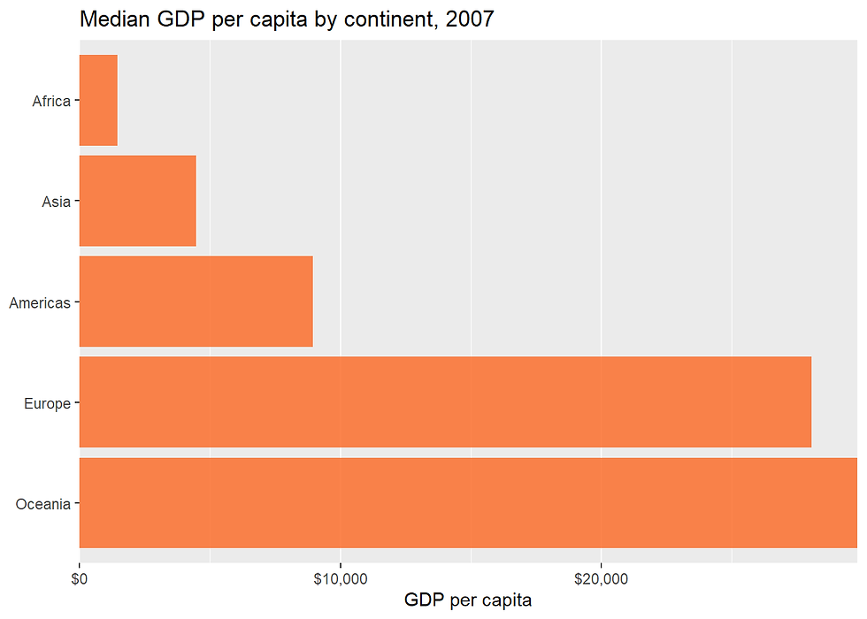
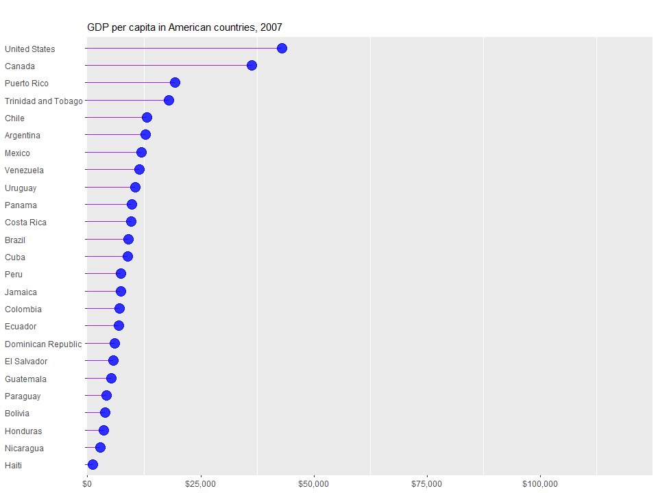
Question 3: Continents with the corresponding median gdp per capita in 2007
df%>% filter(year == 2007 & continent == "Americas") %>%
  arrange(gdpPercap) %>%
  mutate(country = factor(country, levels = country)) %>%
  ggplot(aes(x = gdpPercap, y = country)) +
  geom_segment(aes(x = 0, xend = gdpPercap,
                   y = country, yend = country),
               colour = "purple") +
  geom_point(colour = "blue", size = 5, alpha = 0.8) +
  scale_x_continuous(expand = c(0, 0),
                     limits = c(0, max(df$gdpPercap) * 1.1),
                     labels = scales::dollar) +
  labs(title = "",
       subtitle = "GDP per capita in American countries, 2007",
       x = NULL,
       y = NULL,
       fill = NULL) +
  theme(panel.grid.major = element_blank(),
        axis.text.y = element_text(hjust = 0)
Question 4: Gdp per capita in 2007 for countries in Americas
4. Select the top N values by group (Finding the highest/smallest values)
Question 5: Top 10 countries with the highest life expectancy/the lowest life expectancy (for a specific year)
Similar question: The top most populated countries (for a specific year)
df %>%
  filter(year == 2007) %>%
  select(continent,country, lifeExp) %>%
  arrange(desc(lifeExp)) %>%
  head(10)
## # A tibble: 10 x 3
## continent country lifeExp
## <fct> <fct> <dbl>
## 1 Asia Japan 82.6
## 2 Asia Hong Kong, China 82.2
## 3 Europe Iceland 81.8
## 4 Europe Switzerland 81.7
## 5 Oceania Australia 81.2
## 6 Europe Spain 80.9
## 7 Europe Sweden 80.9
## 8 Asia Israel 80.7
## 9 Europe France 80.7
## 10 Americas Canada 80.7Similarly, we can find the 10 countries with the lowest life expectency.
df %>%
  filter(year == 2007) %>%
  select(continent, country, lifeExp) %>%
  arrange(lifeExp) %>%
  head(10)
## # A tibble: 10 x 3
## continent country lifeExp
## <fct> <fct> <dbl>
## 1 Africa Swaziland 39.6
## 2 Africa Mozambique 42.1
## 3 Africa Zambia 42.4
## 4 Africa Sierra Leone 42.6
## 5 Africa Lesotho 42.6
## 6 Africa Angola 42.7
## 7 Africa Zimbabwe 43.5
## 8 Asia Afghanistan 43.8
## 9 Africa Central African Republic 44.7
## 10 Africa Liberia 45.7It appears that African countries have the lowest life expectancy.
Question 6: Top 10 GDP per capita in the world (in 2007)
df %>%
  filter(year == 2007) %>%
  select(continent,country, gdpPercap) %>%
  arrange(desc(gdpPercap)) %>%
  head(10)
## # A tibble: 10 x 3
## continent country gdpPercap
## <fct> <fct> <dbl>
## 1 Europe Norway 49357.
## 2 Asia Kuwait 47307.
## 3 Asia Singapore 47143.
## 4 Americas United States 42952.
## 5 Europe Ireland 40676.
## 6 Asia Hong Kong, China 39725.
## 7 Europe Switzerland 37506.
## 8 Europe Netherlands 36798.
## 9 Americas Canada 36319.
## 10 Europe Iceland 36181.Five European countries appear in the list of highest Per-capita GDP. No country comes from Africa.
Question 7: For each continent, what are the top 3 countries with highest GDP
df %>%
  filter(year == 1997 & continent != "Oceania") %>%
  select(continent, country, gdpPercap, pop, lifeExp) %>%
  group_by(continent) %>%
  arrange(continent,desc(gdpPercap)) %>%
  top_n(3, gdpPercap)
## # A tibble: 12 x 5
## # Groups: continent [4]
## continent country gdpPercap pop lifeExp
## <fct> <fct> <dbl> <int> <dbl>
## 1 Africa Gabon 14723. 1126189 60.5
## 2 Africa Libya 9467. 4759670 71.6
## 3 Africa Botswana 8647. 1536536 52.6
## 4 Americas United States 35767. 272911760 76.8
## 5 Americas Canada 28955. 30305843 78.6
## 6 Americas Puerto Rico 16999. 3759430 74.9
## 7 Asia Kuwait 40301. 1765345 76.2
## 8 Asia Singapore 33519. 3802309 77.2
## 9 Asia Japan 28817. 125956499 80.7
## 10 Europe Norway 41283. 4405672 78.3
## 11 Europe Switzerland 32135. 7193761 79.4
## 12 Europe Netherlands 30246. 15604464 78.0We can see that the gross domestic product (GDP) per capita for the top African countries are still less than those of other continents. We can see clearly that gdpperCap of African countries are less than 10000.
4. Basic statistics: mean, median, max, min…
To compute some basic statistics for each continent.
df%>%
  filter(year == 2007 & continent != "Oceania") %>%
  group_by(continent) %>%
  summarise(med = median(lifeExp),
            avg = mean(lifeExp),
            min = min(lifeExp),
            max = max(lifeExp))
## # A tibble: 4 x 5
## continent med avg min max
## <fct> <dbl> <dbl> <dbl> <dbl>
## 1 Africa 52.9 54.8 39.6 76.4
## 2 Americas 72.9 73.6 60.9 80.7
## 3 Asia 72.4 70.7 43.8 82.6
## 4 Europe 78.6 77.6 71.8 81.8There are many ways to visualize the distribution of numeric variables. We can also see the difference in life expectancy, population, and GDP per cap between continents.
df%>%
  filter(year == 2007 & continent != "Oceania") %>%
  group_by(continent) %>%
  ggplot(aes(x = continent, y = lifeExp)) +
  geom_boxplot(outlier.colour = "red") +
  geom_jitter(position = position_jitter(width = 0.1, height = 0),
              alpha = 0.75)
Looking at the distribution of variables.
library(gridExtra)p1 <- df %>%
filter(year == 2007 & continent != "Oceania") %>%
ggplot(aes(x = lifeExp, fill = continent)) +
geom_histogram(binwidth=1, alpha=.5, position="identity")
p2 <- df %>%
filter(year == 2007 & continent != "Oceania") %>%
ggplot(aes(x = lifeExp, fill = continent)) +
geom_density(alpha=.5, position="identity")
grid.arrange(p1, p2, ncol=2)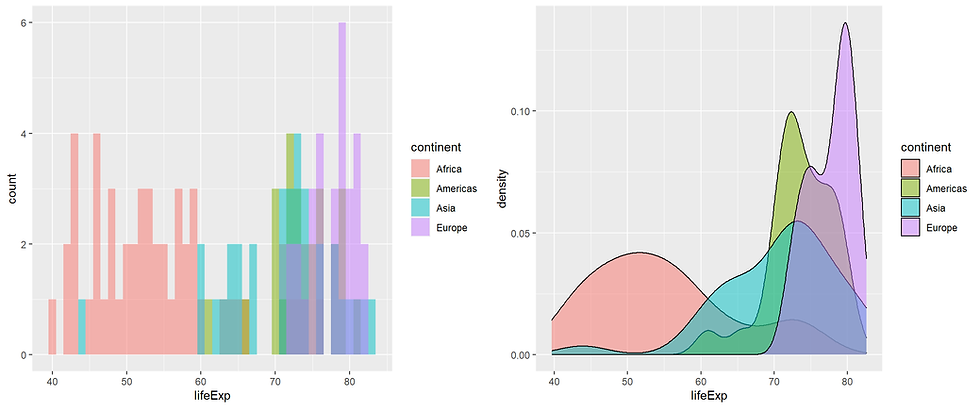
library(ggridges)df %>% filter(year == 2007 & continent != "Oceania") %>%
ggplot(aes(x = lifeExp, y = fct_rev(continent), fill = continent)) +
geom_density_ridges(colour = "#bdbdbd", size = 0.8, alpha = 0.7) +
scale_x_continuous(expand = c(0,0)) +
scale_y_discrete(expand = c(0,0)) +
scale_fill_brewer(palette = "Set2") +
labs(title = "Life expectancy distribution, 2007",
x = "Life Expectancy (years)",
y = "") +
theme(panel.grid.major.x = element_blank(),
legend.position = "none")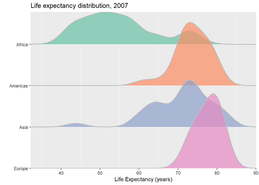
4. Looking at the relationship
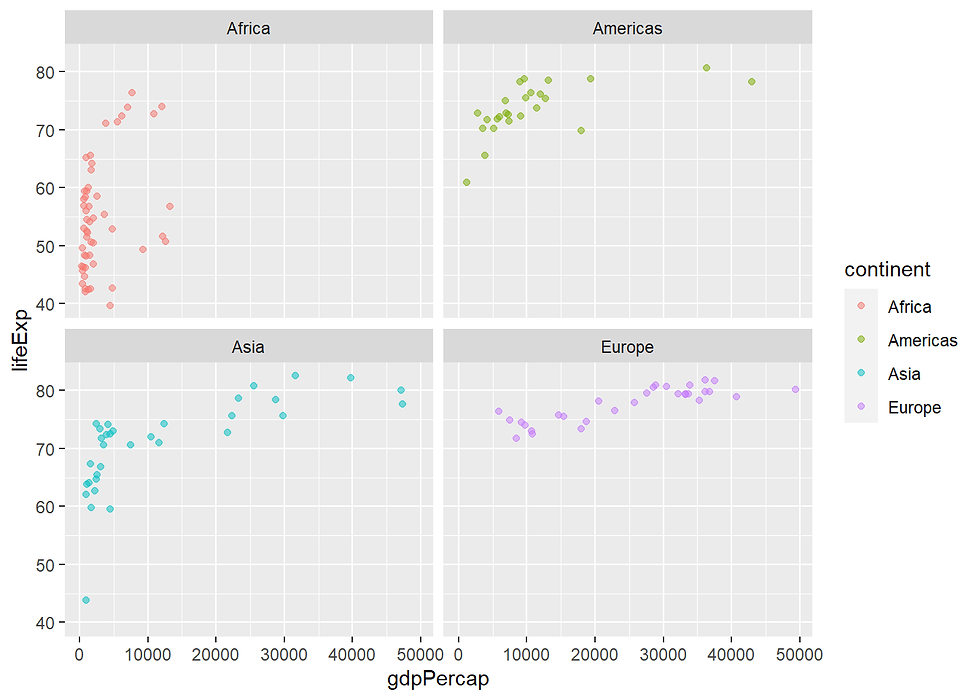
Question 8. Are there relationship between life expectancy and gdppercap ?
df %>%
  filter(year == 2007 & continent != "Oceania") %>%
  ggplot(aes(x = gdpPercap,
             y = lifeExp,
             col = continent)) +
  geom_point(alpha = 0.5)  +
  facet_wrap(~continent)
Taking a closer look for Africa
df %>%
  filter(year == 2007 & continent == "Africa") %>%
  ggplot(aes(x = gdpPercap,
             y = lifeExp)) +
  geom_point(alpha = 0.80, size = 4, col = "blue") +
  theme(legend.title = element_blank())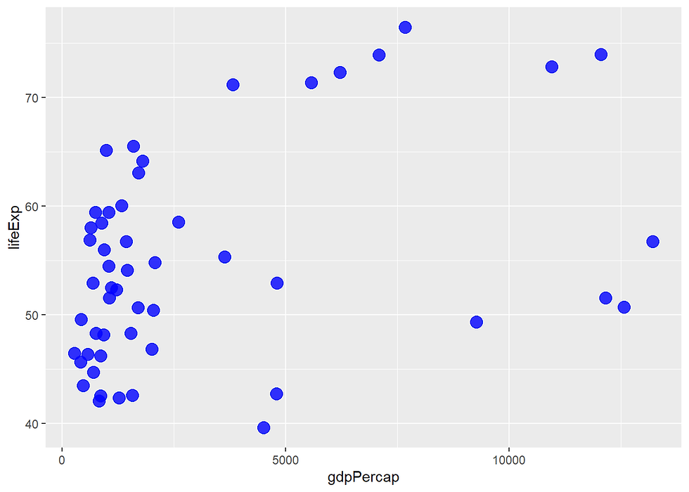
Question 9. Are there any relationship between population and GDP?
library(ggpubr)

pop_gdp_asia <- df %>%
  filter(year == 2007 & continent == "Asia") %>%
  ggplot(aes(x = pop,
             y = gdpPercap)) +
  geom_point(color = "blue", size =2) +
  labs(title = "Asia")

pop_gdp_americas <- df %>%
  filter(year == 2007 & continent == "Americas") %>%
  ggplot(aes(x = pop,
             y = gdpPercap)) +
  geom_point(color = "red", size =2)+
  labs(title = "Americas")

pop_gdp_europe <- df %>%
  filter(year == 2007 & continent == "Europe") %>%
  ggplot(aes(x = pop,
             y = gdpPercap)) +
  geom_point(color = "purple", size =2) +
  labs(title = "Europe")

pop_gdp_africas <- df %>%
  filter(year == 2007 & continent == "Africa") %>%
  ggplot(aes(x = pop,
             y = gdpPercap)) +
  geom_point(color = "darkgreen", size =2) +
  labs(title = "Africa")

ggarrange(pop_gdp_asia, pop_gdp_americas,pop_gdp_europe,pop_gdp_africas)
Question 10. Can we visualize the relationship between three avariables, including life expectancy, population, and gdp per capita?
df %>%
  filter(year == 2007 & continent != "Oceania") %>%
  ggplot(aes(x=gdpPercap, y=lifeExp, size = pop, color=continent)) +
  geom_point(alpha=0.7) +
  scale_size(range = c(.5, 24), name = "Population (M)")
Question 11: The average life expectancy after from 1957 to 1997, for different continents
p3 <- df %>%
  filter(year%in% c("1952", "1997")) %>%
  group_by(continent,year) %>%
  mutate(Avg_life_expectancy = mean(lifeExp),
         Year = factor(year)) %>%
  ggplot() +
  ylim(0,80) +
  geom_line(aes(x = Year,
             y = Avg_life_expectancy,
             group = continent),
            size = 1.5,
            color = "grey") +
  geom_point(aes(x = Year,
             y = Avg_life_expectancy,
             color = continent),
             size = 2) +
  ylim(0,80) +
  theme(legend.position = "none") + theme_minimal()
p4 <- df %>%
group_by(continent,year) %>%
mutate(Avg_life_expectancy = mean(lifeExp),
Year = factor(year)) %>%
ggplot() +
ylim(0,80) +
geom_line(aes(x = Year,
y = Avg_life_expectancy,
group = continent),
size = 1,
color = "grey") +
geom_point(aes(x = Year,
y = Avg_life_expectancy,
color = continent),
size = 2) + theme_minimal()
ggarrange(p3, p4, widths = c(4,10)) 
The important improvement was observed for Asia and Americas.
We can also look at the change in details.
Question 12: What countries in America have the biggest change in life expectancy?
gapminder %>%
  filter(year >= 2002, continent == "Americas") %>%
  mutate(Year = factor(year)) %>%
  ggplot(aes(y = reorder(country, lifeExp),
           x = lifeExp)) +
  geom_line(aes(group = country),
            size = 1.5,
            color = "grey") +
  geom_point(aes(color = Year),
             size = 4) +
  scale_color_manual(values=c("red", "blue")) +
  labs(x = "Life Expectancy (years)", y = NULL) +
  theme(text = element_text(size = 16),
        panel.border = element_rect(fill = NA, colour = "grey20")) +
  theme_minimal()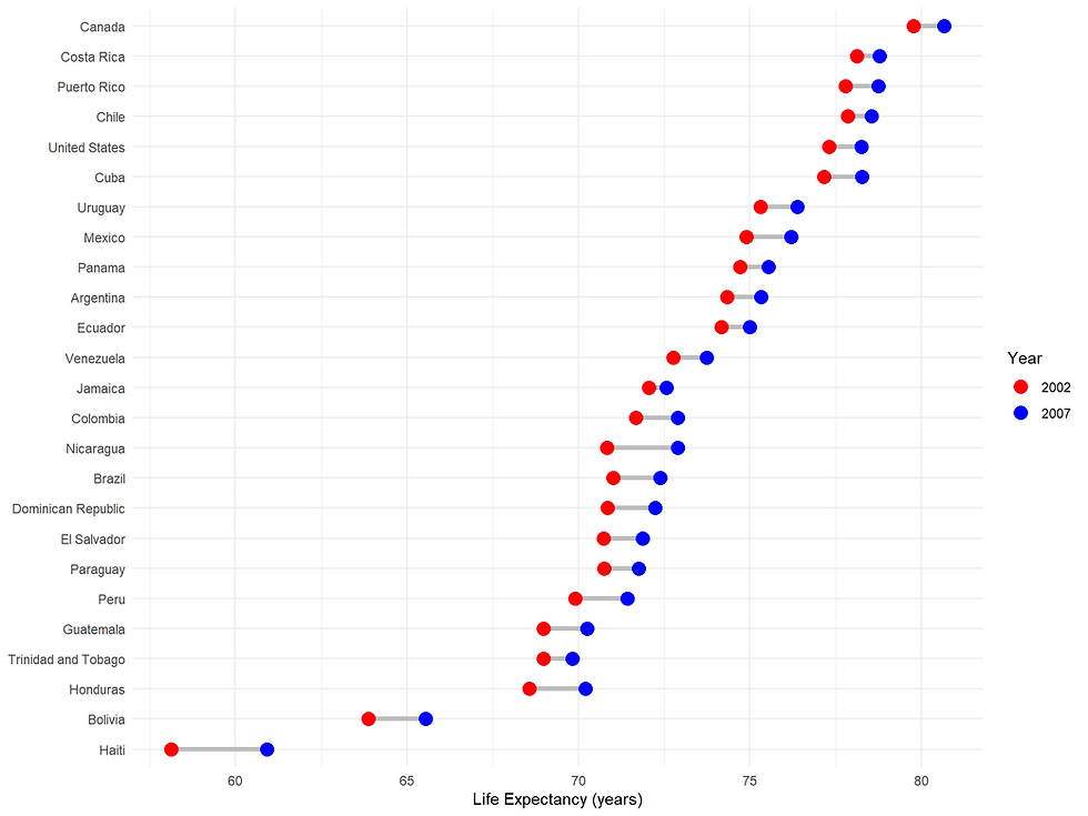
Question 13. What countries have grown the most over the last 10 years?
top10_countries <- df %>%
  select(continent,year, country, gdpPercap) %>%
  filter(year %in% c("1997", "2007"))%>%
  pivot_wider(names_from=year, values_from = gdpPercap) %>%
  mutate(gdp_difference = `2007` - `1997`) %>%
  top_n(10,gdp_difference)

top10_countries
## # A tibble: 10 x 5
##    continent country             `1997` `2007` gdp_difference
##    <fct>     <fct>                <dbl>  <dbl>          <dbl>
##  1 Asia      Bahrain             20292. 29796.          9504.
##  2 Africa    Equatorial Guinea    2814. 12154.          9340.
##  3 Europe    Finland             23724. 33207.          9483.
##  4 Europe    Greece              18748. 27538.          8791.
##  5 Asia      Hong Kong, China    28378. 39725.         11347.
##  6 Europe    Ireland             24522. 40676.         16154.
##  7 Asia      Singapore           33519. 47143.         13624.
##  8 Europe    Slovenia            17161. 25768.          8607.
##  9 Europe    Sweden              25267. 33860.          8593.
## 10 Americas  Trinidad and Tobago  8793. 18009.          9216.
top_countries <- top10_countries$country

df %>% filter(country %in% top_countries) %>%
  ggplot(aes(x = year,
             y = gdpPercap,
             col = country))+
geom_line(size = 1) 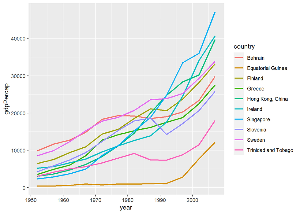
As there are only two countries in Oceania: Australia and New Zealand, we will look at Oceania. How did the life expectancy of these two countries change over the years?
df %>%
  filter(continent == "Oceania") %>%
  ggplot(aes(x = year,y = gdpPercap, color = country)) +
  geom_line( size = 1.0)+
  scale_colour_manual(values = c("Australia" = "blue", "New Zealand" = "red")) +
  ggtitle("GDP per Capita in Oceania from 1952 to 1997")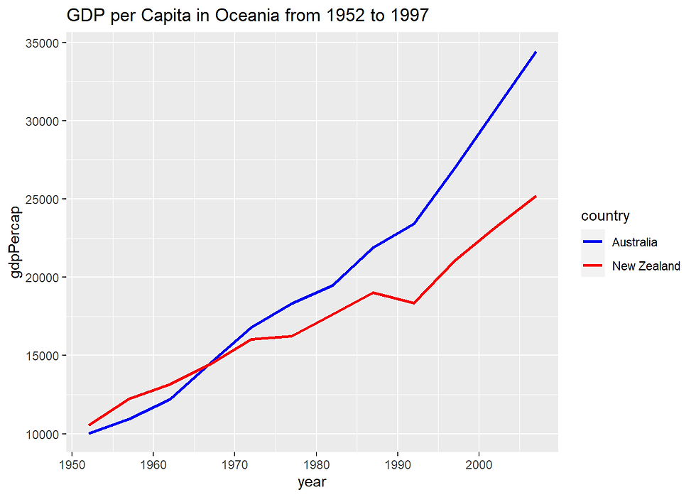
library(ggrepel)
Question 14. In Europe, which countries have GDP above the median (in 2007) ?
df %>%
  filter(year == 2007 & continent == "Europe") %>%
  mutate(median = median(gdpPercap),
         diff = gdpPercap - median,
         type = ifelse(gdpPercap < median, "Below", "Above")) %>%
  arrange(diff) %>%
  mutate(country = factor(country, levels = country)) %>%
  ggplot(aes(x = country, y = diff, label = country)) +
  geom_col(aes(fill = type), width = 0.5, alpha = 0.8)  +
  scale_y_continuous(expand = c(0, 0),
                     labels = scales::dollar) +
  scale_fill_manual(labels = c("Above median", "Below median"),
                    values = c("Above" = "purple", "Below" = "blue")) +
  labs(title =  "GDP per capita, 2007",
       x = NULL,
       y = NULL,
       fill = NULL) +
  coord_flip() +
  theme(panel.grid.major.y = element_blank())

library(treemapify)df%>% filter(year == 2007 & continent != "Oceania") %>%
mutate(gdp = pop * gdpPercap) %>%
ggplot(aes(area = gdp, fill = continent, subgroup = continent, label = country)) +
geom_treemap() +
geom_treemap_subgroup_border(colour = "black") +
geom_treemap_subgroup_text(fontface = "bold", colour = "#f0f0f0", alpha = 0.7, place = "bottomleft") +
geom_treemap_text(colour = "white", place = "centre", reflow = TRUE) +
scale_fill_brewer(palette = "Set2") +
labs(title = "Country GDP by continent, 2007",
x = NULL,
y = NULL,
fill = NULL) +
theme(legend.position = "none")


Comments