


Student Performance Analysis
- sam33frodon
- Jun 12, 2021
- 5 min read
import pandas as pd
import numpy as np
import matplotlib.pyplot as plt
import seaborn as sns
import warnings
warnings.filterwarnings('ignore')
%matplotlib inline
plt.style.use('ggplot')
The fictional data about student performance can be found on Kaggle (https://www.kaggle.com/spscientist/students-performance-in-exams)
df = pd.read_csv("StudentsPerformance.csv") # Loading the data
1. First look at the data
To get a concise summary of the dataframe
df.info() <class 'pandas.core.frame.DataFrame'>
RangeIndex: 1000 entries, 0 to 999
Data columns (total 8 columns):
# Column Non-Null Count Dtype
--- ------ -------------- -----
0 gender 1000 non-null object
1 race/ethnicity 1000 non-null object
2 parental level of education 1000 non-null object
3 lunch 1000 non-null object
4 test preparation course 1000 non-null object
5 math score 1000 non-null int64
6 reading score 1000 non-null int64
7 writing score 1000 non-null int64
dtypes: int64(3), object(5)
memory usage: 62.6+ KBThe summary includes list of all columns with their data types and the number of non-null values in each column.
Categorical variables: gender, race/ethnicity, parental level of education, lunch, and test preparation course
Numerical variables: math score, reading score, and writing score
df.shape(1000, 8)For quickly testing if your object has the right type of data in it
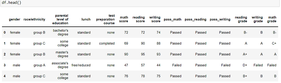
df.head()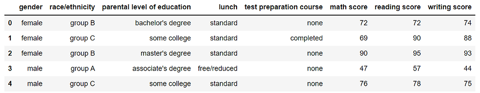
Column Name Description
gender: Male/ Female
race/ethnicity: Group division from A to E
parental level of education: Details of parental education varying from high school to master's degree
lunch: Type of lunch selected
test preparation course: Course details
math score: Marks secured by a student in Mathematics
reading score: Marks secured by a student in Reading
writing score: Marks secured by a student in Writing
Examine missing values
df.isna().sum()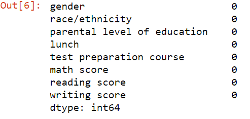
There is no missing value in the dataset.
2. Initial data exploration
In this case, the aim is not to create stunning charts.
The charts are used to give a picture of data.
The initial data exploration are essentially univariate, bivariate, and multivariates analysis.
2.1. Univariate analysis
For univariate, we will examine each and every single variable using appropriate chart for each type of variable.
2.1.1. Categorical variables
How many categories for each categorical column ?
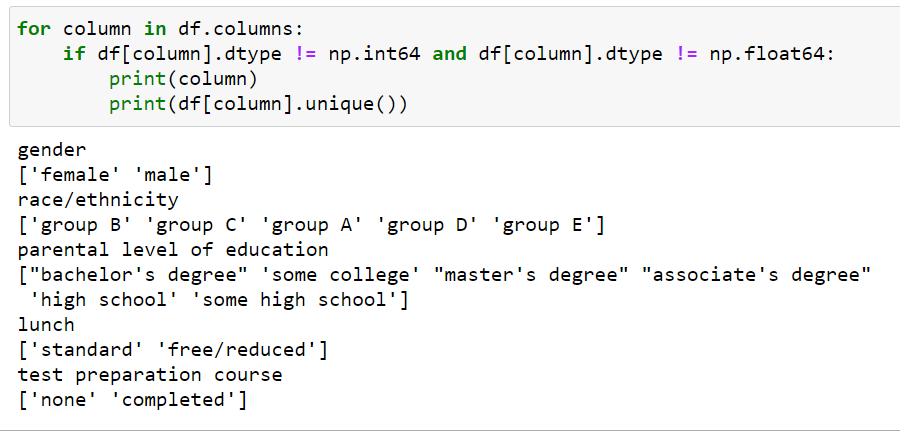
There are five categorical variables in the data set:
gender : 'female', 'male'
race/ethnicity: 'group B', 'group C', 'group A', 'group D', 'group E'
parental level of education: 'bachelor's degree', 'some college', 'master's degree', 'associate's degree', 'high school', 'some high school'
lunch: 'standard', 'free/reduced'
test preparation course: 'none', 'completed'
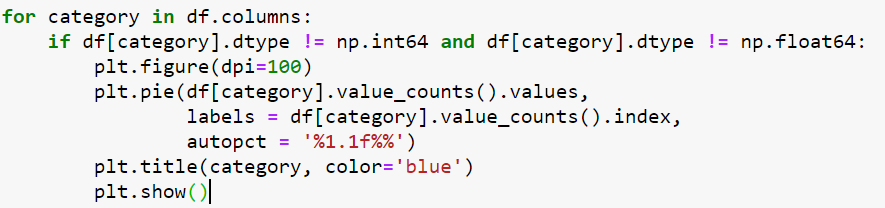
Visualization of distribution of categorical variables
As there are maximum of 5 categories for a few variables (race/ethnicity and parental level of education). We can use pie chart to see the proportion of these categories.


Visualization of numerical variables
math score
reading score
writing score


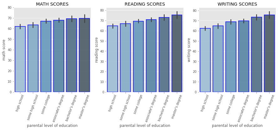
Calculating mean across groups
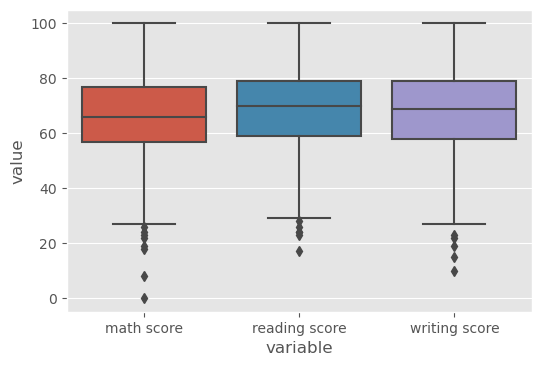
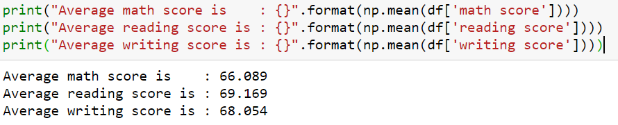
There are three tests: math, reading, and writing. The mean score for the three test are 66, 69, and 68, respectively.
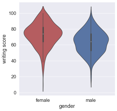
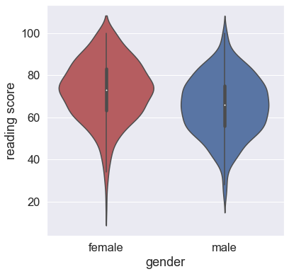
We can also use violin chart to visualize the probability density of the data at different values, usually smoothed by a kernel density estimator
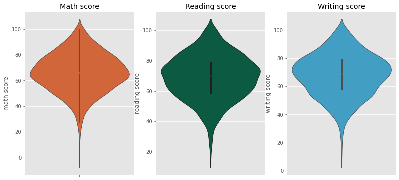
Most of the students score in between 60-80 in Math, whereas in Reading and Writing most of them score from 50-80.
2.2. Bivariate analysis 2.2.1. Categorical and categorical variable
gender
race/ethnicity
parental level of education
lunch
test preparation course
Chi-Square Statistic
from scipy import stats
from scipy.stats import chi2_contingency
The null hypothesis of the Chi-Square test is that no relationship exists on the categorical variables in the population.
Is the p-value less than .05? If so, we can conclude that the variables are not independent of each other and that there is a statistical relationship between the categorical variables.
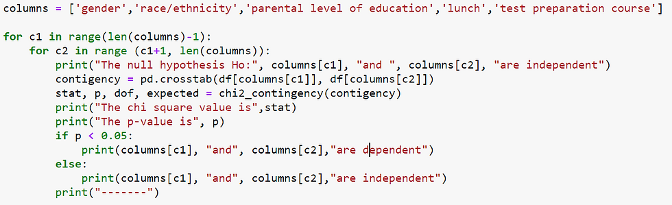
The null hypothesis Ho: gender and  race/ethnicity are independent
The chi square value is 9.02738626908596
The p-value is 0.06041858784847785
gender and race/ethnicity are independent
-------
The null hypothesis Ho: gender and  parental level of education are independent
The chi square value is 3.384904766004173
The p-value is 0.6408699721807456
gender and parental level of education are independent
-------
The null hypothesis Ho: gender and  lunch are independent
The chi square value is 0.37173802316040705
The p-value is 0.5420584175146086
gender and lunch are independent
-------
The null hypothesis Ho: gender and  test preparation course are independent
The chi square value is 0.015529201882465888
The p-value is 0.9008273880804724
gender and test preparation course are independent
-------
The null hypothesis Ho: race/ethnicity and  parental level of education are independent
The chi square value is 29.45866151909779
The p-value is 0.07911304840592065
race/ethnicity and parental level of education are independent
-------
The null hypothesis Ho: race/ethnicity and  lunch are independent
The chi square value is 3.4423502326273185
The p-value is 0.48669808284196503
race/ethnicity and lunch are independent
-------
The null hypothesis Ho: race/ethnicity and  test preparation course are independent
The chi square value is 5.4875148857070695
The p-value is 0.24082911295018397
race/ethnicity and test preparation course are independent
-------
The null hypothesis Ho: parental level of education and  lunch are independent
The chi square value is 1.1112675079168055
The p-value is 0.9531014927218224
parental level of education and lunch are independent
-------
The null hypothesis Ho: parental level of education and  test preparation course are independent
The chi square value is 9.54407054307069
The p-value is 0.08923388625809343
parental level of education and test preparation course are independent
-------
The null hypothesis Ho: lunch and  test preparation course are independent
The chi square value is 0.22095439044844808
The p-value is 0.6383136809999865
lunch and test preparation course are independent
-------
We can see that all categorical variables are independent.
It appears that the association between these categorical variables are very weak.
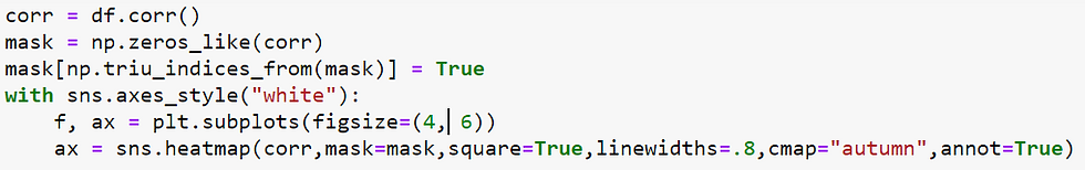
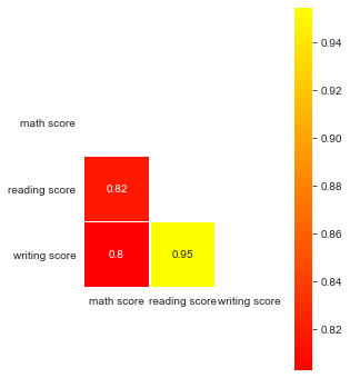
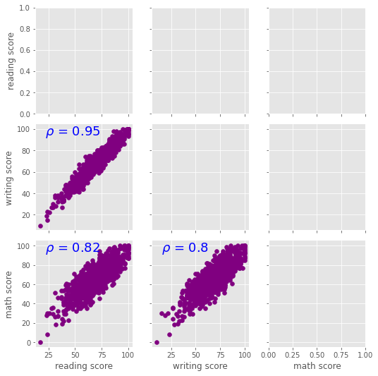
Numerical and numerical variables
Correlation between scores
In statistics, the Pearson correlation coefficient (PCC, pronounced /ˈpɪərsən/), also referred to as Pearson's r, the Pearson product-moment correlation coefficient (PPMCC), or the bivariate correlation, is a measure of linear correlation between two sets of data.
import seaborn as sns
sns.pairplot(df, corner=True)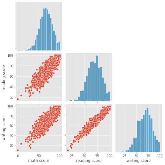
Questions to answer
Question 1: Proportion of students who passed the test
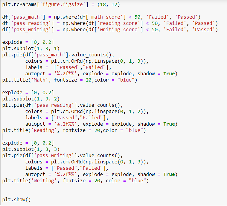

Math seems to be the most difficult subject when compared to Reading and Writing.
Question 2:
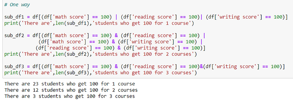
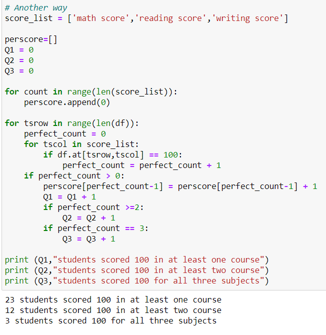
How many students scored 100 in at least one course?
How many students scored 100 in at least two courses?
How many students scored 100 for all three subjects?
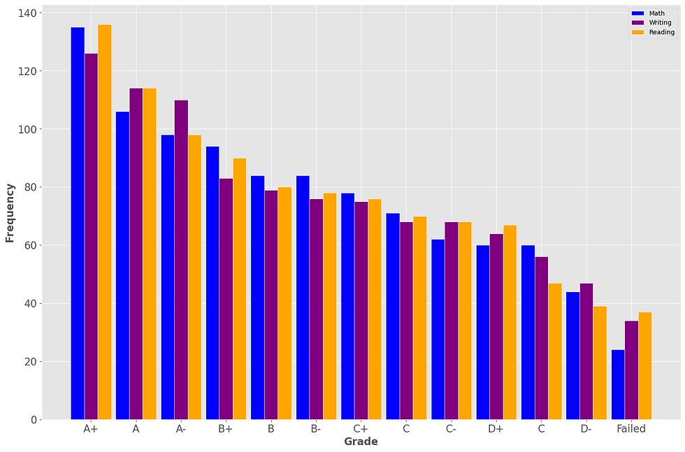
Question 3: How many students got 100 for each subject ?
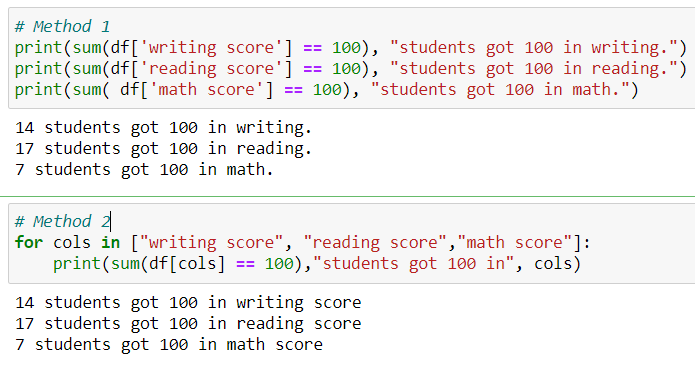
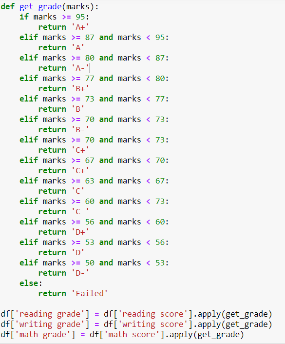
Adding columns for grade
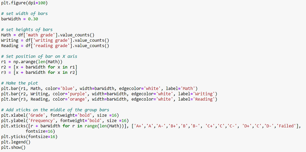
Multivariate analysis (numerical and categorical)
import pylab
import scipy.stats as stats

for i in ['math score','reading score','writing score']:
    plt.figure(figsize=(6,5))
    sns.boxplot(x = 'race/ethnicity', y = i,
                data = df,
                order = ["group A","group B","group C","group D","group E"])
    plt.tight_layout()


columns_list = ['math score','reading score','writing score']

for i in columns:
    plt.figure(figsize=(6,6))
    sns.boxplot(data = df,
                x = 'gender',
                y = i)
    plt.tight_layout()


Three variables
sns.pairplot(df , hue='race/ethnicity')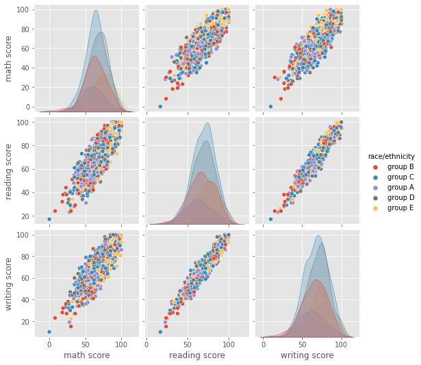
Other Datavis
plt.figure(figsize=(7,7))

plt.pie(df['race/ethnicity'].value_counts().values,
        explode = [0,0,0.1,0,0],
        labels = df['race/ethnicity'].value_counts().index,
        colors = ['#2085ec','#72b4eb','#0a417a','#8464a0','#cea9bc'],
        autopct = '%1.1f%%')

plt.title('Race/Ethnicity According Analysis', color='black', fontsize = 12)
plt.show()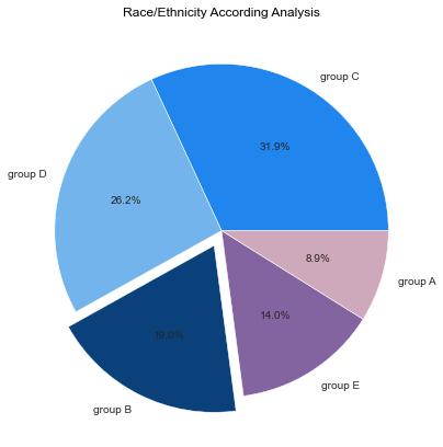
race = ['Group A', 'Group B ', 'Group C', 'Group D', 'Group E']

data = [89, 190, 319, 262, 140]

colors = (  "#ffd11a", "#b463cf",
          "#DC143C", "#6699ff", "#ff66b3" )

wp = { 'linewidth' : 1, 'edgecolor' : "#cccccc" }

def func(pct, allvalues):
    absolute = int(pct / 100.*np.sum(allvalues))
    return "{:.1f}%\n({:d} )".format(pct, absolute)

fig, ax = plt.subplots(figsize =(15, 10))

wedges, texts, autotexts = ax.pie(data,
                                  autopct = lambda pct: func(pct, data),
                                  labels = race,
                                  shadow = True,
                                  colors = colors,
                                  startangle = 90,
                                  wedgeprops = wp,
                                  textprops = dict(color ="#000000"))

ax.legend(wedges, race,
          title ="Race/Ethnicity",
          loc ="center left",
          bbox_to_anchor =(1.25, 0, 0, 1.25))

plt.setp(autotexts, size = 15, weight ="bold")
ax.set_title("Race/Ethnicity Distribution", fontsize=15, fontweight='bold')

plt.show()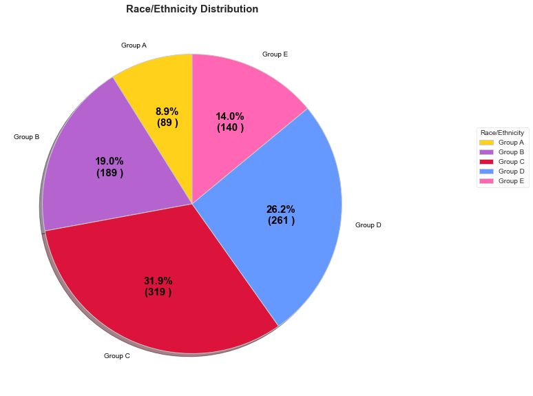
sns.catplot(x="test preparation course",
            y="reading score",
            kind='violin',
            hue='gender',
            split='true',
            data=df, height=6, aspect=2);
plt.grid()
sns.relplot(x='math score',y='reading score',hue='gender',data=df)


Comments